- Home
- /
- Programming
- /
- Graphics
- /
- Is there a way for GBARLINE to plot 3 bar charts and 3 lines ?
- RSS Feed
- Mark Topic as New
- Mark Topic as Read
- Float this Topic for Current User
- Bookmark
- Subscribe
- Mute
- Printer Friendly Page

- Mark as New
- Bookmark
- Subscribe
- Mute
- RSS Feed
- Permalink
- Report Inappropriate Content
Hi All,
I was wondering if there is a possibility for PROC GBARLINE to plot 3 charts in single primary axis and 3 lines in single secondary axis. Basically my data set contains variables such as average student final exam in semester 1,2,3 and average number of hours student study in semester 1,2,3. Herein my data set example :
Class exam_1 exam_2 exam_3 studyhours_1 studyhours_2 studyhours_3
Math 6.2 7.5 7.0 4 4 5
Physic 7.12 6.7 5.8 5 3 4
Is there a way for PROC GBARLINE to manage all of these data in single picture ?
Thanks for any help!.

- Mark as New
- Bookmark
- Subscribe
- Mute
- RSS Feed
- Permalink
- Report Inappropriate Content
I will let other GRAPH experts answer the GBARLINE question. With SAS 9.3, you can certainly do this using proc SGPLOT. While data is reorganized as group (for convenience), you can certainly also use the multi column format, with different syntax. Having same number of ticks on both Y & Y2 axis allows using grids lines.
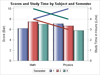
%let gpath='C:\';
data scores;
input Subject $1-8 Semester Score StudyTime;
datalines;
Math 1 6.2 4
Math 2 7.5 4
Math 3 7.0 5
Physics 1 7.12 5
Physics 2 6.7 3
Physics 3 5.8 4
;
run;
ods listing style=htmlblue gpath=&gpath;
ods graphics / reset width=4in height=3in imagename='BarLine3';
proc sgplot data=scores;
title 'Scores and Study Time by Subject and Semester';
vbar subject / response=score group=semester groupdisplay=cluster
nostatlabel dataskin=gloss name='a';
vline subject / response=studytime group=semester nostatlabel y2axis lineattrs=(thickness=5);
yaxis min=0 offsetmin=0 values=(0 to 10 by 2) grid label='Score (Bar)';
y2axis min=0 offsetmin=0 label='Study Time in Hours (Line)';
xaxis display=(nolabel);
keylegend 'a' / title='Semester';
run;
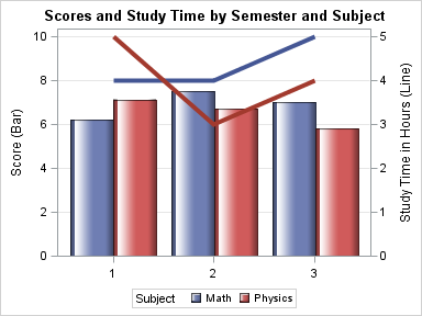
Switching Group and Category gives an alternate arrangement, recommended by some when using Line Charts:
- Mark as New
- Bookmark
- Subscribe
- Mute
- RSS Feed
- Permalink
- Report Inappropriate Content
Many Thanks Sanjay. I don't mind if there is another procedure to do it.
- Mark as New
- Bookmark
- Subscribe
- Mute
- RSS Feed
- Permalink
- Report Inappropriate Content
Please see first line of my code (%let).
For more information see Graphically Speaking blog.
Also see book: Statistical Graphics Procedures by Example: Effective Graphs Using SAS

Don't miss out on SAS Innovate - Register now for the FREE Livestream!
Can't make it to Vegas? No problem! Watch our general sessions LIVE or on-demand starting April 17th. Hear from SAS execs, best-selling author Adam Grant, Hot Ones host Sean Evans, top tech journalist Kara Swisher, AI expert Cassie Kozyrkov, and the mind-blowing dance crew iLuminate! Plus, get access to over 20 breakout sessions.
Learn how use the CAT functions in SAS to join values from multiple variables into a single value.

Find more tutorials on the SAS Users YouTube channel.
 Click image to register for webinar
Classroom Training Available!
Select SAS Training centers are offering in-person courses. View upcoming courses for:
-
3 replies
-
07-03-2013 10:54 PM
-
1339 views
-
0 likes
-
2 in conversation
-
