- Home
- /
- Programming
- /
- Graphics
- /
- Interpretation GLM Interaction Plot - especially the dots
- RSS Feed
- Mark Topic as New
- Mark Topic as Read
- Float this Topic for Current User
- Bookmark
- Subscribe
- Mute
- Printer Friendly Page
- Mark as New
- Bookmark
- Subscribe
- Mute
- RSS Feed
- Permalink
- Report Inappropriate Content
Hi, community,
I'm running SAS 9.3 on 32 bit-System.
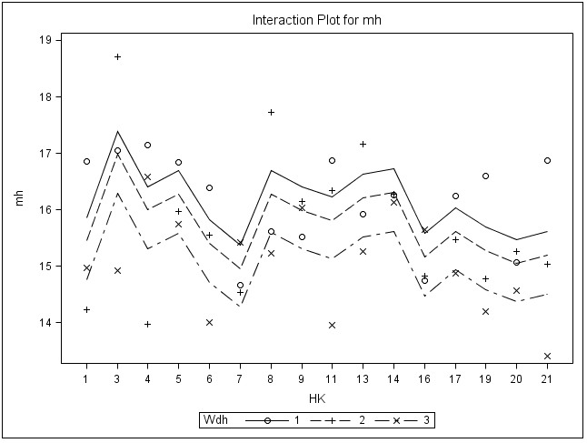
I have the following interaction plot - thrown out by
ods graphics on;
TITLE2 'paarweise Differenzierung der Höhenmittel 2015'; TITLE3 'Model Höhe = Herkunft Wiederholung (&Interaktion) / ss3';
PROC GLM DATA=beta;
BY VFL; CLASS hk wdh;
model mh=hk wdh /ss3;
lsmeans hk / adjust=tukey pdiff=all;
RUN; QUIT;
ODS graphics off;
Part of the Output, while the model is significant, is the attached graphic (in the html-output).
My research for the meaning of the dots and circles are resultless yet. Is there someone, who can tell?
The data set has three values for each class of hk.
Thx to helpful readers!
Christoph_Alwin
data example:
Wdh HK VFL mh
1 1 12 11.9891
1 3 12 12.6261
1 4 12 11.7111
1 5 12 12.3704
1 6 12 12.1714
1 21 12 11.9086
1 7 12 11.656
1 8 12 11.248
1 9 12 11.322
1 11 12 12.3973
1 13 12 11.5538
1 14 12 11.7488
1 16 12 12.188
1 17 12 11.5387
1 19 12 11.1318
1 20 12 11.3882
2 1 12 11.1585
2 3 12 13.1
2 4 12 12.27
2 5 12 12.26
2 6 12 12.3529
2 21 12 12.4622
2 7 12 10.9118
2 8 12 11.0143
2 9 12 11.871
2 11 12 11.5024
2 13 12 12.0889
2 14 12 11.3424
2 16 12 11.0917
2 17 12 11.2925
2 19 12 11.2895
2 20 12 12.1375
3 1 12 11.8188
3 3 12 12.7313
3 4 12 12.2667
3 5 12 11.8
3 6 12 12.2
3 21 12 12.1795
3 7 12 12.8733
3 8 12 11.275
3 9 12 12.3308
3 11 12 12.4059
3 13 12 12.0263
3 14 12 12.2895
3 16 12 13.0231
3 17 12 11.7345
3 19 12 11.175
3 20 12 11.2643

Accepted Solutions
- Mark as New
- Bookmark
- Subscribe
- Mute
- RSS Feed
- Permalink
- Report Inappropriate Content
The circle, cross and x are a scatter plot of the original values you supplied. Each symbol represents one level of the variable WDH.
The solid line graph represents the modeled value of the circle, or first level of WDH.
The simple dashed line is associated with cross and the second level of WDH.
The long-short dashed line is associated wth X and third level of WDH.
- Mark as New
- Bookmark
- Subscribe
- Mute
- RSS Feed
- Permalink
- Report Inappropriate Content
Don't miss out on SAS Innovate - Register now for the FREE Livestream!
Can't make it to Vegas? No problem! Watch our general sessions LIVE or on-demand starting April 17th. Hear from SAS execs, best-selling author Adam Grant, Hot Ones host Sean Evans, top tech journalist Kara Swisher, AI expert Cassie Kozyrkov, and the mind-blowing dance crew iLuminate! Plus, get access to over 20 breakout sessions.
Learn how use the CAT functions in SAS to join values from multiple variables into a single value.
Find more tutorials on the SAS Users YouTube channel.
 Click image to register for webinar
Classroom Training Available!
Select SAS Training centers are offering in-person courses. View upcoming courses for:


