BookmarkSubscribeRSS Feed
🔒 This topic is solved and locked. Need further help from the community? Please sign in and ask a new question.
aminkarimid
Lapis Lazuli | Level 10

Hello everybody,

I want to plot a 3D box blot which illustrates means with standard error bars from calculated data as I show bellow:
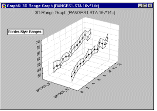
3D Box Plot3D Box Plot


All of data, which I have, are numeric type.


How can I do that?

1 ACCEPTED SOLUTION

Accepted Solutions
aminkarimid
Lapis Lazuli | Level 10

I have a suggestion, However it is not the best one and needs to be corrected.


/* Set the graphics environment */                                                                                                      
goptions reset=all cback=white border htext=10pt htitle=12pt;                                                                           
 proc sort data=have;                                                                                                                    
   by x y;                                                                                                                             
run;

/* Calculate the mean and standard error for each X */                                                                                  
proc means data=have noprint;                                                                                                           
   by x y;                                                                                                                             
   var z;                                                                                                                            
   output out=meansout mean=mean stderr=stderr;                                                                                         
run;                                                                                                                                    
                                                                                                                                        
/* Reshape the data to contain three Y values for */                                                                                    
/* each X for use with the HILOC interpolation.   */                                                                                    
data reshape(keep=x y z mean);                                                                                                      
   set meansout;                                                                                                                        
   z=mean;  
   output;                                                                                                                              
                                                                                                                                        
   z=mean - stderr;                                                                                                                  
   output;                                                                                                                              
                                                                                                                                        
   z=mean + stderr;                                                                                                                  
   output;                                                                                                                              
run;                                                                                                                                    
 
/* Define the title */
   title1 '3D Plot Intraday Volume vs year and Time from Calculated Data'; 

/* Define the axis characteristics */
   axis1 offset=(10,10) minor=none;                                                                                                                  
   axis2 label=(angle=90);                                                                                                              

/* Define the symbol characteristics */
   symbol1 interpol=hiloctj color=blue line=2;                                                                                          
   symbol2 interpol=none color=blue value=dot height=1.5;
                                                                                                                                       
/* Plot the error bars using the HILOCTJ interpolation */                                                                               
/* and overlay symbols at the means. */                                                                                                 
proc g3d data=reshape;                                                                                                                
   scatter x*y=z / size=2 shape='prism';     
run;                                                                                                      
quit;

This program make a bar chart which illustrates means of z vs x and y variables.


View solution in original post

7 REPLIES 7
WarrenKuhfeld
Rhodochrosite | Level 12

How about something more like this instead? You can make two panels of two-dimensional box plots. Here is one way.

data x;
   do z = 1 to 2;
      do x = 1 to 5;
         do i = 1 to 100;
            y = log(x) + 2 * z + normal(7);
            output;
         end;
      end;
   end;
run;

proc sgpanel;
   panelby z / columns=1;
   vbox y / category=x;
   run;


aminkarimid
Lapis Lazuli | Level 10

Thanks @WarrenKuhfeld, However simultaneous effects of variables is important.

Reeza
Super User

Since you're not displaying 3 variables, a single line series plot with the high/low bars will communicate the information in a more efficient manner.

Reeza
Super User

Thats one of those things you can technically do, but really really shouldn't. 

3D graphs rarely do a good job of conveying information. 


So if you're looking for data to include in a presentation I would suggest an alternative visualization. 

aminkarimid
Lapis Lazuli | Level 10
Hello @Reeza,
Please let me know your suggestions.
Thanks.
ballardw
Super User

Not a Box plot in normal terms. A box plot, or box and whisker shows mean, median, interquartile range [box part] and whiskers out from the box to +/- 1.5 interquartile range for outliers.


If you have SAS Graph then the  procedure us Proc G3D. The data set to plot would require the x, y and z value for each point. Getting the series connected as shown would take more than a bit of work to get the correct symbol statements displaying the intended series (upper, lower bound or the value though).


aminkarimid
Lapis Lazuli | Level 10

I have a suggestion, However it is not the best one and needs to be corrected.


/* Set the graphics environment */                                                                                                      
goptions reset=all cback=white border htext=10pt htitle=12pt;                                                                           
 proc sort data=have;                                                                                                                    
   by x y;                                                                                                                             
run;

/* Calculate the mean and standard error for each X */                                                                                  
proc means data=have noprint;                                                                                                           
   by x y;                                                                                                                             
   var z;                                                                                                                            
   output out=meansout mean=mean stderr=stderr;                                                                                         
run;                                                                                                                                    
                                                                                                                                        
/* Reshape the data to contain three Y values for */                                                                                    
/* each X for use with the HILOC interpolation.   */                                                                                    
data reshape(keep=x y z mean);                                                                                                      
   set meansout;                                                                                                                        
   z=mean;  
   output;                                                                                                                              
                                                                                                                                        
   z=mean - stderr;                                                                                                                  
   output;                                                                                                                              
                                                                                                                                        
   z=mean + stderr;                                                                                                                  
   output;                                                                                                                              
run;                                                                                                                                    
 
/* Define the title */
   title1 '3D Plot Intraday Volume vs year and Time from Calculated Data'; 

/* Define the axis characteristics */
   axis1 offset=(10,10) minor=none;                                                                                                                  
   axis2 label=(angle=90);                                                                                                              

/* Define the symbol characteristics */
   symbol1 interpol=hiloctj color=blue line=2;                                                                                          
   symbol2 interpol=none color=blue value=dot height=1.5;
                                                                                                                                       
/* Plot the error bars using the HILOCTJ interpolation */                                                                               
/* and overlay symbols at the means. */                                                                                                 
proc g3d data=reshape;                                                                                                                
   scatter x*y=z / size=2 shape='prism';     
run;                                                                                                      
quit;

This program make a bar chart which illustrates means of z vs x and y variables.


sas-innovate-2024.png

Don't miss out on SAS Innovate - Register now for the FREE Livestream!

Can't make it to Vegas? No problem! Watch our general sessions LIVE or on-demand starting April 17th. Hear from SAS execs, best-selling author Adam Grant, Hot Ones host Sean Evans, top tech journalist Kara Swisher, AI expert Cassie Kozyrkov, and the mind-blowing dance crew iLuminate! Plus, get access to over 20 breakout sessions.


Register now!

How to Concatenate Values

Learn how use the CAT functions in SAS to join values from multiple variables into a single value.

Find more tutorials on the SAS Users YouTube channel.

Click image to register for webinarClick image to register for webinar

Classroom Training Available!

Select SAS Training centers are offering in-person courses. View upcoming courses for:

View all other training opportunities.

Discussion stats
  • 7 replies
  • 1505 views
  • 1 like
  • 4 in conversation