- Home
- /
- Programming
- /
- Graphics
- /
- Re: How to make grouped histogams
- RSS Feed
- Mark Topic as New
- Mark Topic as Read
- Float this Topic for Current User
- Bookmark
- Subscribe
- Mute
- Printer Friendly Page
- Mark as New
- Bookmark
- Subscribe
- Mute
- RSS Feed
- Permalink
- Report Inappropriate Content
I'm new to SAS and have been struggling with learning it. Hopefully someone can help me with a task.
I'm trying to make a grouped bar chart. So I have a dataset with the following information:
idNumber: id number of the student
gradeLevel: grade in high school... takes values of freshman, sophomore, junior, and senior.
plansToGoToCollege: binary indicator indicating whether the student plans to go to college (1 if yes,0 if no).
dataset is called collegeSurvey
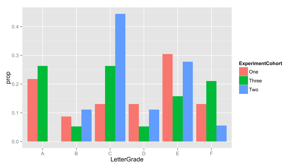
I'm trying to make a bar charrt plotting the 0's and 1's of the plansToGoToCollege variable segmented by gradeLevel. Something that looks kinda like the picture below (which is just a random picture I found from google).
So I'd have 4 different x values (fresh, sophomore, junior, and senior)... each x value has 2 bars (0 and 1), and the y axis would measure the frequency of the occurrence.
gradeLevel is of type character
plansToGoToCollege is numeric
- Mark as New
- Bookmark
- Subscribe
- Mute
- RSS Feed
- Permalink
- Report Inappropriate Content
I think you're looking for something similar to:
proc sgplot data=collegesurvey;
  vbar gradelevel /group=planstogotocollege groupdisplay=cluster;
run;
You might want bookmark this as one source of graphs with pictures and example SAS code including data.
- Mark as New
- Bookmark
- Subscribe
- Mute
- RSS Feed
- Permalink
- Report Inappropriate Content
thanks! I did that and it plotted the frequencies.... I'm wondering if theres a way change that to percentages. So if there are 150 0's and 50 1's for freshman, how do I change it do 75% and 25%?
- Mark as New
- Bookmark
- Subscribe
- Mute
- RSS Feed
- Permalink
- Report Inappropriate Content
Try changing type=FREQ to type=PERCENT.
http://support.sas.com/documentation/cdl/en/proc/61895/HTML/default/viewer.htm#a002473361.htm
- Mark as New
- Bookmark
- Subscribe
- Mute
- RSS Feed
- Permalink
- Report Inappropriate Content
type wont show up as option though
- Mark as New
- Bookmark
- Subscribe
- Mute
- RSS Feed
- Permalink
- Report Inappropriate Content
@toesockshoe wrote:
type wont show up as option though
I don't know what that means.
- Mark as New
- Bookmark
- Subscribe
- Mute
- RSS Feed
- Permalink
- Report Inappropriate Content
Here is the error I get
ERROR 22-322: Syntax error, expecting one of the following: ;, ALPHA, ATTRID, BARWIDTH, BASELINE, BASELINEATTRS, CATEGORYORDER,
CLUSTERWIDTH, COLORMODEL, COLORRESPONSE, COLORSTAT, DATALABEL, DATALABELATTRS, DATALABELFITPOLICY, DATALABELPOS,
DATASKIN, DISCRETEOFFSET, FILL, FILLATTRS, FILLTYPE, FREQ, GROUP, GROUPDISPLAY, GROUPORDER, LEGENDLABEL, LIMITATTRS,
LIMITS, LIMITSTAT, MISSING, NAME, NOFILL, NOOUTLINE, NOSTATLABEL, NOZEROBARS, NUMSTD, OUTLINE, OUTLINEATTRS, RATTRID,
RESPONSE, SEGLABEL, SEGLABELATTRS, SEGLABELFITPOLICY, SEGLABELFORMAT, SPLITCHAR, SPLITCHARNODROP, STAT, STATLABEL,
TIP, TIPFORMAT, TIPLABEL, TRANSPARENCY, URL, WEIGHT, X2AXIS, Y2AXIS.
ERROR 76-322: Syntax error, statement will be ignored.
- Mark as New
- Bookmark
- Subscribe
- Mute
- RSS Feed
- Permalink
- Report Inappropriate Content
Full code and log please. My suggestion was to change the TYPE= from the original code posted by Rob Allison.
@toesockshoe wrote:
Here is the error I get
ERROR 22-322: Syntax error, expecting one of the following: ;, ALPHA, ATTRID, BARWIDTH, BASELINE, BASELINEATTRS, CATEGORYORDER,
CLUSTERWIDTH, COLORMODEL, COLORRESPONSE, COLORSTAT, DATALABEL, DATALABELATTRS, DATALABELFITPOLICY, DATALABELPOS,
DATASKIN, DISCRETEOFFSET, FILL, FILLATTRS, FILLTYPE, FREQ, GROUP, GROUPDISPLAY, GROUPORDER, LEGENDLABEL, LIMITATTRS,
LIMITS, LIMITSTAT, MISSING, NAME, NOFILL, NOOUTLINE, NOSTATLABEL, NOZEROBARS, NUMSTD, OUTLINE, OUTLINEATTRS, RATTRID,
RESPONSE, SEGLABEL, SEGLABELATTRS, SEGLABELFITPOLICY, SEGLABELFORMAT, SPLITCHAR, SPLITCHARNODROP, STAT, STATLABEL,
TIP, TIPFORMAT, TIPLABEL, TRANSPARENCY, URL, WEIGHT, X2AXIS, Y2AXIS.
ERROR 76-322: Syntax error, statement will be ignored.
- Mark as New
- Bookmark
- Subscribe
- Mute
- RSS Feed
- Permalink
- Report Inappropriate Content
here is my code:
proc sgplot data=collegesurvey;
vbar gradelevel /group=planstogotocollege groupdisplay=cluster;
run;
uhh I don't think I can give you the full log... there are some variable names that are proprietary... the example I gave above is a madeup example.
- Mark as New
- Bookmark
- Subscribe
- Mute
- RSS Feed
- Permalink
- Report Inappropriate Content
The example provided was GCHART and the solution suggested aligned with GCHART. You are using SGPLOT instead, and the option within SGPLOT is STAT=PERCENT.
@toesockshoe wrote:
here is my code:
proc sgplot data=collegesurvey;
vbar gradelevel /group=planstogotocollege groupdisplay=cluster;
run;
uhh I don't think I can give you the full log... there are some variable names that are proprietary... the example I gave above is a madeup example.
- Mark as New
- Bookmark
- Subscribe
- Mute
- RSS Feed
- Permalink
- Report Inappropriate Content
ok thanks... ill keep that in mind for future posts!
- Mark as New
- Bookmark
- Subscribe
- Mute
- RSS Feed
- Permalink
- Report Inappropriate Content
There are multiple ways, see the posts below for example code with the graphs so you can see what matches up to what you're attempting.
https://blogs.sas.com/content/iml/2016/03/09/comparative-panel-overlay-histograms-sas.html
https://blogs.sas.com/content/graphicallyspeaking/2017/04/30/getting-started-with-sgplot-histograms/
@toesockshoe wrote:
I'm new to SAS and have been struggling with learning it. Hopefully someone can help me with a task.
I'm trying to make a grouped histogram. So I have a dataset with the following information:
idNumber: id number of the student
gradeLevel: grade in high school... takes values of freshman, sophomore, junior, and senior.
plansToGoToCollege: binary indicator indicating whether the student plans to go to college (1 if yes,0 if no).
dataset is called collegeSurvey
I'm trying to make a histogram plotting the 0's and 1's of the plansToGoToCollege variable segmented by gradeLevel. Something that looks kinda like the picture below (which is just a random picture I found from google).
So I'd have 4 different x values (fresh, sophomore, junior, and senior)... each x value has 2 bars (0 and 1), and the y axis would measure the frequency of the occurrence.
gradeLevel is of type character
plansToGoToCollege is numeric
- Mark as New
- Bookmark
- Subscribe
- Mute
- RSS Feed
- Permalink
- Report Inappropriate Content
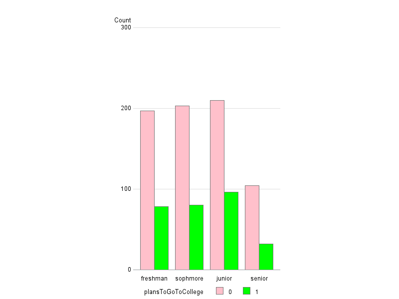
Here's one way to do it, using a grouped bar chart, created with Proc Gchart:
Here, I'm just creating some "random data" similar to the data you describe, since I don't have your real data:
data collegeSurvey (keep = idNumber gradelevel plansToGoToCollege);
do loop = 1 to 1000;
idNumber=round(ranuni(123)*10000);
length grade_level $10;
gradelevel_num=round(ranuni(123)*4);
if gradelevel_num=1 then gradelevel='freshman';
if gradelevel_num=2 then gradelevel='sophmore';
if gradelevel_num=3 then gradelevel='junior';
if gradelevel_num=4 then gradelevel='senior';
if ranuni(123)>.7 then plansToGoToCollege=1;
else plansToGoToCollege=0;
output;
end;
run;
And this is how I generate the plot:
pattern1 v=s c=pink;
pattern2 v=s c=lime;
axis1 label=none order=('freshman' 'sophmore' 'junior' 'senior') offset=(2,2);
axis2 label=('Count') major=none minor=none style=0;
axis3 label=none value=none;
legend1 shape=bar(.15in,.15in);
proc gchart data=collegeSurvey;
vbar plansToGoToCollege / discrete type=freq
group=gradelevel
gaxis=axis1 raxis=axis2 maxis=axis3 noframe
autoref clipref cref=graydd legend=legend1
subgroup=plansToGoToCollege /* controls color */
coutline=gray77
space=0;
run;
Don't miss out on SAS Innovate - Register now for the FREE Livestream!
Can't make it to Vegas? No problem! Watch our general sessions LIVE or on-demand starting April 17th. Hear from SAS execs, best-selling author Adam Grant, Hot Ones host Sean Evans, top tech journalist Kara Swisher, AI expert Cassie Kozyrkov, and the mind-blowing dance crew iLuminate! Plus, get access to over 20 breakout sessions.
Learn how use the CAT functions in SAS to join values from multiple variables into a single value.
Find more tutorials on the SAS Users YouTube channel.
 Click image to register for webinar
Classroom Training Available!
Select SAS Training centers are offering in-person courses. View upcoming courses for:


