- Home
- /
- Programming
- /
- Graphics
- /
- Re: How to get 100% bars by category in SGPlot
- RSS Feed
- Mark Topic as New
- Mark Topic as Read
- Float this Topic for Current User
- Bookmark
- Subscribe
- Mute
- Printer Friendly Page
- Mark as New
- Bookmark
- Subscribe
- Mute
- RSS Feed
- Permalink
- Report Inappropriate Content
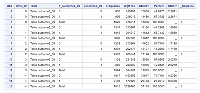
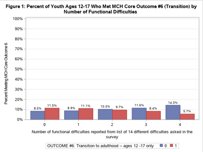
I have a set of survey data that I would like to construct a SGPLOT vbar graph showing how many per each "different" category met "outcome 6". The proc surveyfreq code below correctly calculates the percentages within each value for "different" that meets "outcome 6". However, when I transmit the data to SGPLOT, the correct proportions are then applied to 20% (as there are 5 "different" categories) and I was trying to set this up so each bar is standalone (100%). (E.g.; the last category should be 71% but is 71% of 20%, not of 100%. ) I cannot figure out how to correct this or where the miscommunication is. Photos attached. If there is an entirely better way doing this at all (showing stratified data), I'd accept happily. Thank you!
proc surveyfreq data=terrier.transition;
cluster IDNUMR;
weight WEIGHT_I;
by diff5_09;
tables outcome6_09 ;
ods output oneway=AllOutcomeSorted;
run;
proc print data=AllOutcomeSorted;
run;
proc sgplot data=AllOutcomeSorted uniform=all;
title 'Figure 1: Percent of Youth Ages 12-17 Who Met MCH Core Outcome #6 (Transition) by Number of Functional Difficulties';
yaxis label='Percent Meeting MCH Core Outcome 6' grid values=(0 to 1 by .1);
xaxis display=(nolabel);
vbar diff5_09 / response = percent group=outcome6_09 grouporder=data groupdisplay=cluster stat=percent datalabel;
xaxis discreteorder=data;
run;
Accepted Solutions
- Mark as New
- Bookmark
- Subscribe
- Mute
- RSS Feed
- Permalink
- Report Inappropriate Content
Try adding PCTLEVEL=GROUP to the PROC SGPLOT statement and see if you get what you want.
Hope this helps!
Dan
- Mark as New
- Bookmark
- Subscribe
- Mute
- RSS Feed
- Permalink
- Report Inappropriate Content
Provide some data in the form of data step. Very few of us are likely to type data to attempt to test code.
If the precentages calculated by surveyfreq are not the ones desired you likely need to add them to the request.
I would suggest that instead of using BY that you change the tables statement to
tables f5_09 * outcome6_09 /column row ;
That should give you the percentage you are looking for in one of either row, column or overall percentage. I can't quite tell from your description which one is actually desired.
You might consider adding the CL statistic to the options in the table statement so you could show error bars for your statistics.
- Mark as New
- Bookmark
- Subscribe
- Mute
- RSS Feed
- Permalink
- Report Inappropriate Content
How do I provide you some data? The dataset is about 42,000 entries.
Tables diff5_09*outcome6_09 does not stratify by "different". I want to be able to plot that WITHIN category "different 1", 45% met outcome6, and WITHIN category "different 5", 28% met outcome6. When I used Tables diff5_09*outcome6_09, it would transmit individual cell percentages to SGPLOT (e.g.; 5% of ALL responses met both outcome6 and diff5_09 = 1).
I had followed this example code, who does similarly to what I want:
But my issue is that it does not seem to make 100% bars, but 20% bars instead.
- Mark as New
- Bookmark
- Subscribe
- Mute
- RSS Feed
- Permalink
- Report Inappropriate Content
You are creating a summary data set to plot. That is the correct approach. I strongly suspect the summary data does not contain 42,000 rows.
So create a summary data set we can use, showing the relationship you expect to plot.
Have you tried the modified tables syntax I suggested?
As I said, I am not sure what 71 percent of what 20 percent you are either getting or wanting. I very strongly suspect that one of the percentages shows from the modified syntax will have the value you want.
When I used Tables diff5_09*outcome6_09, it would transmit individual cell percentages to SGPLOT (e.g.; 5% of ALL responses met both outcome6 and diff5_09 = 1).
And which percent was that? There are overall percents, row percents and column percents in the output.
And from the surveyfreq documentation you will see another reason to use the suggested tables syntax:
Using a BY statement provides completely separate analyses of the BY groups. It does not provide a statistically valid domain (subpopulation) analysis, where the total number of units in the subpopulation is not known with certainty. You should include the domain variable(s) in your TABLES request to obtain domain analysis. For more information, see the section Domain Analysis.
I added the emphasis
- Mark as New
- Bookmark
- Subscribe
- Mute
- RSS Feed
- Permalink
- Report Inappropriate Content
Try adding PCTLEVEL=GROUP to the PROC SGPLOT statement and see if you get what you want.
Hope this helps!
Dan
Don't miss out on SAS Innovate - Register now for the FREE Livestream!
Can't make it to Vegas? No problem! Watch our general sessions LIVE or on-demand starting April 17th. Hear from SAS execs, best-selling author Adam Grant, Hot Ones host Sean Evans, top tech journalist Kara Swisher, AI expert Cassie Kozyrkov, and the mind-blowing dance crew iLuminate! Plus, get access to over 20 breakout sessions.
Learn how use the CAT functions in SAS to join values from multiple variables into a single value.
Find more tutorials on the SAS Users YouTube channel.
 Click image to register for webinar
Classroom Training Available!
Select SAS Training centers are offering in-person courses. View upcoming courses for:


