- Home
- /
- Programming
- /
- Graphics
- /
- How to create a GRAPH like THIS(plotting a category and its constituen...
- RSS Feed
- Mark Topic as New
- Mark Topic as Read
- Float this Topic for Current User
- Bookmark
- Subscribe
- Mute
- Printer Friendly Page

- Mark as New
- Bookmark
- Subscribe
- Mute
- RSS Feed
- Permalink
- Report Inappropriate Content
Hello Experts,
how do we create a plot using the set of data like below:
| Category | element | value | date |
| cat1 | a | 20 | Jan-10 |
| cat1 | a | 30 | Feb-10 |
| cat1 | a | 40 | Mar-10 |
| cat1 | a | 25 | Apr-10 |
| cat1 | b | 10 | Jan-10 |
| cat1 | b | 15 | Feb-10 |
| cat1 | b | 20 | Mar-10 |
| cat1 | b | 25 | Apr-10 |
| cat2 | c | 30 | Jan-10 |
| cat2 | c | 35 | Feb-10 |
| cat2 | c | 25 | Mar-10 |
| cat2 | c | 50 | Apr-10 |
| cat2 | d | 45 | Jan-10 |
| cat2 | d | 50 | Feb-10 |
| cat2 | d | 60 | Mar-10 |
| cat2 | d | 55 | Apr-10 |
From above data we can see that , category "cat1" have two elements "a and b" , category "cat2" have two elements "c and d" and for all of them we have "values" and "date".
Que is how do we create plot which looks like this:
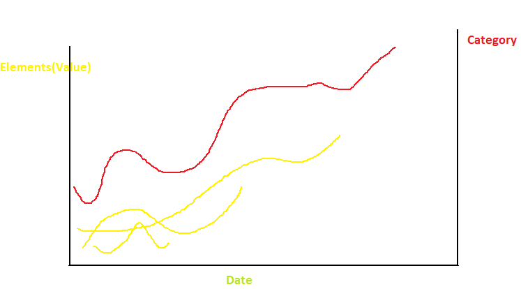
Motive is to see how category looks at an aggregated level along with how its elements are contributing. So above plot will be for "CAT1 and all its elements (here A and B)" and we will have same for "CAT2".
Thanks,
Harshad M.
Accepted Solutions

- Mark as New
- Bookmark
- Subscribe
- Mute
- RSS Feed
- Permalink
- Report Inappropriate Content
Something along these lines should work.
data t (index=(CD=(CAT DATE )));
input CAT $4. EL : $1. VAL : 2. DATE : monyy6.;
format DATE date.;
cards;
cat1 a 20 Jan-10
cat1 a 30 Feb-10
cat1 a 40 Mar-10
cat1 a 25 Apr-10
cat1 b 10 Jan-10
cat1 b 15 Feb-10
cat1 b 20 Mar-10
cat1 b 25 Apr-10
cat2 c 30 Jan-10
cat2 c 35 Feb-10
cat2 c 25 Mar-10
cat2 c 50 Apr-10
cat2 d 45 Jan-10
cat2 d 50 Feb-10
cat2 d 60 Mar-10
cat2 d 55 Apr-10
run;
data T2 (drop=SUM);
set T;
by CAT DATE;
SUM+VAL;
if LAST.DATE then do;
VALCAT=SUM;
SUM=.;
end;
run;
proc sort; by DATE;
proc gplot;
plot VAL*DATE=EL;
plot2 VALCAT*DATE=CAT;
run;
quit;
Sorry I can't test the code.
Use symbol statements to color the lines.

- Mark as New
- Bookmark
- Subscribe
- Mute
- RSS Feed
- Permalink
- Report Inappropriate Content
It always helps to include the SAS release number. It seems you want s SERIES plot of VALUE by DATE grouped by ELEMENT. However, you want the series colored by CATEGORY.
this is very easy with SAS 9.4M2, where in the SERIES plot you can set GROUPLC=CATEGORY. Now, each series is colored by CATEGORY.
With SAS 9.3, you can use the AttributeMap feature to get the same result. Define an attribute map data set and set the color for each series group value explicitly.
- Mark as New
- Bookmark
- Subscribe
- Mute
- RSS Feed
- Permalink
- Report Inappropriate Content
Is there any way we can do it using Proc gplot in version 9.3.
Because to plot category and its constituents in same graph we need source dataset to be aggregated at category level as well as the element level so as to be able to plot them on same graph may be
using plot1 plot2 statements. Also there should be only two (CAT1 and CAT2 ) output files.
Apart from color, how do we plot data in above manner using basic gplot.
Thanks,
Harshad M.
Message was edited by: Harshad Madhmshettiwar
- Mark as New
- Bookmark
- Subscribe
- Mute
- RSS Feed
- Permalink
- Report Inappropriate Content
Something along these lines should work.
data t (index=(CD=(CAT DATE )));
input CAT $4. EL : $1. VAL : 2. DATE : monyy6.;
format DATE date.;
cards;
cat1 a 20 Jan-10
cat1 a 30 Feb-10
cat1 a 40 Mar-10
cat1 a 25 Apr-10
cat1 b 10 Jan-10
cat1 b 15 Feb-10
cat1 b 20 Mar-10
cat1 b 25 Apr-10
cat2 c 30 Jan-10
cat2 c 35 Feb-10
cat2 c 25 Mar-10
cat2 c 50 Apr-10
cat2 d 45 Jan-10
cat2 d 50 Feb-10
cat2 d 60 Mar-10
cat2 d 55 Apr-10
run;
data T2 (drop=SUM);
set T;
by CAT DATE;
SUM+VAL;
if LAST.DATE then do;
VALCAT=SUM;
SUM=.;
end;
run;
proc sort; by DATE;
proc gplot;
plot VAL*DATE=EL;
plot2 VALCAT*DATE=CAT;
run;
quit;
Sorry I can't test the code.
Use symbol statements to color the lines.
- Mark as New
- Bookmark
- Subscribe
- Mute
- RSS Feed
- Permalink
- Report Inappropriate Content
Bang on...!!!
This is what I wanted.
This code generates only one graph containing both categories, so I made a change by adding a BY group (Cat).
What is the purpose of creating a composite index in first step?
Thanks.
Harshad M.
- Mark as New
- Bookmark
- Subscribe
- Mute
- RSS Feed
- Permalink
- Report Inappropriate Content
To use the BY statement is the data step.
We could also sort.

Don't miss out on SAS Innovate - Register now for the FREE Livestream!
Can't make it to Vegas? No problem! Watch our general sessions LIVE or on-demand starting April 17th. Hear from SAS execs, best-selling author Adam Grant, Hot Ones host Sean Evans, top tech journalist Kara Swisher, AI expert Cassie Kozyrkov, and the mind-blowing dance crew iLuminate! Plus, get access to over 20 breakout sessions.
Learn how use the CAT functions in SAS to join values from multiple variables into a single value.

Find more tutorials on the SAS Users YouTube channel.
 Click image to register for webinar
Classroom Training Available!
Select SAS Training centers are offering in-person courses. View upcoming courses for:
-
5 replies
-
03-01-2015 02:37 AM
-
1113 views
-
0 likes
-
3 in conversation
-
