- Home
- /
- Programming
- /
- Graphics
- /
- Re: How to add one second vaxis using sas?
- RSS Feed
- Mark Topic as New
- Mark Topic as Read
- Float this Topic for Current User
- Bookmark
- Subscribe
- Mute
- Printer Friendly Page
- Mark as New
- Bookmark
- Subscribe
- Mute
- RSS Feed
- Permalink
- Report Inappropriate Content
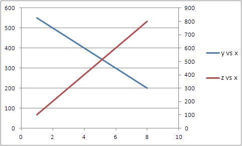
For example, I have one dataset as below. Because y and z have different dimensions, I have to use two vertical axis to represent y*x and z*x plots respectively. It is easy to do in excel (please see the attached figure), but how to do it using sas? Thanks!
data mydata;
input x y z;
datalines;
1 550 100
2 500 200
3 450 300
4 400 400
5 350 500
6 300 600
7 250 700
8 200 800
;
run;
symbol1 v=none INTERPOL=join c=blue width=5;
symbol2 v=none INTERPOL=join c=red width=5;
proc gplot data=mydata;
plot y*x
z*x/overlay;
run;
quit;

- Mark as New
- Bookmark
- Subscribe
- Mute
- RSS Feed
- Permalink
- Report Inappropriate Content
Change the proc to say:
proc gplot data=mydata;
plot y*x;
plot2 z*x;
run;
quit;
Don't miss out on SAS Innovate - Register now for the FREE Livestream!
Can't make it to Vegas? No problem! Watch our general sessions LIVE or on-demand starting April 17th. Hear from SAS execs, best-selling author Adam Grant, Hot Ones host Sean Evans, top tech journalist Kara Swisher, AI expert Cassie Kozyrkov, and the mind-blowing dance crew iLuminate! Plus, get access to over 20 breakout sessions.
Learn how use the CAT functions in SAS to join values from multiple variables into a single value.
Find more tutorials on the SAS Users YouTube channel.
 Click image to register for webinar
Classroom Training Available!
Select SAS Training centers are offering in-person courses. View upcoming courses for:


