- Home
- /
- Programming
- /
- Graphics
- /
- How do I plot a multilevel model with clustered participants?
- RSS Feed
- Mark Topic as New
- Mark Topic as Read
- Float this Topic for Current User
- Bookmark
- Subscribe
- Mute
- Printer Friendly Page
- Mark as New
- Bookmark
- Subscribe
- Mute
- RSS Feed
- Permalink
- Report Inappropriate Content
Hi, all. I'm fairly new to SAS (using version 9.4), as a colleague kindly showed me how to run some analyses I was requested to do on revisions for a manuscript that I was unable to do in SPSS / Mplus. I am seeing if there are any differences among 3 groups of users of different drugs (let's call them X, Y, and Z) on a measure of Attention. Each participant was seen once yearly for 4 years and therefore has 4 scores on attention. The data are in long-form with each time-point coded as "timept", and time was treated as a continuous variable. Predictors in the model include age, sex, and years of education. I included effects of time ("timept"), drug group ("grp"), and a time x group interaction in the model, and clustered participants by hospital to account for prescribing practices.
Is there a way to plot results of this analysis with each group (X, Y, and Z) on their separate lines, with time on the x-axis and attention scores on the y-axis? I've Googled around trying to figure this out, but have been having trouble finding code to adapt which has clustered participants as I have done - though perhaps I have not looked in the right place.
Any help or advice on how else to best present these findings would be much appreciated. The time x group interaction is significant - users of drug Y showed worse attention over time than users of drugs X and Z. Thanks!
Here is the code I have been using:
ods listing;
run;

libname data 'C:\Users\kateiverson\Downloads\';
run;

ods graphics on;

*Importing data;

proc import datafile="C:\Users\kateiverson\Downloads\11-25-16.csv"
     out=final
     dbms=csv
     replace;
run;

*Attention;

proc mixed data=final plots=all covtest noclprint cl nobound;
   class hospital subjectID grp(ref="3");
   model attention=age sex edu timept grp timept*grp / solution cl;
   random intercept timept / subject=hospital;
   random intercept timept / subject=subjectID(hospital);
run;
- Mark as New
- Bookmark
- Subscribe
- Mute
- RSS Feed
- Permalink
- Report Inappropriate Content
Can you post sample data and a mockup, even hand drawn, of what your plot should look like?
- Mark as New
- Bookmark
- Subscribe
- Mute
- RSS Feed
- Permalink
- Report Inappropriate Content
Hi Reeza,
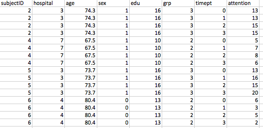
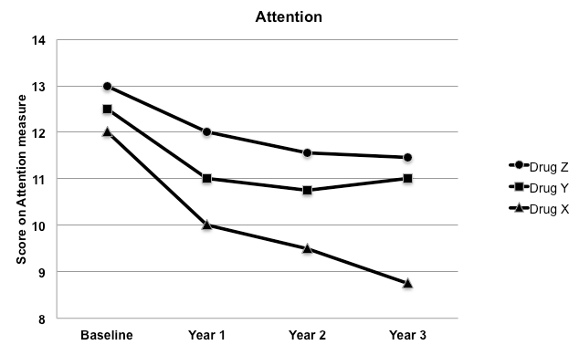
Yes, here is some sample data and the kind of plot I am looking for. Scores at timept=0 are scores at baseline.
I'd like the graph to reflect values on Attention after controlling for the covariates (age, sex, education). Of note, age does not change as I'm controlling for age as simply their age at the baseline visit.
Is this possible?
Thanks!
Kate
- Mark as New
- Bookmark
- Subscribe
- Mute
- RSS Feed
- Permalink
- Report Inappropriate Content
First, make sure ODS GRAPHICS are on and use the PLOTS=ALL option on the PROC MIXED statement. You might get lucky and see an insightful graph that is created automatically:
ods graphics on;
proc mixed plots=all ....;
...;
run;
Most likely you should look at the EFFECTPLOT statement. An introduction with examples is in the article "Use the EFFECTPLOT statement to visualize regression models in SAS."
- Mark as New
- Bookmark
- Subscribe
- Mute
- RSS Feed
- Permalink
- Report Inappropriate Content
Hi Rick,
Thanks for the response. Unfortunately, plots=all with PROC MIXED does not give the insightful graph I have been hoping for! EFFECTPLOT seems closer to what I want to achieve, but I am stuck after adapting some of the code, as I still haven’t accounted for clustering my participants by hospital in the plotting syntax (as I did in my analyses).
Here’s what I could come up with. I know it's wrong given that I haven’t even specified the dependent variable (attention) anywhere!
proc plm source=final;
   effectplot slicefit(x=timept sliceby=timept=0 1 2 3 plotby=grp);
run;
It did not work in SAS, as one would expect. Would be grateful for any further advice.
Thanks,
Kate
- Mark as New
- Bookmark
- Subscribe
- Mute
- RSS Feed
- Permalink
- Report Inappropriate Content
When you use the STORE statement in PROC MIXED, the file that is stored (called the "item store") contains all information about the model, including the dependent variable. Thus you do not need to re-specify that information in PRO PLM. (You did use the STORE statement, right?)
You say "It did not work in SAS, as one would expect," but that doesn't help us diagnose what happened. Was there an error? Was the graph not what you want?
From the information you've provided, I suggest that you reread the article on the EFFECTPLOT statement AND read the many links in that article, which provide additional information. If you post some sample data (in the form of an CSV or SAS DATA step; NOT as an image file), someone might be able to work with you.
Don't miss out on SAS Innovate - Register now for the FREE Livestream!
Can't make it to Vegas? No problem! Watch our general sessions LIVE or on-demand starting April 17th. Hear from SAS execs, best-selling author Adam Grant, Hot Ones host Sean Evans, top tech journalist Kara Swisher, AI expert Cassie Kozyrkov, and the mind-blowing dance crew iLuminate! Plus, get access to over 20 breakout sessions.
Learn how use the CAT functions in SAS to join values from multiple variables into a single value.
Find more tutorials on the SAS Users YouTube channel.
 Click image to register for webinar
Classroom Training Available!
Select SAS Training centers are offering in-person courses. View upcoming courses for:


