- Home
- /
- Programming
- /
- Graphics
- /
- Re: Histogram with different fill colors beyond a specified point
- RSS Feed
- Mark Topic as New
- Mark Topic as Read
- Float this Topic for Current User
- Bookmark
- Subscribe
- Mute
- Printer Friendly Page

- Mark as New
- Bookmark
- Subscribe
- Mute
- RSS Feed
- Permalink
- Report Inappropriate Content
Dear all,
Thought this might be doable via attribute maps, but can't quite seem to do it.
I am using SGPANEL to draw histograms of patient ages across four disease areas and what I would really like to be able to do is have the area/proportion of patients who are aged 75 or over have a different fill color such that it is very easy to see at a glance which disease area has the highest proportion of patients above the specified threshold. Any ideas?
many thanks, Chris

- Mark as New
- Bookmark
- Subscribe
- Mute
- RSS Feed
- Permalink
- Report Inappropriate Content
Hi.
I don't know how to do this using PRC SGPANEL, but below is a code using PROC TEMPLATE + PROC SGRENDER:
*say you want to differentiate children older than 12;
*I created two variables out of AGE: age_below and age_above;
DATA HAVE;
SET SASHELP.CLASS;
IF AGE <= 12 THEN AGE_BELOW = AGE;
ELSE AGE_ABOVE = AGE;
RUN;
*tell SAS to save my graph in this location;
ODS LISTING GPATH = "GivePath";
*give a name to my graph;
ODS GRAPHICS/RESET IMAGENAME = "SPLIT_HIST";
*write the template to create the histogram with two colors;
*the first few lines are telling SAS how wide and long I want to graph, then gives some graph space preferences;
*notice the two histogram statements (which I overlay), one for the below variable, one for the above variable;
PROC TEMPLATE;
DEFINE STATGRAPH Hist2Colors;
BEGINGRAPH / DESIGNWIDTH=1074 DESIGNHEIGHT=724;
LAYOUT LATTICE / ROWDATARANGE=DATA COLUMNDATARANGE=DATA ROWGUTTER=10 COLUMNGUTTER=10;
LAYOUT OVERLAY / XAXISOPTS=( LABEL=('AGE'));
HISTOGRAM AGE_ABOVE / NAME='HISTOGRAM' BINWIDTH=1.0 FILLATTRS=GRAPHDATA1 OUTLINEATTRS=GRAPHDATA1;
HISTOGRAM AGE_BELOW / NAME='HISTOGRAM2' BINAXIS=FALSE BINWIDTH=1.0;
ENDLAYOUT;
ENDLAYOUT;
ENDGRAPH;
END;
RUN;
*the sgrender procedure will render the template
PROC SGRENDER DATA=WORK.HAVE TEMPLATE=Hist2Colors;
RUN;
I hope it helps.
Best of luck!
Anca.

- Mark as New
- Bookmark
- Subscribe
- Mute
- RSS Feed
- Permalink
- Report Inappropriate Content
You can do this with SGPANEL too. If your data has a class variable for the four disease areas, and you divide the analysis column into two as suggested by Anca has done above,you can overlay the two histograms in each cell of the 4 panel graph.
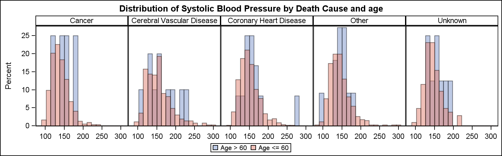
data heart;
label systolicGT60='Age > 60' systolicLE60='Age <= 60';
set sashelp.heart(keep=systolic ageatstart deathcause);
if ageatstart > 60 then systolicGT60=Systolic;
else systolicLE60=systolic;
run;
title 'Distribution of Systolic Blood Pressure by Death Cause and age';
proc sgpanel data=heart(where=(deathcause ne ''));
panelby deathcause / layout=columnlattice columns=5 onepanel novarname;
histogram systolicGT60 / transparency=0.5;
histogram systolicLE60 / transparency=0.5;
run;
title;
- Mark as New
- Bookmark
- Subscribe
- Mute
- RSS Feed
- Permalink
- Report Inappropriate Content
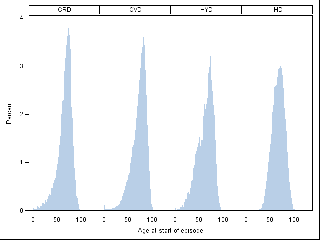
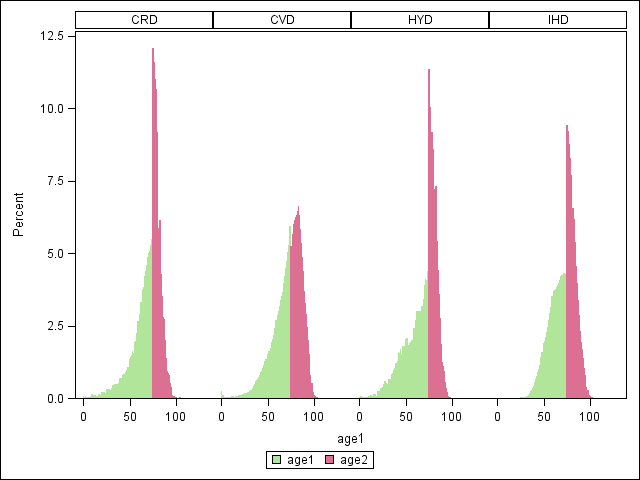
Many thanks for taking the time to answer Anca and Sanjay, it is much appreciated (and forgive the late reply ... was away on holiday last week). My eyes have been opened to PROC TEMPLATE and SGRENDER so I am well on the way to learning some new tools. However, your answers don't quite solve my original problem. This is my fault for not being specific enough in my original question, but these solutions overlay two histograms (per disease) split on age. What I really want is one histogram (per disease) with different shading beyond a certain point. I cannot treat them as two different histograms because the percentage values get messed up.
The first image shows the correct histogram, but I would like the area to the right of 75 in each graph to be red and the second image shows the problem with the histograms themselves if I adopt the solutions above.
- Mark as New
- Bookmark
- Subscribe
- Mute
- RSS Feed
- Permalink
- Report Inappropriate Content
Hi.
AS soon as I posted my answer, I realized ...ehh, that's not a solution.
Well, here is something soooo tedious, but does what you want:
(this is going back to good ol' style: annotate!)
*--create an annotate dataset, that will force to color bins based on VERY specific values;
data boxColor;
length function style color $ 8 ;
xsys="3"; ysys="3";when = "a";
set sashelp.class;
%bar(32.7,7.89,42.5,88.2,red,1,solid);
%move(32.7,7.9);
%draw(32.7,88.2,black,1,.5);
%move(32.7,88.2);
%draw(42.5,88.2,black,1,.5);
%move(42.5,7.9);
%draw(42.5,88.2,blue,1,.5);
%bar(42.5,7.9,61.5,48,red,1,solid);
%move(42.5,7.9);
%draw(42.5,48,black,1,.5);
%move(42.5,48);
%draw(61.5,48,black,1,.5);
%bar(61.5,7.9,80.5,48,red,1,solid);
%move(61.5,7.9);
%draw(61.5,48,black,1,.5);
%move(61.5,48);
%draw(80.5,48,black,1,.5);
%bar(80.5,7.9,98.5,18,red,1,solid);
%move(80.5,7.9);
%draw(80.5,18,black,1,.5);
%move(80.5,18);
%draw(98.5,18,black,1,.5);
run;
%annomac;
ods graphics off;
proc univariate data = sashelp.class anno = boxColor;
var age;histogram age;
run;
Now let me know if you have questions.
Hopefully will find a more elegant solution ![]()
Anca.
- Mark as New
- Bookmark
- Subscribe
- Mute
- RSS Feed
- Permalink
- Report Inappropriate Content
Here is one way, but needs a little bit of GTL. The idea is to run a SGPLOT histogram, and get the binned data. Then use GTL to overlay two HistogramParm statements, each with part of the data and different colors.
But you cannot get the transition bin to have partial colors. I have seen that done too,by using a band plot to really draw the color bands, and then overlay it with an unfilled histogram having same bins..
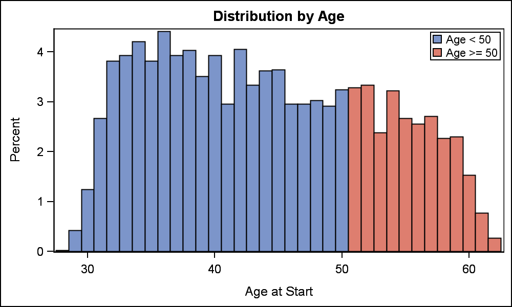
ods html close;
ods listing image_dpi=200;
ods output sgplot=sgplotData;
ods graphics / reset width=5in height=3in imagename='Hist';
proc sgplot data=sashelp.heart;
histogram ageatstart / nbins=50;
run;
data HistBins;
set sgplotData(rename=(bin_ageatstart_nbins_50___x=x bin_ageatstart_nbins_50___y=y));
if x and y;
run;
proc template;
define statgraph HistBins;
begingraph;
entrytitle 'Distribution by Age';
layout overlay / xaxisopts=(label='Age at Start');
histogramparm x=eval(ifn(x<=50, x, .)) y=y / fillattrs=graphdata1 binaxis=false name='a' legendlabel='Age < 50';
histogramparm x=eval(ifn(x>50, x, .)) y=y / fillattrs=graphdata2 binaxis=false name='b' legendlabel='Age >= 50';
discretelegend 'a' 'b' / location=inside across=1 autoalign=(topright);
endlayout;
endgraph;
end;
run;
ods graphics / reset width=5in height=3in imagename='TwoColorHist';
proc sgrender data=HistBins template=HistBins;
run;

Don't miss out on SAS Innovate - Register now for the FREE Livestream!
Can't make it to Vegas? No problem! Watch our general sessions LIVE or on-demand starting April 17th. Hear from SAS execs, best-selling author Adam Grant, Hot Ones host Sean Evans, top tech journalist Kara Swisher, AI expert Cassie Kozyrkov, and the mind-blowing dance crew iLuminate! Plus, get access to over 20 breakout sessions.
Learn how use the CAT functions in SAS to join values from multiple variables into a single value.

Find more tutorials on the SAS Users YouTube channel.
 Click image to register for webinar
Classroom Training Available!
Select SAS Training centers are offering in-person courses. View upcoming courses for:
-
5 replies
-
10-24-2014 07:35 AM
-
6270 views
-
2 likes
-
3 in conversation
-
