- Home
- /
- Programming
- /
- Graphics
- /
- Graphs
- RSS Feed
- Mark Topic as New
- Mark Topic as Read
- Float this Topic for Current User
- Bookmark
- Subscribe
- Mute
- Printer Friendly Page
- Mark as New
- Bookmark
- Subscribe
- Mute
- RSS Feed
- Permalink
- Report Inappropriate Content
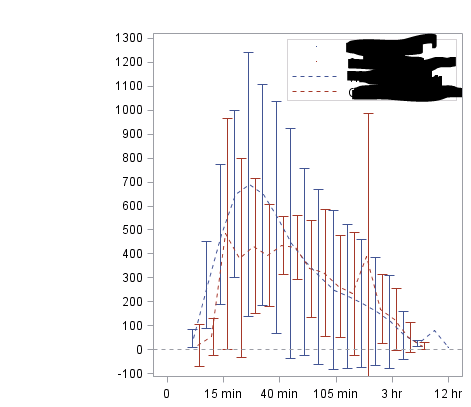
I need your helps.
- for X axis i want pu max+100 and min-100 ranges, coz data changes every time and need to give automatically ranges.
- one line solid and second line shortdash (groupdisplay=cluster clusterwidth=0.5 lineattrs=(pattern=shortdash);
- need to drop labels for point and keep only for dashs.
Photo attached Thanks a lot
proc sgplot data=final sganno=final pad=(bottom=14%);
	format dose dose. tmt box.;
	scatter x=dose y=mean / yerrorupper=UCLM yerrorlower=LCLM group=tmt
		groupdisplay=cluster clusterwidth=1
		markerattrs=(size=1 symbol=none);
	series x=dose y=mean / group=tmt groupdisplay=cluster
		clusterwidth=0.5 lineattrs=(pattern=shortdash);
	refline 26 / axis=x;
	refline 0 / axis=y lineattrs=(pattern=shortdash);
	xaxis type=linear values=(0 1 2 4 8 12 16 20 24 28) max=29
		valueshint display=(nolabel);
	yaxis label="Plasma &var2 Concentration (ng/mL)" values=(-100 to 1300 by 50);
	xaxis label="Time" values =(0 to 20 by 1);
	keylegend/ location=inside position=topright;
run;
Vahe
Accepted Solutions
- Mark as New
- Bookmark
- Subscribe
- Mute
- RSS Feed
- Permalink
- Report Inappropriate Content
Look through this blog:
https://blogs.sas.com/content/graphicallyspeaking/
There are thousands of examples for all types of graphs and all options. As you have not provided any code its pretty hard to answer. The labels is simple (assuming your using proc sgplot/gtl, just label the point plot one name and don't use it in the legend statement). The other two, range, get max from data, add 100, then block it up as you need the axis, and pass that as a dynamic variable. The other about lines sound to me like your style needs updating.
All these can be found as examples in the website given.
- Mark as New
- Bookmark
- Subscribe
- Mute
- RSS Feed
- Permalink
- Report Inappropriate Content
Vahe
Don't miss out on SAS Innovate - Register now for the FREE Livestream!
Can't make it to Vegas? No problem! Watch our general sessions LIVE or on-demand starting April 17th. Hear from SAS execs, best-selling author Adam Grant, Hot Ones host Sean Evans, top tech journalist Kara Swisher, AI expert Cassie Kozyrkov, and the mind-blowing dance crew iLuminate! Plus, get access to over 20 breakout sessions.
Learn how use the CAT functions in SAS to join values from multiple variables into a single value.
Find more tutorials on the SAS Users YouTube channel.
 Click image to register for webinar
Classroom Training Available!
Select SAS Training centers are offering in-person courses. View upcoming courses for:


