- Home
- /
- Programming
- /
- Graphics
- /
- Re: Geographic Density Heat Map
- RSS Feed
- Mark Topic as New
- Mark Topic as Read
- Float this Topic for Current User
- Bookmark
- Subscribe
- Mute
- Printer Friendly Page
- Mark as New
- Bookmark
- Subscribe
- Mute
- RSS Feed
- Permalink
- Report Inappropriate Content
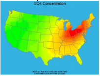
Is it possible to make a map like the one below in SAS? I can't find any examples of such a map online nor any SUGI proceedings on it.

Looks like it'd be a contour plot by coordinates overlaid on a projected map. But how do you go about doing that? Is it possible?
Any help would be greatly appreciated.
Accepted Solutions
- Mark as New
- Bookmark
- Subscribe
- Mute
- RSS Feed
- Permalink
- Report Inappropriate Content
See the paper and references in
Massengill and Kolovos (2012) "Together at last: Spatial analysis and SAS mapping"
- Mark as New
- Bookmark
- Subscribe
- Mute
- RSS Feed
- Permalink
- Report Inappropriate Content
Here's a link with one form. though the data is precipitation the principal could be the same: http://robslink.com/SAS/democd82/precipitation_map_10inches_info.htm
And here's one using smaller regular filled circles to simulate a larger area
http://robslink.com/SAS/democd75/solar_potential_map_info.htm
Explore Robslink.com for many examples of graphs and maps.
- Mark as New
- Bookmark
- Subscribe
- Mute
- RSS Feed
- Permalink
- Report Inappropriate Content
See the paper and references in
Massengill and Kolovos (2012) "Together at last: Spatial analysis and SAS mapping"
- Mark as New
- Bookmark
- Subscribe
- Mute
- RSS Feed
- Permalink
- Report Inappropriate Content
- Mark as New
- Bookmark
- Subscribe
- Mute
- RSS Feed
- Permalink
- Report Inappropriate Content
Basically, there are 2 ways to do it and neither are easy without the proper data.
First, there is making the heat map with annotate. You have to draw the heat map in the correct locations. The examples that Ballardw and Rick suggested are using annotate.
Second, there is a counties map. If you have the data per county, you can do something like this weather map:
- Mark as New
- Bookmark
- Subscribe
- Mute
- RSS Feed
- Permalink
- Report Inappropriate Content
- Mark as New
- Bookmark
- Subscribe
- Mute
- RSS Feed
- Permalink
- Report Inappropriate Content
You don't mention what the heat map is actually intended to display. Please note that in those "big counties out west", since I work with such data, that many interpolations across those areas can be extremely misleading. In some cases related to characteristics of people because there are no people resident in the area and for phyiscal characteristics such as weather phenomena that elevation often has a large influence on results.
Don't miss out on SAS Innovate - Register now for the FREE Livestream!
Can't make it to Vegas? No problem! Watch our general sessions LIVE or on-demand starting April 17th. Hear from SAS execs, best-selling author Adam Grant, Hot Ones host Sean Evans, top tech journalist Kara Swisher, AI expert Cassie Kozyrkov, and the mind-blowing dance crew iLuminate! Plus, get access to over 20 breakout sessions.
Learn how use the CAT functions in SAS to join values from multiple variables into a single value.
Find more tutorials on the SAS Users YouTube channel.
 Click image to register for webinar
Classroom Training Available!
Select SAS Training centers are offering in-person courses. View upcoming courses for:


