- Home
- /
- Programming
- /
- Graphics
- /
- GTL Questions
- RSS Feed
- Mark Topic as New
- Mark Topic as Read
- Float this Topic for Current User
- Bookmark
- Subscribe
- Mute
- Printer Friendly Page
- Mark as New
- Bookmark
- Subscribe
- Mute
- RSS Feed
- Permalink
- Report Inappropriate Content
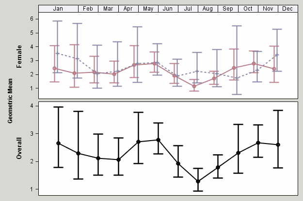
- I am trying to create a lattice layout with two rows and a header at the top for the months but the months don’t seem to be spacing evenly. January is too large so the rest of the months don’t line up with the data (see photo I attached)
- I am also having a hard time labeling the axes to the left. I would like the axis for the top row to say “By Sex” and the bottom to say “Combined.” It Currently says "Female" and "overall"
- Finally, I want both axes to go from 0 to 6 and have the same labels but the bottom one keeps staying at 1-4. I have attached my code.
ods graphics on;
ods path(prepend) work.templat(update);
data bpa2;
set WORK.bpa1;
if xc=1 then month='Jan';
else if xc=2 then month='Feb';
else if xc=3 then month='Mar';
else if xc=4 then month='Apr';
else if xc=5 then month='May';
else if xc=6 then month='Jun';
else if xc=7 then month='Jul';
else if xc=8 then month='Aug';
else if xc=9 then month='Sep';
else if xc=10 then month='Oct';
else if xc=11 then month='Nov';
else if xc=12 then month='Dec';
run;
Proc template;
Define statgraph combined;
Begingraph / designwidth=640px designheight=480px backgroundcolor=cxd5d9d2;
Layout lattice / columndatarange=unionall Columns=1 Rowgutter=5px Rowweights=(.50 .50);
columnaxes;
columnaxis / display=none type=linear offsetmin=0 offsetmax=0
linearopts=( thresholdmin=0.5 thresholdmax=0.5 viewmax=13);
endcolumnaxes;
/*Row 1-Geometric means by sex*/
/*Use sidebar rather than rowheaders so it will span both rows on the left*/
Sidebar/align=left;
layout gridded / border=false;
Entry 'Geometric Mean ' / rotate=90
textattrs=(weight=bold) ;
endlayout;
endsidebar;
/*Scatterplots*/
layout overlay / cycleattrs=true yaxisopts=(griddisplay=off)
xaxisopts=(offsetmin=0.05 offsetmax=0.05 display=(line ticks)
linearopts=(viewmin=0 viewmax=6 tickvaluesequence=(start=0 end=11 increment=1)));
/*Display month names*/
Innermargin /align=top;
Blockplot x=xc block=month / display=(fill outline values)
Valuehalign=center valuevalign=center filltype=alternate
fillattrs=graphaltblock altfillattrs=graphaltblock;
Endinnermargin;
scatterplot x=eval(xc-0.20) y=Female / yerrorlower=f_lcl yerrorupper=f_ucl name='By Sex'
markerattrs=graphdata1(color=CXBA7C87 size=9px weight=bold)
errorbarattrs=graphdata1( color=CXBA7C87 pattern=solid thickness=2);
scatterplot x=eval(xc-0.05) y=Male / yerrorlower=m_lcl yerrorupper=m_ucl /*name='Male' */
markerattrs=graphdata2(color=CX8585A6 size=9px weight=bold)
errorbarattrs=graphdata2(color=CX8585A6 pattern=solid thickness=2);
seriesplot x=eval(xc-0.20) y=Female / lineattrs=graphdata1(color=CXBA7C87 pattern=solid thickness=2px) /*name='Female'*/;
seriesplot x=eval(xc-0.05) y=Male / lineattrs=graphdata2(color=CX8585A6 pattern=shortdash thickness=2px) /*name='Male'*/;
endlayout;
/*row two-overall*/
layout overlay / cycleattrs=true yaxisopts=(label='Overall' griddisplay=off)
xaxisopts=(offsetmin=0.05 offsetmax=0.05 display=(line ticks tickvalues)
linearopts=(viewmin=0 viewmax=6 tickvaluesequence=(start=0 end=12 increment=1)
));
scatterplot x=eval(xc) y=overall / yerrorlower=lcl yerrorupper=ucl
markerattrs=graphdata1(color=black size=9px weight=bold)
errorbarattrs=graphdata1( color=black pattern=solid thickness=2);
seriesplot x=eval(xc) y=overall / lineattrs=graphdata1(color=black pattern=solid thickness=2px) name='Overall';
endlayout;
endlayout;
endgraph;
end;
run;

- Mark as New
- Bookmark
- Subscribe
- Mute
- RSS Feed
- Permalink
- Report Inappropriate Content
Have tried explicitly setting the length of Month to 3?
length month $ 3;
if xc=1 then month='Jan';
etc.
Try assigning a label for the y variables in the SGRender to change the axis label.
and possibly a Rowdatarange=UnionAll as an option for the Layout Lattice statement to get the same axis values
- Mark as New
- Bookmark
- Subscribe
- Mute
- RSS Feed
- Permalink
- Report Inappropriate Content
Thanks. The rowdatarange=unionall suggestion worked perfectly.
Setting the length of month did not work. I think it has something to do with the thresholdmin and thresholdmax but I can't get them all to line up. Any suggestions there?
- Mark as New
- Bookmark
- Subscribe
- Mute
- RSS Feed
- Permalink
- Report Inappropriate Content
In general, if you want things to line up, you must use the same axis variables or at least variables with similar values. You are using XC and eval(Xc-0.2). Not sure what effect this has. You are using overlay of two columns with offsets. It may be easier to use ClusterGroups for the scatter and series (SAS 9.3). Also, you have Offsetmin of 5% which will add to the apparent length of January.
If you attach the full working program with data, it may be easier to diagnose.
Don't miss out on SAS Innovate - Register now for the FREE Livestream!
Can't make it to Vegas? No problem! Watch our general sessions LIVE or on-demand starting April 17th. Hear from SAS execs, best-selling author Adam Grant, Hot Ones host Sean Evans, top tech journalist Kara Swisher, AI expert Cassie Kozyrkov, and the mind-blowing dance crew iLuminate! Plus, get access to over 20 breakout sessions.
Learn how use the CAT functions in SAS to join values from multiple variables into a single value.
Find more tutorials on the SAS Users YouTube channel.
 Click image to register for webinar
Classroom Training Available!
Select SAS Training centers are offering in-person courses. View upcoming courses for:


