- Home
- /
- Programming
- /
- Graphics
- /
- Re: GPlot y axis labeling
- RSS Feed
- Mark Topic as New
- Mark Topic as Read
- Float this Topic for Current User
- Bookmark
- Subscribe
- Mute
- Printer Friendly Page

- Mark as New
- Bookmark
- Subscribe
- Mute
- RSS Feed
- Permalink
- Report Inappropriate Content
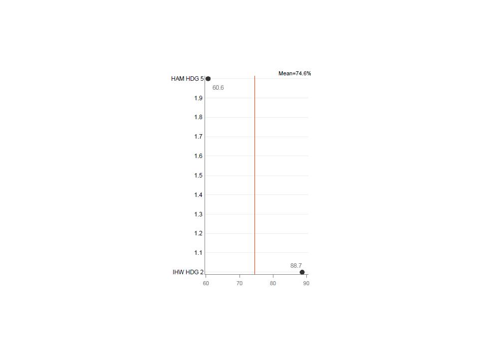
I'm producing the graph below with this (pared down) code:
axis1 minor=none label=none;
axis2 minr-none major=none label=none;
proc gplot;
format n2 lbl.;
plot n2*col1/haxis=axis1
vaxis=axis2
href=74.6;
run;
When there are more than 2 values on the y axis, only the formatted values appear. With 2 values (e.g. 1 and 2), the values in between also appear as shown. How do I stop the 1.1 to 1.9 values from showing up on the y axis?
Thanks,
Bill
Accepted Solutions

- Mark as New
- Bookmark
- Subscribe
- Mute
- RSS Feed
- Permalink
- Report Inappropriate Content
Sorry I misunderstood your problem.
proc gplot data=have;
format n2 lbl.;
plot n2*col1/haxis=60 to 90 by 10
vaxis=1 to 2 by 1
href=74.6;
run;
- Mark as New
- Bookmark
- Subscribe
- Mute
- RSS Feed
- Permalink
- Report Inappropriate Content
Use a where statement.
proc gplot;
where n2=1 or n2=2;
format n2 lbl.;
plot n2*col1/haxis=axis1
vaxis=axis2
href=74.6;
run;
- Mark as New
- Bookmark
- Subscribe
- Mute
- RSS Feed
- Permalink
- Report Inappropriate Content
Sorry I misunderstood your problem.
proc gplot data=have;
format n2 lbl.;
plot n2*col1/haxis=60 to 90 by 10
vaxis=1 to 2 by 1
href=74.6;
run;

- Mark as New
- Bookmark
- Subscribe
- Mute
- RSS Feed
- Permalink
- Report Inappropriate Content
You might want to try PROC SGPLOT to handle this situation. There is an option on SGPLOT's axis statements called INTEGER that should do exactly what you want. Your code above would look something like the following with SGPLOT:
proc sgplot data=sample;
format n2 lbl.;
yaxis display=(noticks nolabel) integer;
xaxis display=(nolabel);
scatter y=n2 x=col1;
refline 74.6 / axis=x;
run;
You need at least SAS 9.2 to run this.
Hope this helps!
Dan

- Mark as New
- Bookmark
- Subscribe
- Mute
- RSS Feed
- Permalink
- Report Inappropriate Content
axis2 minr-none major=none label=none;
Should read:
axis2 minor=none major=none label=none;

- Mark as New
- Bookmark
- Subscribe
- Mute
- RSS Feed
- Permalink
- Report Inappropriate Content
Pronabesh's 2nd solution is correct.
Or, you might want to use a separate axis statement, to allow a little more flexibility, such as ...
axis1 order=(1 to 2 by 1);
axis2 order=(60 to 90 by 10);
proc gplot data=have;
format n2 lbl.;
plot n2*col1 / haxis=axis2 vaxis=axis1 href=74.6;
run;
Details:
The reason you're seeing the extra values along the vertical axis is that gplot just sees it as a numeric axis, and therefore picks a good numeric range to encompass the min-to-max numeric values, and adds some major tickmarks between the min & max for good measure (the default is to always have several tickmarks along the numeric axis). When you specify the axis order "by 1", then only the integer major tickmarks are used (no 1.1, 1.2, 1.3, etc).
- Mark as New
- Bookmark
- Subscribe
- Mute
- RSS Feed
- Permalink
- Report Inappropriate Content
Thank you Pronabesh and Robert. Your responses are indeed correct. I was hoping for something a little more generic so that I could avoid some macro programming - this situation uses a by statement within gplot where the y axis levels vary in number (2 to N). I'll have to write some code to create a &max in place of "2" in the example.

Don't miss out on SAS Innovate - Register now for the FREE Livestream!
Can't make it to Vegas? No problem! Watch our general sessions LIVE or on-demand starting April 17th. Hear from SAS execs, best-selling author Adam Grant, Hot Ones host Sean Evans, top tech journalist Kara Swisher, AI expert Cassie Kozyrkov, and the mind-blowing dance crew iLuminate! Plus, get access to over 20 breakout sessions.
Learn how use the CAT functions in SAS to join values from multiple variables into a single value.

Find more tutorials on the SAS Users YouTube channel.
 Click image to register for webinar
Classroom Training Available!
Select SAS Training centers are offering in-person courses. View upcoming courses for:
-
6 replies
-
12-06-2013 03:55 PM
-
2499 views
-
6 likes
-
5 in conversation
-
