- Home
- /
- Programming
- /
- Graphics
- /
- Re: Fun w/SAS ODS Graphics: Ch-ch-ch-ch-Changes - Vector plots of YOY ...
- RSS Feed
- Mark Topic as New
- Mark Topic as Read
- Float this Topic for Current User
- Bookmark
- Subscribe
- Mute
- Printer Friendly Page
- Mark as New
- Bookmark
- Subscribe
- Mute
- RSS Feed
- Permalink
- Report Inappropriate Content
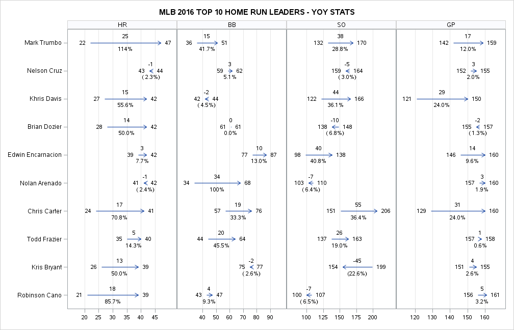
SAS OUTPUT (VIEW LARGER IMAGE)
Was recently looking for ideas on how to display Ch-ch-ch-ch-Changes, so I reread Stephen Few's excellent Displaying Change Between Two Points in Time. Drawing inspiration from the Range Bar Graph and side-by-side combinations of graphs described therein, here's my chock-full-o'numbers SAS ODS Graphics vector plot look at selected year-over-year stats for Major League Baseball's Top 10 home run leaders of 2016.
SAS CODE
*-> Fun w/SAS ODS Graphics: Vector plots of YOY stats for MLB 2016 Top 10 home run leaders;
                                                   /* Data from espn.com (1 row per player/year */
proc import datafile='/folders/myfolders/2016MlbHrLeaders.xlsx' dbms=xlsx out=MlbHrLeaders2016 replace;
                                                   /* Transform to 1 row per player/stat */
proc transpose data=MlbHrLeaders2016 out=hrleaders prefix=X name=STAT;
by player notsorted; id year; var hr bb so gp;

data hrleaders;                                    /* Add some calculated fields for plotting */
set hrleaders;
playernum=floor((_n_-1)/4)+1;                      /* 4 rows per player (1 for each stat) */
xlo=min(of x2015 x2016);                           /* Label for left side of vector */
xlotext=put(xlo,3.)||'   ';                        /* Add some padding */
xhi=max(of x2015 x2016);                           /* Label for right side of vector */
xhitext='   '||compress(put(xhi,3.));              /* Add some padding */
chg=x2016-x2015;                                   /* YOY change */
pctchg=(x2016-x2015)/x2015;                        /* YOY % change */
xmid=(xlo+xhi)/2;                                  /* X coordinate for YOY change measures */
ymid1=playernum+.1;                                /* Y coordinate for YOY change (padding) */
ymid2=playernum-.1;                                /* Y coordinate for YOY percent change (padding) */

proc sql;                                          /* Create format to print player name instead of # */
create table pfmt as select distinct 'pfmt' as fmtname, playernum as start, player as label from hrleaders;
proc format cntlin=pfmt;

ods graphics /reset height=6.75in width=10.5in;    /* Time to plot! */
proc sgpanel data=hrleaders noautolegend;          /* Panel by stat - homers, walks, strikeouts, games played */
panelby stat / onepanel rows=1 uniscale=row sort=data novarname headerattrs=(size=8pt);
title height=10pt "MLB 2016 TOP 10 HOME RUN LEADERS - YOY STATS";
vector x=x2016 y=playernum / xorigin=x2015 yorigin=playernum;                 /* Plot prior/current year stats */
text x=xlo y=playernum text=xlotext / position=left textattrs=(size=7.5pt);
text x=xhi y=playernum text=xhitext / position=right textattrs=(size=7.5pt);
text x=xmid y=ymid2 text=chg / position=top strip textattrs=(size=7pt);       /* Plot YOY change */
text x=xmid y=ymid1 text=pctchg / position=bottom strip textattrs=(size=7pt); /* Plot YOY % change */
colaxis display=(nolabel) grid valueattrs=(size=7pt);
rowaxis display=(nolabel) values=(1 to 10 by 1) valueattrs=(size=8pt) offsetmin=.05 offsetmax=.05 reverse;
format playernum pfmt. chg 4. pctchg percent7.1 xlotext $char6.;
run;
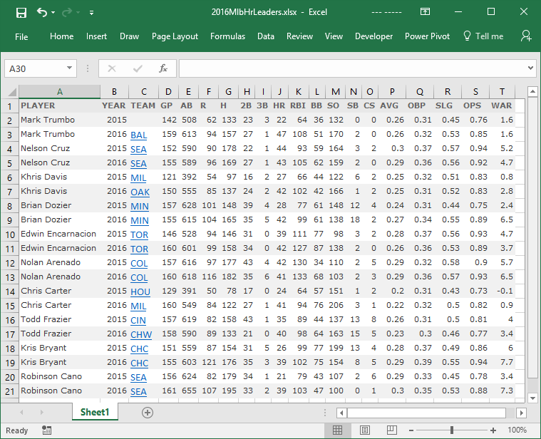
SCREENSHOT OF INPUT DATA (CUT-AND-PASTED FROM ESPN.COM)
- Mark as New
- Bookmark
- Subscribe
- Mute
- RSS Feed
- Permalink
- Report Inappropriate Content
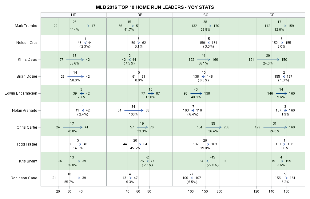
Very interesting. I would suggest horizontal color bands on rowaxis to help differentiate the rows of data.
- Mark as New
- Bookmark
- Subscribe
- Mute
- RSS Feed
- Permalink
- Report Inappropriate Content
SAS OUTPUT (VIEW LARGER IMAGE)
Thanks, that does make a difference! Seems I can't use the nifty COLORBANDS= COLAXIS option here since my y-axis isn't DISCRETE, but a quick Google search turned up a SAS 9.3 tip from an old paper of yours that did the trick.
refline 1 3 5 7 9 / axis=y transparency=.85 lineattrs=(thickness=40pt color=green);
Don't miss out on SAS Innovate - Register now for the FREE Livestream!
Can't make it to Vegas? No problem! Watch our general sessions LIVE or on-demand starting April 17th. Hear from SAS execs, best-selling author Adam Grant, Hot Ones host Sean Evans, top tech journalist Kara Swisher, AI expert Cassie Kozyrkov, and the mind-blowing dance crew iLuminate! Plus, get access to over 20 breakout sessions.
Learn how use the CAT functions in SAS to join values from multiple variables into a single value.
Find more tutorials on the SAS Users YouTube channel.
 Click image to register for webinar
Classroom Training Available!
Select SAS Training centers are offering in-person courses. View upcoming courses for:


