- Home
- /
- Programming
- /
- Graphics
- /
- Differences in SGPLOT output: in SAS studio or downloaded PDF versus d...
- RSS Feed
- Mark Topic as New
- Mark Topic as Read
- Float this Topic for Current User
- Bookmark
- Subscribe
- Mute
- Printer Friendly Page
- Mark as New
- Bookmark
- Subscribe
- Mute
- RSS Feed
- Permalink
- Report Inappropriate Content
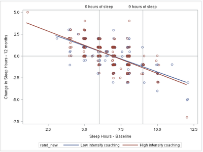
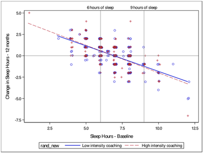
I do not have a lot of experience creating figures in SAS, but I am hoping to create a scatterplot with the font type I am seeing in both the SAS Studio output and downloaded PDF (i.e., Arial font). But most of the attributes I want are in the downloaded RTF version (i.e., different style/color markers between groups, different style/color regression lines between groups). Here is my SAS program:
proc template;
define style styles.arial;
parent=styles.listing; /* Or your favorite style */

style graphfonts from graphfonts /
      'GraphDataFont' = ("Arial")
      'GraphUnicodeFont' = ("Arial")
      'GraphValueFont' = ("Arial")
      'GraphLabel2Font' = ("Arial")
      'GraphLabelFont' = ("Arial")
      'GraphFootnoteFont' = ("Arial")
      'GraphTitleFont' = ("Arial")
      'GraphTitle1Font' = ("Arial")
      'GraphAnnoFont' = ("Arial")   ;
end;
run;

ods listing style=arial;

proc sgplot data = sleep_amt ;
xaxis label = "Sleep Hours - Baseline";
yaxis label = "Change in Sleep Hours - 12 months";
reg x = sleep_amt_0 y = sleep_change / group = rand_new jitter  ;
where event =0;
refline   0;
refline 6 / AXIS= X LABEL = "6 hours of sleep" LABELLOC= outside;
refline 9 / AXIS= X  LABEL = "9 hours of sleep" LABELLOC= outside;
run;
Here is the output in the SAS Studio output and downloaded PDF:
Here is the output in the downloaded PDF:
I also hope to display alternative text instead of the variable name, rand_new.
Please pardon me if this is not actually a SAS Studio-/University-specific issue.
- Mark as New
- Bookmark
- Subscribe
- Mute
- RSS Feed
- Permalink
- Report Inappropriate Content
The easiest way for you to achieve what you want is to use the ATTRPRIORITY=NONE option on the ODS GRAPHICS statement. Just add that statement before generating any of your graphic output to defeat the COLOR prioirty in the default styles used by those destinations. That setting will be active until you change it, or you reset your graphics options.
Hope this helps!
Dan
ods graphics / attrpriority=none;
proc sgplot data = sleep_amt ;
xaxis label = "Sleep Hours - Baseline";
yaxis label = "Change in Sleep Hours - 12 months";
reg x = sleep_amt_0 y = sleep_change / group = rand_new jitter  ;
where event =0;
refline   0;
refline 6 / AXIS= X LABEL = "6 hours of sleep" LABELLOC= outside;
refline 9 / AXIS= X  LABEL = "9 hours of sleep" LABELLOC= outside;
run;
- Mark as New
- Bookmark
- Subscribe
- Mute
- RSS Feed
- Permalink
- Report Inappropriate Content
You can change the legend title by two ways:
1 Add a LABEL to your variable "rand_new".
2. Use the TITLE option in the KEYLEGEND statement.
Since your legend is automatically generated, you can add a KEYLEGEND statement as follows:
KEYLEGEND / title="title";
Don't miss out on SAS Innovate - Register now for the FREE Livestream!
Can't make it to Vegas? No problem! Watch our general sessions LIVE or on-demand starting April 17th. Hear from SAS execs, best-selling author Adam Grant, Hot Ones host Sean Evans, top tech journalist Kara Swisher, AI expert Cassie Kozyrkov, and the mind-blowing dance crew iLuminate! Plus, get access to over 20 breakout sessions.
Learn how use the CAT functions in SAS to join values from multiple variables into a single value.
Find more tutorials on the SAS Users YouTube channel.
 Click image to register for webinar
Classroom Training Available!
Select SAS Training centers are offering in-person courses. View upcoming courses for:


