- Home
- /
- Programming
- /
- Graphics
- /
- Customize x-axis (DateTime) to see both plots clearly - Line series pl...
- RSS Feed
- Mark Topic as New
- Mark Topic as Read
- Float this Topic for Current User
- Bookmark
- Subscribe
- Mute
- Printer Friendly Page
- Mark as New
- Bookmark
- Subscribe
- Mute
- RSS Feed
- Permalink
- Report Inappropriate Content
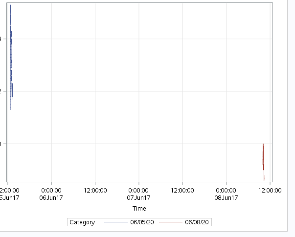
SAS 9.4 - I have a data table that I am trying to visualize. The x-axis is a DateTime field. The table contains aggregate data with two sets from different dates. When I attempt to plot the series using a category variable, the two series are spread far apart, they appear too zoomed out.
The dates of the sets are three days apart, and I can see on the x-axis there is a tick for every 12 hours, but the values for the y-axis are per second. Meaning each second there is a y value but only for about a 20 minute stretch.
As you can see in the screenshot the plots are so small you can't really see them.
How can I fix this so that you can see both series up close and not so small and spread apart? Please know that I can provide more information if needed.
-Thanks!

- Mark as New
- Bookmark
- Subscribe
- Mute
- RSS Feed
- Permalink
- Report Inappropriate Content
Usually you use a broken Y axis, but in this case maybe a broken X axis?
http://blogs.sas.com/content/graphicallyspeaking/2015/09/02/broken-axis-redux/
- Mark as New
- Bookmark
- Subscribe
- Mute
- RSS Feed
- Permalink
- Report Inappropriate Content
When x values don't overlap any graph will have a similar behavior. this is aggrevated a bit by the relatively large numeric values involved with datetime values and the SAS default axis generator
Are you attempting to compare time of day behavior on different days? If so I suggest modifying your data to have a time variable: TV= timepart(datetimevariablename) in a data step and plot that with your category variable as a group. Or some sort of scale shift.
Another option might be to use a sgpanel, panel by the category variable, columns=1 and use uniscale=Row to allow the x axis values to display differently in each panel.
Your comparing to two datetimes with a gap of a couple days is similar to the behavior you would get if you plotted data from a few dates a coupls centuries apart. So some sort of rescaling is like needed to make a useable
Don't miss out on SAS Innovate - Register now for the FREE Livestream!
Can't make it to Vegas? No problem! Watch our general sessions LIVE or on-demand starting April 17th. Hear from SAS execs, best-selling author Adam Grant, Hot Ones host Sean Evans, top tech journalist Kara Swisher, AI expert Cassie Kozyrkov, and the mind-blowing dance crew iLuminate! Plus, get access to over 20 breakout sessions.
Learn how use the CAT functions in SAS to join values from multiple variables into a single value.
Find more tutorials on the SAS Users YouTube channel.
 Click image to register for webinar
Classroom Training Available!
Select SAS Training centers are offering in-person courses. View upcoming courses for:


