- Home
- /
- Programming
- /
- Graphics
- /
- Controlling Sort order indepently for multiple bar charts produced via...
- RSS Feed
- Mark Topic as New
- Mark Topic as Read
- Float this Topic for Current User
- Bookmark
- Subscribe
- Mute
- Printer Friendly Page

- Mark as New
- Bookmark
- Subscribe
- Mute
- RSS Feed
- Permalink
- Report Inappropriate Content
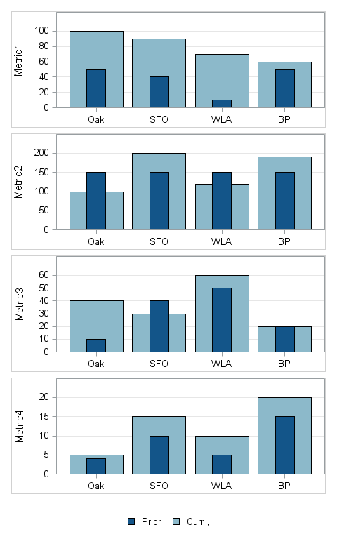
I am creating multiple graphs in a single Proc sgrender statement but the request is to have each of them sorted idenpendently by Curr ( the light blue bar). Each of the Metric values ( Prior and Curr for each metric) are independent values. In this case the order by data does not work because the order changes by metric. As you can see Metric 1 is sorted correctly but the rest are not.
I could just do 1 plot at a time and pass in the data sort appropriately for each metric, but since I output to html, rtf and pdf, producing a single sgrender output simlifies the output rendering.
Is this even possible to do in SG Render
We are currently on SAS 9.2 on our way to 9.4 TS1M1 - sadly not in time for my project
Data and code attached
Accepted Solutions

- Mark as New
- Bookmark
- Subscribe
- Mute
- RSS Feed
- Permalink
- Report Inappropriate Content
Since you are using the LAYOUT LATTICE to create this graph, I could propose this idea:
Instead of using one column FAC for all 4 graphs, use 4 separate variables, Fac1-Fac4. Fac1 will have values of 'Oak', 'SFO', 'WLA' and 'BP' in the first 4 obs only, and missing for all other. Fac2 will ave values of 'Oak', 'SFO', 'WLA' and 'BP' in the next 4 obs only, and missing for all other. and so on. You can sort within the 4 obs based on the response value.
Then use a BarChart X=Fac1 Y=metric1a in the first cell.
use a BarChart X=Fac2 Y=metric2a in the second cell, and so on.
I think this should work.

- Mark as New
- Bookmark
- Subscribe
- Mute
- RSS Feed
- Permalink
- Report Inappropriate Content
The reason you get this behavior is that the column (X) axis is common between the cells. To fix this for your use case, I would change the bar chart orientation to HORIZONTAL. The default ROWDATARANGE is UNION, so that should be okay. Give that a try and see if it works for you.
- Mark as New
- Bookmark
- Subscribe
- Mute
- RSS Feed
- Permalink
- Report Inappropriate Content
I changed the orientation to Horizontal but I don't see that it did what I needed - I don't need the values sort in alpha order ie BP is first which is what it did. I need to sort based on the value of Curr in a desc order so the highest curr bar is always on the left.
I really need a function like they have for group bars - a grouporder where I sort the output by the data in a desc order
- Mark as New
- Bookmark
- Subscribe
- Mute
- RSS Feed
- Permalink
- Report Inappropriate Content
Sorry, I misunderstood. I thought you already had them sorted by response, but the sort was not maintained when you plotted them. You must be using a BARCHART statement in GTL to calculate and render the bars. Here's what you'll have to do:
1. Use PROC SUMMARY or MEANS to calculate your stats. Make sure you list both CURR and PRIOR on the VAR statement.
2. Use PROC SORT to sort the data on the calculated column for the CURR variable.
3. I haven't seen your code, so I cannot give you any more specifics about the GTL code. Are you using LAYOUT LATTICE or LAYOUT GRIDDED? If these are truly independent charts, I would recommend using GRIDDED instead of LATTICE.
Hope this helps!
- Mark as New
- Bookmark
- Subscribe
- Mute
- RSS Feed
- Permalink
- Report Inappropriate Content
Hi
The code is attached in the original post because for whatever reason copy/paste does not work from IE - now I switched browsers and have corrected and pasted below
The Curr variable is independent by Metric - so I am not following how sorting on the curr var solves the issue because in my example I have multiple Curr values.
It seems to mean that the only way I could make the sort work is if I repeated Med Center for each metric and then did as you suggested
data data2;
infile datalines delimiter=',';
infile datalines dsd;
input FAC $ Metric1a Metric1b Metric2a Metric2b Metric3a Metric3b Metric4a Metric4b;
label Fac='Fac', Metric1a='Curr', Metric1b='Prior', Metric2a='Curr' ,Metric2b='Prior', Metric3a='Curr' ,Metric3b='Prior',Metric4a= 'Curr' ,Metric4b='Prior' ;
datalines;
OAK,100,50,100,150,40,10,10,5
SFO,90,40,200,150,30,40,30,40
WLA,70,10,120,150,60,50,60,50
BP,60,50,190,150,20,20,20,20
;
run;
run;
ODS PATH (prepend) MIAIDR.templat(update);
ods path show;
options mprint;
Proc template;
define statgraph KPRLPOWideBar;
dynamic x1a x1b x2a x2b x3a x3b x4b y1a y1b y2a y2b y3a y3b datalabel1 datalabel2 datalabel3 graphtitle1 graphtitle2 graphtitle3
refline legendlabel minscale maxscale value1;
begingraph / border=false;
layout lattice / columns=1 rows=4 rowgutter=5px columngutter=5px;
layout overlay / XAXISOPTS=(griddisplay=off display=(ticks tickvalues))
YAXISOPTS=(griddisplay=on label="Metric1" linearopts=(tickvalueformat=(extractscale=true)) offsetmax=
0.2)
BORDER=true;
BARCHART x=FAC y=Metric1a/ fillattrs=(color=CX8CB9CA) tip=(x group y)
IncludeMissingGroup=False ;
BARCHART x=FAC y=Metric1b / barwidth=.3 fillattrs=(color=CX135589) tip=(x group y) ;
endlayout;
layout overlay / XAXISOPTS=(griddisplay=off display=(ticks tickvalues))
YAXISOPTS=(griddisplay=on label="Metric2" linearopts=(tickvalueformat=(extractscale=true)) offsetmax=
0.2)
BORDER=true;
BARCHART x=FAC y=Metric2a / fillattrs=(color=CX8CB9CA) tip=(x group y)
IncludeMissingGroup=False;
BARCHART x=FAC y=Metric2b / barwidth=.3 fillattrs=(color=CX135589) tip=(x group y);
endlayout;
layout overlay / XAXISOPTS=(griddisplay=off display=(ticks tickvalues))
YAXISOPTS=(griddisplay=on label="Metric3" linearopts=(tickvalueformat=(extractscale=true)) offsetmax=
0.2)
BORDER=true;
BARCHART x=FAC y=Metric3a / fillattrs=(color=CX8CB9CA) tip=(x group y)
IncludeMissingGroup=False;
BARCHART x=FAC y=Metric3b / barwidth=.3 fillattrs=(color=CX135589) tip=(x group y);
endlayout;
layout overlay / XAXISOPTS=(griddisplay=off display=(ticks tickvalues))
YAXISOPTS=(griddisplay=on label="Metric4" linearopts=(tickvalueformat=(extractscale=true)) offsetmax=
0.2)
BORDER=true;
BARCHART x=FAC y=Metric4a / fillattrs=(color=CX8CB9CA) name="LAST YTD" tip=(x group y)
IncludeMissingGroup=False;
BARCHART x=FAC y=Metric4b / barwidth=.3 fillattrs=(color=CX135589) name='CURR YTD' tip=(x group y);
endlayout;
sidebar / align=bottom;
discretelegend "CURR YTD" "LAST YTD" / border=off pad=(top=10px);
endsidebar;
endlayout;
endgraph;
end;
run;
ods graphics on / imagemap border=off height=8in width=5in;
proc sgrender data=work.data template=KPRLPOWideBar;
run;
ods graphics off;
- Mark as New
- Bookmark
- Subscribe
- Mute
- RSS Feed
- Permalink
- Report Inappropriate Content
Since you are using the LAYOUT LATTICE to create this graph, I could propose this idea:
Instead of using one column FAC for all 4 graphs, use 4 separate variables, Fac1-Fac4. Fac1 will have values of 'Oak', 'SFO', 'WLA' and 'BP' in the first 4 obs only, and missing for all other. Fac2 will ave values of 'Oak', 'SFO', 'WLA' and 'BP' in the next 4 obs only, and missing for all other. and so on. You can sort within the 4 obs based on the response value.
Then use a BarChart X=Fac1 Y=metric1a in the first cell.
use a BarChart X=Fac2 Y=metric2a in the second cell, and so on.
I think this should work.
- Mark as New
- Bookmark
- Subscribe
- Mute
- RSS Feed
- Permalink
- Report Inappropriate Content
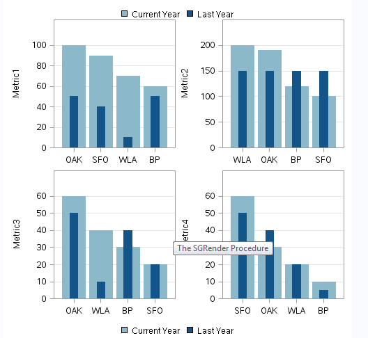
Thanks - I was on this same trajectory but I did not think about having multiple FACs - I used a different column to splay the data out thinking that since the sum when the bar is sorted would be the same.
This is the final version - I do think it would be a great if you could have a sg render procedure that allow for different input datasets. With only 4 metrics and 4 facs this is not a huge deal but the actual report will have 50 facs and 8 metrics as well as a parameter that has another 8 measures in it so the dataset will be huge feeding this graph.
data data2;
infile datalines delimiter=',';
infile datalines dsd;
input FAC1 $ FAC2 $ FAC3 $ FAC4 $ Metric1a Metric1b Metric2a Metric2b Metric3a Metric3b Metric4a Metric4b;
label Fac='Fac', Metric1a='Curr', Metric1b='Prior', Metric2a='Curr' ,Metric2b='Prior', Metric3a='Curr' ,Metric3b='Prior',Metric4a= 'Curr' ,Metric4b='Prior' ;
datalines;
OAK,,,,100,50,,,,,,
SFO,,,,90,40,,,,,,
WLA,,,,70,10,,,,,,
BP,,,,60,50,,,,,,
,SFO,,,,,100,150,,,,
,WLA,,,,,200,150,,,,
,BP,,,,,120,150,,,,
,OAK,,,,,190,150,,,,
,,WLA,,,,,,40,10,,
,,BP,,,,,,30,40,,
,,OAK,,,,,,60,50,,
,,SFO,,,,,,20,20,,
,,,BP,,,,,,,10,5
,,,OAK,,,,,,,30,40
,,,SFO,,,,,,,60,50
,,,WLA,,,,,,,20,20
;
run;
PROC SQL;
CREATE TABLE NEW AS SELECT *
FROM DATA2
ORDER BY METRIC1a DESC, METRIC2a DESC, METRIC3a DESC, METRIC4a DESC;
QUIT;
ODS PATH (prepend) MIAIDR.templat(update);
proc template;
define statgraph KPRLPOWideBar;
dynamic x1 x2 x3 x4 y1a y1b y2a y2b y3a y3b y4a y4b y5a y5b y6a y6b y7a y7b y8a y8b titlelabel1 titlelabel2 titlelabel3 titlelabel4
titlelabel5 titlelabel6 titlelabel7 titlelabel8 datalabel2 datalabel3 graphtitle1 graphtitle2 graphtitle3 refline legendlabel
minscale maxscale value1;
begingraph / border=false designwidth=7in ;
layout lattice / columns=2 rows=4 rowgutter=5px columngutter=5px;
layout overlay / XAXISOPTS=(griddisplay=off display=(ticks tickvalues))
YAXISOPTS=(griddisplay=on label=TITLELABEL1
linearopts=(tickvalueformat=(extractscale=true)) offsetmax=0.2)
BORDER=false;
BARCHART x=x1 y=y1a / fillattrs=(color=CX8CB9CA) outlineattrs=(color=CX8CB9CA)
name="CURR" legendlabel="Current Year" tip=(x group y)
IncludeMissingGroup=False;
BARCHART x=x1 y=y1b / barwidth=.3 fillattrs=(color=CX135589)
outlineattrs=(color=CX135589) name="LAST"
legendlabel="Last Year" tip=(x group y);
endlayout;
layout overlay / XAXISOPTS=(griddisplay=off display=(ticks tickvalues))
YAXISOPTS=(griddisplay=on label=TITLELABEL1
linearopts=(tickvalueformat=(extractscale=true)) offsetmax=0.2)
BORDER=false;
BARCHART x=x2 y=y2a / fillattrs=(color=CX8CB9CA) outlineattrs=(color=CX8CB9CA)
name="CURR" legendlabel="Current Year" tip=(x group y)
IncludeMissingGroup=False;
BARCHART x=x2 y=y2b / barwidth=.3 fillattrs=(color=CX135589)
outlineattrs=(color=CX135589) name="LAST"
legendlabel="Last Year" tip=(x group y);
endlayout;
layout overlay / XAXISOPTS=(griddisplay=off display=(ticks tickvalues))
YAXISOPTS=(griddisplay=on label=TITLELABEL1
linearopts=(tickvalueformat=(extractscale=true)) offsetmax=0.2)
BORDER=false;
BARCHART x=x3 y=y3a / fillattrs=(color=CX8CB9CA) outlineattrs=(color=CX8CB9CA)
name="CURR" legendlabel="Current Year" tip=(x group y)
IncludeMissingGroup=False;
BARCHART x=x3 y=y3b / barwidth=.3 fillattrs=(color=CX135589)
outlineattrs=(color=CX135589) name="LAST"
legendlabel="Last Year" tip=(x group y);
endlayout;
layout overlay / XAXISOPTS=(griddisplay=off display=(ticks tickvalues))
YAXISOPTS=(griddisplay=on label=TITLELABEL1
linearopts=(tickvalueformat=(extractscale=true)) offsetmax=0.2)
BORDER=false;
BARCHART x=x4 y=y4a / fillattrs=(color=CX8CB9CA) outlineattrs=(color=CX8CB9CA)
name="CURR" legendlabel="Current Year" tip=(x group y)
IncludeMissingGroup=False;
BARCHART x=x4 y=y4b / barwidth=.3 fillattrs=(color=CX135589)
outlineattrs=(color=CX135589) name="LAST"
legendlabel="Last Year" tip=(x group y);
endlayout;
sidebar / align=top;
discretelegend "CURR" "LAST" / border=off pad=(top=10px);
endsidebar;
sidebar / align=bottom;
discretelegend "CURR" "LAST" / border=off pad=(top=10px);
endsidebar;
endlayout;
endgraph;
end;
run;
ods graphics on / imagemap border=off height=8in width=5in;
proc sgrender data=work.NEW template=KPRLPOWideBar;
dynamic
x1 = 'fac1'
x2 = 'fac2'
x3 = 'fac3'
x4 = 'fac4'
y1a = 'Metric1a'
y1b= 'Metric1b'
y2a= 'Metric2a'
y2b= 'Metric2b'
y3a= 'Metric3a'
y3b= 'Metric3b'
y4a= 'Metric4a'
y4b= 'Metric4b'
titlelabel1 = 'Metric1'
titlelabel2 = 'Metric2'
titlelabel3 = 'Metric3'
titlelabel4 = 'Metric4'
;
run;
ods graphics off;
- Mark as New
- Bookmark
- Subscribe
- Mute
- RSS Feed
- Permalink
- Report Inappropriate Content
Yes, it is a problem when you have a large number of cells. SAS 9.4 SGPLOT and SGPANEL include an option to sort by response. This could be useful for you.

Don't miss out on SAS Innovate - Register now for the FREE Livestream!
Can't make it to Vegas? No problem! Watch our general sessions LIVE or on-demand starting April 17th. Hear from SAS execs, best-selling author Adam Grant, Hot Ones host Sean Evans, top tech journalist Kara Swisher, AI expert Cassie Kozyrkov, and the mind-blowing dance crew iLuminate! Plus, get access to over 20 breakout sessions.
Learn how use the CAT functions in SAS to join values from multiple variables into a single value.

Find more tutorials on the SAS Users YouTube channel.
 Click image to register for webinar
Classroom Training Available!
Select SAS Training centers are offering in-person courses. View upcoming courses for:
-
7 replies
-
03-20-2015 01:51 PM
-
1966 views
-
0 likes
-
3 in conversation
-
