- Home
- /
- Programming
- /
- Graphics
- /
- Re: Change fill attributes based on date SGPLOT
- RSS Feed
- Mark Topic as New
- Mark Topic as Read
- Float this Topic for Current User
- Bookmark
- Subscribe
- Mute
- Printer Friendly Page
- Mark as New
- Bookmark
- Subscribe
- Mute
- RSS Feed
- Permalink
- Report Inappropriate Content
Hi All
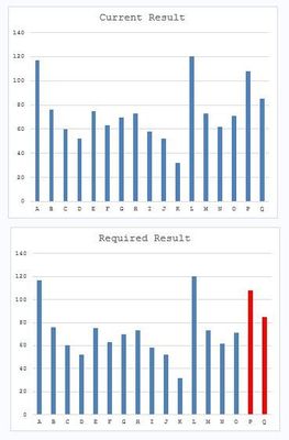
I'm using the following SGPLOT to produce a bar chart - however I would like to change the colour of the fill attributes based on the date (indicated by P - I can't add dates successfully to test data 😞 ) to identify when a change occurred to the business rules.
Data test;
Input Date $ Result;
Datalines;
A 117
B 76
C 60
D 52
E 75
F 63
G 70
H 73
I 58
J 52
K 32
L 120
M 73
N 62
O 71
P 108
Q 85
;
Run;

Proc SGPLOT data=test noborder;
Title "Results";
VBAR Date / RESPONSE=Result FILLATTRS=(Color=BIBG) ;
 yaxis display=(noline noticks) ;
RUN;
The output result is in the Current Result graph and I would like it to look like Required Results graph.
How do I change my code to show different colours? Any help appreciated.
Cheers
Dean
Accepted Solutions
- Mark as New
- Bookmark
- Subscribe
- Mute
- RSS Feed
- Permalink
- Report Inappropriate Content
You can use the approach here and then style your colors using either STYLEATTRS or an attribute map.
Data test;
Input Date $ Result Group;
Datalines;
A 117 1
B 76 1
C 60 1
D 52 1
E 75 1
F 63 1
G 70 1
H 73 1
I 58 1
J 52 1
K 32 1
L 120 1
M 73 1
N 62 1
O 71 1
P 108 0
Q 85 0
;
Run;

Proc SGPLOT data=test noborder noautolegend;
Title "Results";
VBAR Date / RESPONSE=Result group=group ;
 yaxis display=(noline noticks) ;
RUN;
PS. I'm moving your question to the graphics forum as well.
- Mark as New
- Bookmark
- Subscribe
- Mute
- RSS Feed
- Permalink
- Report Inappropriate Content
The I'm now trying to change the colour of the bars but not quit there. I'm trying to use a attrid.
As your example I added the 'group' in the data step.
Data Attrmap;
	input group $ fillcolor $8.;
	datalines;
	0 beige
	1 pink
	;
RUN;

Proc SGPLOT data=work.Test noborder noautolegend dattrmap=attrmap;
	Title "Test";
	VBAR Date / RESPONSE=Resul group=group attrid=group;
	yaxis display=(noline noticks) Label="mm:ss";
RUN;
Cheers
Dean
- Mark as New
- Bookmark
- Subscribe
- Mute
- RSS Feed
- Permalink
- Report Inappropriate Content
The column you called "group" in the attrmap must be called "value". It's a reserved column name for the column that contains the values to map. Also, you need the "ID" column to contain the ID referenced from the plot statement. We do it this way because you can have multiple attrmaps in the same data set. Your code should look something like this:
Data Attrmap;
        retain id "myid";  /* or whatever you want to call the map */
	input value $ fillcolor $8.;
	datalines;
	0 beige
	1 pink
	;
RUN;

Proc SGPLOT data=work.Test noborder noautolegend dattrmap=attrmap;
	Title "Test";
	VBAR Date / RESPONSE=Resul group=group attrid=myid;
	yaxis display=(noline noticks) Label="mm:ss";
RUN;- Mark as New
- Bookmark
- Subscribe
- Mute
- RSS Feed
- Permalink
- Report Inappropriate Content
You need to use an attribute map. Here is the code:
data attrmap;
retain id "myid";
length fillcolor $ 4;
input value $ fillcolor $;
cards;
P       red
Q       red
_other_ bibg
;
run;

Data test;
Input Date $ Result;
Datalines;
A 117
B 76
C 60
D 52
E 75
F 63
G 70
H 73
I 58
J 52
K 32
L 120
M 73
N 62
O 71
P 108
Q 85
;
Run;

Proc SGPLOT data=test dattrmap=attrmap noborder;
Title "Results";
VBAR Date / RESPONSE=Result group=date attrid=myid;
 yaxis display=(noline noticks) ;
RUN;- Mark as New
- Bookmark
- Subscribe
- Mute
- RSS Feed
- Permalink
- Report Inappropriate Content
Reeza's solution will work as well.
Don't miss out on SAS Innovate - Register now for the FREE Livestream!
Can't make it to Vegas? No problem! Watch our general sessions LIVE or on-demand starting April 17th. Hear from SAS execs, best-selling author Adam Grant, Hot Ones host Sean Evans, top tech journalist Kara Swisher, AI expert Cassie Kozyrkov, and the mind-blowing dance crew iLuminate! Plus, get access to over 20 breakout sessions.
Learn how use the CAT functions in SAS to join values from multiple variables into a single value.
Find more tutorials on the SAS Users YouTube channel.
 Click image to register for webinar
Classroom Training Available!
Select SAS Training centers are offering in-person courses. View upcoming courses for:


