- Home
- /
- Programming
- /
- Graphics
- /
- Re: Change color of bars
- RSS Feed
- Mark Topic as New
- Mark Topic as Read
- Float this Topic for Current User
- Bookmark
- Subscribe
- Mute
- Printer Friendly Page

- Mark as New
- Bookmark
- Subscribe
- Mute
- RSS Feed
- Permalink
- Report Inappropriate Content
Hi all,
This is the very first time I am using SAS to do a customized chart. I have SAS 9.3
I tried to draw confidence intervals in gplot and find the thread
So I bascially followed Sanjay's codes like.
proc template; define statgraph errorbars; begingraph; entrytitle 'Product Revenue'; layout overlay / yaxisopts=(offsetmin=0) xaxisopts=(display=(ticks tickvalues line)); barchart x=product y=revenue; scatterplot x=product y=revenue / yerrorupper=upper yerrorlower=lower markerattrs=(size=0); endlayout; endgraph; end; run; But, I cannot figure out how to change the color of the bars. Can anyone tell me how to do that?
Here is my data:
| days | Mean | Upper | Lower |
| 0 day | 34.36 | 31.97 | 36.76 |
| 1-3 days | 37.75 | 33.87 | 41.64 |
| 4-7 days | 42.69 | 38.43 | 46.96 |
| >7 days | 48.60 | 43.07 | 54.12 |
"days" is my x-axis, and "Mean" is the variable I want to plot for a bar chart, with 95% CI of upper and lower values.
Thanks so much!
Lizi
Accepted Solutions

- Mark as New
- Bookmark
- Subscribe
- Mute
- RSS Feed
- Permalink
- Report Inappropriate Content
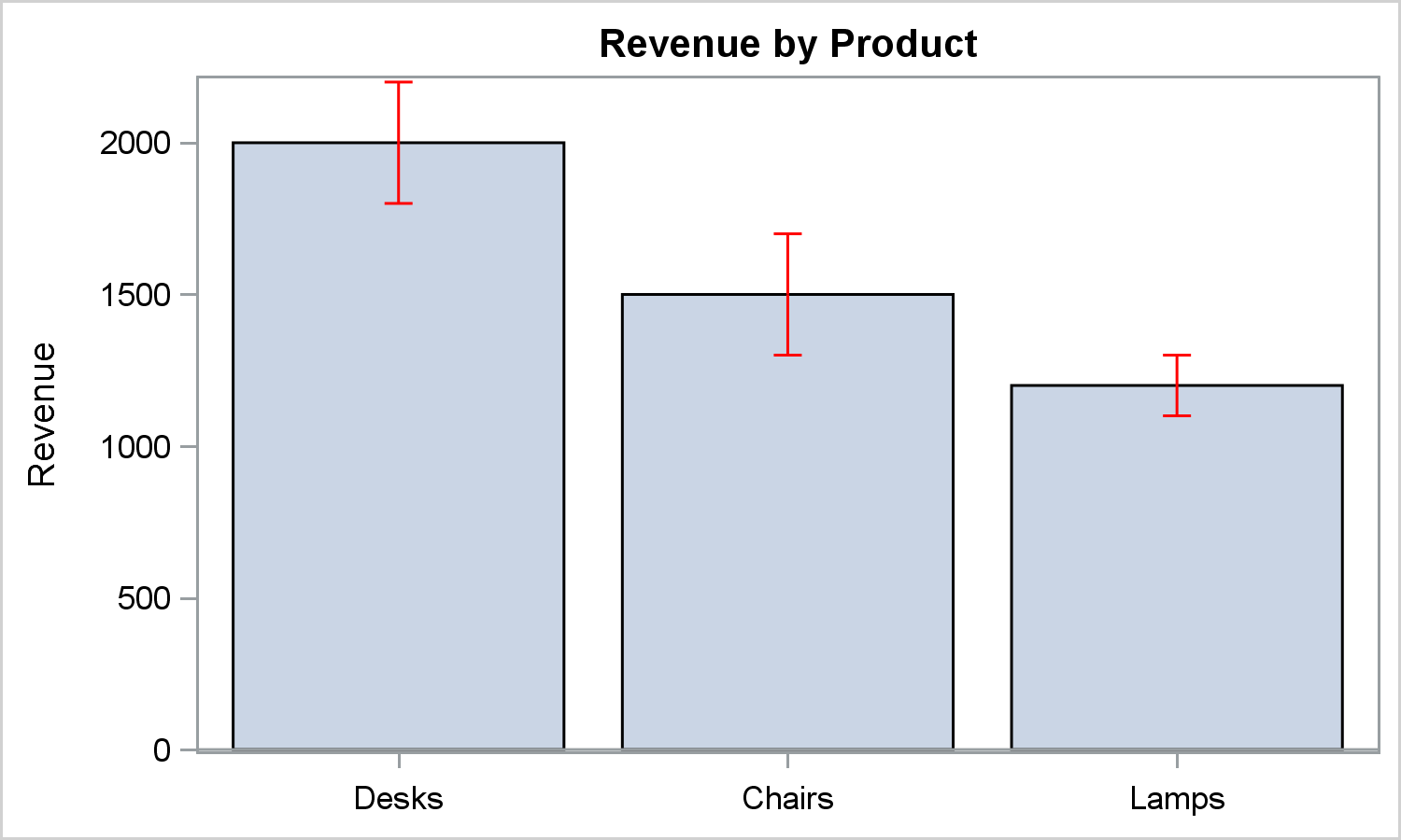
If you have SAS 9.3 or later, you can do this using the SGPLOT procedure.
Use LIMITATTRS to change the color of the error bars.
You can change the color of the bars themselves using FILLATTRS. SGPLOT has very extensive features and you can see product documentation for all the details.
title 'Revenue by Product';
proc sgplot data=error;
vbarparm category=product response=revenue / limitupper=upper limitlower=lower
limitattrs=(color=red);
xaxis display=(nolabel);
run;
- Mark as New
- Bookmark
- Subscribe
- Mute
- RSS Feed
- Permalink
- Report Inappropriate Content
- Mark as New
- Bookmark
- Subscribe
- Mute
- RSS Feed
- Permalink
- Report Inappropriate Content
Sorry, I'll keep that in my mind. I have SAS 9.3. I also just added some sample data in my question. Thanks a lot.
- Mark as New
- Bookmark
- Subscribe
- Mute
- RSS Feed
- Permalink
- Report Inappropriate Content
If you have SAS 9.3 or later, you can do this using the SGPLOT procedure.
Use LIMITATTRS to change the color of the error bars.
You can change the color of the bars themselves using FILLATTRS. SGPLOT has very extensive features and you can see product documentation for all the details.
title 'Revenue by Product';
proc sgplot data=error;
vbarparm category=product response=revenue / limitupper=upper limitlower=lower
limitattrs=(color=red);
xaxis display=(nolabel);
run;
- Mark as New
- Bookmark
- Subscribe
- Mute
- RSS Feed
- Permalink
- Report Inappropriate Content
Note: VBARPARM draws the data as you provide it without any summarization. It is designed for pre summarized data by category, and allows you to specify your own error limits. If you have two observations for "Desks", a second bar will be drawn over the first one for "Desks". You will see a log message.
If you want the statement to summarize data, use VBAR, but you will then get the error bars based on the other statement options.
- Mark as New
- Bookmark
- Subscribe
- Mute
- RSS Feed
- Permalink
- Report Inappropriate Content
Thanks, Sanjay.
I have one more question: is it possible to change the font of x-axis(Desks, Chairs, Lamps) /y-axis (0, ...,2000) labels?
- Mark as New
- Bookmark
- Subscribe
- Mute
- RSS Feed
- Permalink
- Report Inappropriate Content
Most things can be customized. See VALUEATTRS or LABELATTRS on the axis statements.
This Blog has many examples of SGPLOT usage:

- Mark as New
- Bookmark
- Subscribe
- Mute
- RSS Feed
- Permalink
- Report Inappropriate Content
Lizi,
I agree with Sanjay regarding the useful information to include. i.e. the version number of SAS, and please see the tip.
I'm guessing that you need to include the following within your SCATTERPLOT statement to change the color of the bars.
ERRORBARATTRS = (color = red)
You can also choose other colors apart from red.
Thanks.
- Mark as New
- Bookmark
- Subscribe
- Mute
- RSS Feed
- Permalink
- Report Inappropriate Content
Thanks, Dirisks! I tried including ERRORBARATTRS = (color = red) at the end of the SCATTERPLOT statement. It looks there is no error message, but I do not see the bar color change.

Don't miss out on SAS Innovate - Register now for the FREE Livestream!
Can't make it to Vegas? No problem! Watch our general sessions LIVE or on-demand starting April 17th. Hear from SAS execs, best-selling author Adam Grant, Hot Ones host Sean Evans, top tech journalist Kara Swisher, AI expert Cassie Kozyrkov, and the mind-blowing dance crew iLuminate! Plus, get access to over 20 breakout sessions.
Learn how use the CAT functions in SAS to join values from multiple variables into a single value.

Find more tutorials on the SAS Users YouTube channel.
 Click image to register for webinar
Classroom Training Available!
Select SAS Training centers are offering in-person courses. View upcoming courses for:
-
8 replies
-
02-05-2015 10:20 AM
-
11860 views
-
8 likes
-
3 in conversation
-
