- Home
- /
- Programming
- /
- Graphics
- /
- Re: Center axis label along horizontal axis (and legend along vertical...
- RSS Feed
- Mark Topic as New
- Mark Topic as Read
- Float this Topic for Current User
- Bookmark
- Subscribe
- Mute
- Printer Friendly Page
- Mark as New
- Bookmark
- Subscribe
- Mute
- RSS Feed
- Permalink
- Report Inappropriate Content
Hi -
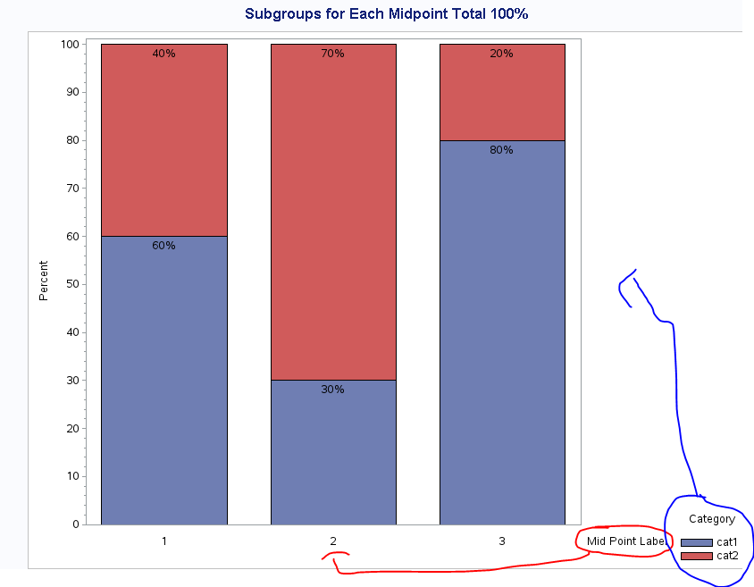
I am trying to center the horizontal axis label (along the axis) and center the legend along the vertical axis with proc gchart in this example but with no luck ...
Code modified from here: http://support.sas.com/kb/41/976.html
/* Set the graphics environment */
goptions reset=all cback=white border htitle=12pt htext=10pt;

/* Create sample data */
data test;
 input midpnt category $ count;
 datalines;
1 cat1 60
1 cat2 40
2 cat1 30
2 cat2 70
3 cat1 80
3 cat2 20
;
run;

/* Define a title for the graph */
title1 'Subgroups for Each Midpoint Total 100%';

/* Suppress the group axis label and values */
axis1 label=none value=none;

/* Angle the label for the response axis */
axis2 label=(angle=90 'Percent');

/* midpoint axis */
axis3 label=(position=middle "Mid Point Label");

/* Define legend characteristics */
legend1 label=(position=top justify=center 'Category') position=(center right outside) mode=reserve across=1;

proc gchart data=test;
 vbar midpnt / discrete subgroup=category
 group=midpnt g100 nozero
 freq=count type=percent
 inside=percent width=20
 gaxis=axis1 raxis=axis2 maxis=axis3
 legend=legend1;
run;
quit;
Any help much appreciated!d
- Mark as New
- Bookmark
- Subscribe
- Mute
- RSS Feed
- Permalink
- Report Inappropriate Content
Hi,
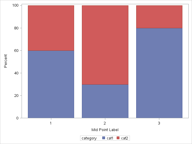
Do you need to show the percentages in the barchart, and does the legend have to be centered vertically? If not here is a quick solution.
proc sgplot data = test;
  vbar midpnt / response = count group = category;
  xaxis label = "Mid Point Label";
  yaxis label = "Percent";
run;
- Mark as New
- Bookmark
- Subscribe
- Mute
- RSS Feed
- Permalink
- Report Inappropriate Content
This code, will also help you to get your percentage labels if you want them. It works in SAS 9.4. There may be an easier way in proc gchart to rearrange the labels and the legend but I am not that familiar with proc gchart,
data test2;
  set test;
  by midpnt category;
  retain stacked_result;
  if first.midpnt then stacked_result = count;
  else stacked_result = stacked_result + count;
  length perc $4;
  perc = cats(stacked_result, "%");
  stacked_final = stacked_result - (0.05 * stacked_result);
run;

proc sgplot data = test2;
  vbarparm category = midpnt response = count / group = category groupdisplay = stacked;
  scatter x = midpnt y = stacked_final / markerchar=perc;
  xaxis label = "Mid Point Label";
  yaxis label = "Percent";
run;- Mark as New
- Bookmark
- Subscribe
- Mute
- RSS Feed
- Permalink
- Report Inappropriate Content
- Mark as New
- Bookmark
- Subscribe
- Mute
- RSS Feed
- Permalink
- Report Inappropriate Content
Don't miss out on SAS Innovate - Register now for the FREE Livestream!
Can't make it to Vegas? No problem! Watch our general sessions LIVE or on-demand starting April 17th. Hear from SAS execs, best-selling author Adam Grant, Hot Ones host Sean Evans, top tech journalist Kara Swisher, AI expert Cassie Kozyrkov, and the mind-blowing dance crew iLuminate! Plus, get access to over 20 breakout sessions.
Learn how use the CAT functions in SAS to join values from multiple variables into a single value.
Find more tutorials on the SAS Users YouTube channel.
 Click image to register for webinar
Classroom Training Available!
Select SAS Training centers are offering in-person courses. View upcoming courses for:


