- Home
- /
- Programming
- /
- Graphics
- /
- Re: Bubble sizes
- RSS Feed
- Mark Topic as New
- Mark Topic as Read
- Float this Topic for Current User
- Bookmark
- Subscribe
- Mute
- Printer Friendly Page

- Mark as New
- Bookmark
- Subscribe
- Mute
- RSS Feed
- Permalink
- Report Inappropriate Content
Hello everyone,
When I...
* have size values ranging from, let's say, 4 (minimum) to 20 (maximum)
* and then define a radius range from 4pt (BRADIUSMIN=4pt) to 20 pt (BRADIUSMAX=20pt)
...I always thought that any size value x between 4 and 20 would result in a bubble of radius x pt.
However, the example below shows that this doesn't seem to be the case:
The size values for the red bubbles range from 4 to 20. Therefore, BRADIUSMIN=4pt BRADIUSMAX=20pt.
The size values for the gray bubbles range from 4 to 10 => BRADIUSMIN=4pt BRADIUSMAX=10pt.
Now, a size value x within the according range should result in a bubble of radius x pt.
However, the red bubbles with sizes 8 and 6 are bigger than the corresponding gray bubbles with sizes 8 and 6.
What am I missing here?
Any help is appreciated!
DATA test;
x++5;
y=5;
INPUT size_red size_gray;
DATALINES;
20 10
8 8
6 6
4 4
RUN;
PROC SGPLOT DATA=test;
BUBBLE X=x Y=y SIZE=size_red / BRADIUSMAX=20pt BRADIUSMIN=4pt FILLATTRS=(COLOR=RED) NOOUTLINE;
BUBBLE X=x Y=y SIZE=size_gray / BRADIUSMAX=10pt BRADIUSMIN=4pt FILLATTRS=(COLOR=lightGRAY) NOOUTLINE;
QUIT;

- Mark as New
- Bookmark
- Subscribe
- Mute
- RSS Feed
- Permalink
- Report Inappropriate Content
The min and max radii are used to SCALE the actual values. When your maximum values happen to match the values then you get exactly that size. If your maximum value was 200 it would be represented as a 20pt (or 10pt) bubble and if your minimum was 2 then it would be shown as a 4pt bubble.

- Mark as New
- Bookmark
- Subscribe
- Mute
- RSS Feed
- Permalink
- Report Inappropriate Content
While BRadiusMin and BRadiusMax are radius values, the computation of the intermediate radius is based on AREA of the bubble. We had considered an option to scale by Area or Radius, but did not release it. The thought was that area based scaling is more appropriate for bubbles. Does your use case require radius based scaling? If so, we can add that option.
Another option available (in GTL) is to scale proportionally through zero. For this, the computation is based on the a straight line through (max data value, BRadiusMax) and (0, 0). Then BRadiusMin is used as a cutoff for the smallest bubble.
- Mark as New
- Bookmark
- Subscribe
- Mute
- RSS Feed
- Permalink
- Report Inappropriate Content
Thank you very much for your quick response! In my opinion, and for my work, bubbles should really represent their underlying values... but I'm clearly not getting this area concept and I'm open and grateful for explanations and suggestions.
Also, I'm just getting started with using SAS not only to compute but also to visualize data. I would really appreciate some advice on what to use if I need exotic charts that doesn't seem to be directly supported by GPLOT or SGPLOT (like this bubble thing). Is it worth taking a look at GTL?
For example, when I needed to draw candle stick charts (what happens pretty often) using SGPLOT, I've taken a look at this example and coded the following down below which still seems to be more like a "work-around". Would GTL provide a more "direct" approach?
DATA candles2(KEEP=Date candle_type x body_y docht_y lunte_y);
SET Stocks;
IF Close > Open THEN candle_type="d";
ELSE IF Close < Open THEN candle_type="u";
ELSE candle_type="n";
x=Date-.45;
body_y=Open;
docht_y=MAX(Open,Close);
lunte_y=MIN(Open,Close); OUTPUT;
body_y=Close;
docht_y=High;
lunte_y=Low; OUTPUT;
x=Date+.45;
CALL MISSING(docht_y,lunte_y); OUTPUT;
body_y=Open; OUTPUT;
RUN;
DATA chart_attrs;
id="candle";
value="u"; fillcolor="VeryLightGreen"; linecolor="MediumGray"; filltransparency=.8; OUTPUT;
value="n"; fillcolor="VeryLightGray"; OUTPUT;
value="d"; fillcolor="VeryLightRed"; OUTPUT;
RUN;
PROC SGPLOT DATA=candles2 DATTRMAP=chart_attrs NOAUTOLEGEND;
XAXIS VALUESFORMAT=date11.;
YAXIS LABEL="Price";
SERIES X=Date Y=docht_y / LINEATTRS=(COLOR=MediumGray) BREAK;
SERIES X=Date Y=lunte_y / LINEATTRS=(COLOR=MediumGray) BREAK;
POLYGON X=x Y=body_y ID=Date / GROUP=candle_type ATTRID=candle NOMISSINGGROUP FILL OUTLINE;
QUIT;
- Mark as New
- Bookmark
- Subscribe
- Mute
- RSS Feed
- Permalink
- Report Inappropriate Content
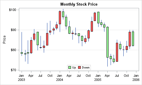
As far as a "Candle Stick Graph" is concerned, here is one using SGPLOT HIGHLOW plot statement. SAS 9.4 Code is attached. Remove the STYLEATTRS statement if you don't have SAS 9.4.
data stock;
length Gain $4;
set sashelp.stocks(where=(stock='IBM' and date > '01Jan2003'd));
if open < close then do;
gain='Down';
v1=open; v2=close;
end;
else do;
gain='Up';
v1=close; v2=open;
end;
run;
ods graphics / reset attrpriority=color width=5in height=3in imagename='CandleStick';
title 'Monthly Stock Price';
proc sgplot data=stock;
styleattrs datacolors=(lightgreen lightred);
highlow x=date low=low high=high / type=line;
highlow x=date low=v1 high=v2 / type=bar group=gain lineattrs=(color=black) name='a';
yaxis label='Price' grid;
xaxis display=(nolabel);
keylegend 'a' / location=inside position=bottom;
run;
- Mark as New
- Bookmark
- Subscribe
- Mute
- RSS Feed
- Permalink
- Report Inappropriate Content
Thank you all very much for providing suggestions and insights into bubble and candle stick plotting!
This discussion really helped me a lot!
- Mark as New
- Bookmark
- Subscribe
- Mute
- RSS Feed
- Permalink
- Report Inappropriate Content

- Mark as New
- Bookmark
- Subscribe
- Mute
- RSS Feed
- Permalink
- Report Inappropriate Content
A philosophical answer rather than a coding answer ... Bubble charts have at least two inherent design deficiencies.
1 Bubble charts attempt to express three dimensions on a two dimensional plane.
2 Bubble size is related to area. A doubling of the "plotted" value results in a 4x increase in area - quite misleading. Given that area ranks in 5th place on Cleveland's Features Hierarchy, one should look for a way to move up in the features hierarchy. A combination of smaller bar and line charts will result in a more easily understood graphic. This can usually be done in the same amount of space or less.
wd

- Mark as New
- Bookmark
- Subscribe
- Mute
- RSS Feed
- Permalink
- Report Inappropriate Content
Hi, I'm curious, can you provide a good reference for Cleveland's Features Hierarchy?
PG
- Mark as New
- Bookmark
- Subscribe
- Mute
- RSS Feed
- Permalink
- Report Inappropriate Content
The original document: http://www.cs.uic.edu/~wilkinson/Publications/iesbs.pdf.
Some reworks of the chart in the document: Cleveland's Graphical Feature's Hierarchy - Perceptual Edge Discussion Forum; Cleveland's Graphical Features Hierarchy - Perceptual Edge Discussion Forum
- Mark as New
- Bookmark
- Subscribe
- Mute
- RSS Feed
- Permalink
- Report Inappropriate Content
Thank you Bill. Will read.
PG

- Mark as New
- Bookmark
- Subscribe
- Mute
- RSS Feed
- Permalink
- Report Inappropriate Content
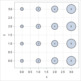
Bill,
It sounds like you thing that the radius of the bubble is proportional to the variable. It is not. It is the AREA that is proportional. Run this code to see that the areas increase linearly with the size variable.
data A;
x=.; y=.; size=0; output; /* fake point to set size scale */
do x = 0 to 3;
do y = 0 to 3;
size = 2**x;
output;
end;
end;
run;
ods graphics / width=500 height=500;
proc sgplot data=A;
bubble x=x y=y size=size / datalabelpos=center datalabel=size;
xaxis grid;
yaxis grid;
run;
- Mark as New
- Bookmark
- Subscribe
- Mute
- RSS Feed
- Permalink
- Report Inappropriate Content
Thanks Rick for pointing out my error. Having said that, I have seen bubble size proportional to radius - obviously made by deficient software! Beyond that though, even with the technically correct example you have provided, it's difficult to understand that the "8" bubble is 4x larger than the "2" bubble. Area just doesn't work. Lengths are much easier to compare.
- Mark as New
- Bookmark
- Subscribe
- Mute
- RSS Feed
- Permalink
- Report Inappropriate Content
Linear distance from common baseline provides the best magnitude comparisons. Like Dot Plot, Needle Plot, BarChart, It will be better to use one of these graphs instead of a Bubble Plot. If the response data is by two classsifiers, with values at each crossing, one could replace the bubble by a small straight line segment. I can drum up an example.
- Mark as New
- Bookmark
- Subscribe
- Mute
- RSS Feed
- Permalink
- Report Inappropriate Content
I agree, Bill. I don't use bubble plots when a simpler plot would suffice. But justlast week I created a bubble plot to try to solve a question someone asked me. I'd welcome feedback on whether you think this is a good application for a bubble plot, or whether you think a different plot would be better: Designing a quantile bin plot - The DO Loop

Don't miss out on SAS Innovate - Register now for the FREE Livestream!
Can't make it to Vegas? No problem! Watch our general sessions LIVE or on-demand starting April 17th. Hear from SAS execs, best-selling author Adam Grant, Hot Ones host Sean Evans, top tech journalist Kara Swisher, AI expert Cassie Kozyrkov, and the mind-blowing dance crew iLuminate! Plus, get access to over 20 breakout sessions.
Learn how use the CAT functions in SAS to join values from multiple variables into a single value.

Find more tutorials on the SAS Users YouTube channel.
 Click image to register for webinar
Classroom Training Available!
Select SAS Training centers are offering in-person courses. View upcoming courses for:
-
16 replies
-
09-23-2014 12:33 PM
-
2913 views
-
6 likes
-
6 in conversation
-
