- Home
- /
- Programming
- /
- Graphics
- /
- Re: Boxplots With Varying Endpoints, Boundaries, Fences, or Percentile...
- RSS Feed
- Mark Topic as New
- Mark Topic as Read
- Float this Topic for Current User
- Bookmark
- Subscribe
- Mute
- Printer Friendly Page

- Mark as New
- Bookmark
- Subscribe
- Mute
- RSS Feed
- Permalink
- Report Inappropriate Content
I am about to start studying the code for building boxplots with SAS. I noticed there are many ways or procedures to build them. Which one is best for the following?
I wish to do a box plot for 10 groups of data, side-by-side. I thijnk that will be easy enough. I am not really interested in the fanciness of the graphics, but I am sure that will come in time.
I also wish to vary the end points for my whiskers or outliers. For example, I believe the standard box plot pushes the outer fences to 1.5 X the IQR. I would like the option of seeing the data at 2 X IQR range or 3 X IQR as well. Or, maybe perhaps specify the percentiles.
Thank you very much in advance.
Accepted Solutions

- Mark as New
- Bookmark
- Subscribe
- Mute
- RSS Feed
- Permalink
- Report Inappropriate Content
WHISKERPCT is also supported by SGPLOT with SAS 9.4M2.
With earlier releases, we have used HighLow plot do do the same:
http://blogs.sas.com/content/graphicallyspeaking/2013/03/24/custom-box-plots/

- Mark as New
- Bookmark
- Subscribe
- Mute
- RSS Feed
- Permalink
- Report Inappropriate Content
If you want to customize it use GTL with WHISKERPERCENTILE which is an option in SAS 9.4 at least.
I'm not sure about 2XIQR or 3XIQR. Would also have to be careful that wasn't over the max/min of the data.
- Mark as New
- Bookmark
- Subscribe
- Mute
- RSS Feed
- Permalink
- Report Inappropriate Content
WHISKERPCT is also supported by SGPLOT with SAS 9.4M2.
With earlier releases, we have used HighLow plot do do the same:
http://blogs.sas.com/content/graphicallyspeaking/2013/03/24/custom-box-plots/
- Mark as New
- Bookmark
- Subscribe
- Mute
- RSS Feed
- Permalink
- Report Inappropriate Content
That is great information from both of you guys! Thank you so much.
Now the problem I am dealing with is my scatterplots are skewed in a major way. Wihin each of the 10 categories the majority of the points are zero - no longer thinking boxplots would be terribly conducive to understanding such a skewed distribution.
Any other suggestions to graphically see what is going on in a snapshot? If I were to just send out my percentiles an example for one of my categories could be:
P1 0
P5 0
P10 0
P25 0
P50 0
P75 6
P90 22
P95 47
P99 128
Can anyone think of a way to adjust such scatterplots in these situations? Perhaps put a condition in that the value needs to be > 0 - but then I am steering away from the original question.
Thank you.
- Mark as New
- Bookmark
- Subscribe
- Mute
- RSS Feed
- Permalink
- Report Inappropriate Content
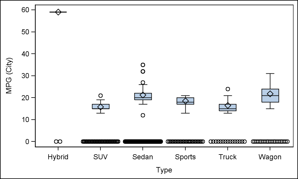
With SAS 9.4M2, you can overlay scatter plot on a BoxPlot. Would that help?
Here, for many observations (chosen randomly), I made mpg_city=missing, and mpg=0 for the same.
Then I plotted a box plot of mpg_city, overlaid with a scatter plot of mpg with JITTER.
Does this help?
data cars;
set sashelp.cars;
if ranuni(2) < 0.7 then do;
mpg=0;
mpg_city=.;
end;
run;
proc sgplot data=cars noautolegend;
vbox mpg_city / category=type;
scatter x=type y=mpg / jitter;
run;
- Mark as New
- Bookmark
- Subscribe
- Mute
- RSS Feed
- Permalink
- Report Inappropriate Content
Thank you Sanjay. My chart is similar to yours - but my boxes do not show up at all given the quality of the data I am working with.

Don't miss out on SAS Innovate - Register now for the FREE Livestream!
Can't make it to Vegas? No problem! Watch our general sessions LIVE or on-demand starting April 17th. Hear from SAS execs, best-selling author Adam Grant, Hot Ones host Sean Evans, top tech journalist Kara Swisher, AI expert Cassie Kozyrkov, and the mind-blowing dance crew iLuminate! Plus, get access to over 20 breakout sessions.
Learn how use the CAT functions in SAS to join values from multiple variables into a single value.

Find more tutorials on the SAS Users YouTube channel.
 Click image to register for webinar
Classroom Training Available!
Select SAS Training centers are offering in-person courses. View upcoming courses for:
-
5 replies
-
02-05-2015 09:23 AM
-
1743 views
-
6 likes
-
3 in conversation
-
