- Home
- /
- Programming
- /
- Graphics
- /
- Band in PROC SGPLOT
- RSS Feed
- Mark Topic as New
- Mark Topic as Read
- Float this Topic for Current User
- Bookmark
- Subscribe
- Mute
- Printer Friendly Page

- Mark as New
- Bookmark
- Subscribe
- Mute
- RSS Feed
- Permalink
- Report Inappropriate Content
The attached graph was created in PROC SGPLOT. I want the gray band to extend the full width of the plot. However, I would like the data points to stay where they are. Any suggestions?


- Mark as New
- Bookmark
- Subscribe
- Mute
- RSS Feed
- Permalink
- Report Inappropriate Content
I'm not sure how to do it in sgplot, but you can do it in gplot by annotating the gray shaded range ...
data foo;
input entry $ 1-7 value group;
datalines;
Entry A 1.20 1
Entry A 1.25 2
Entry A 1.50 3
Entry A 1.60 4
Entry B 1.23 1
Entry B 1.41 2
Entry B 1.52 3
Entry B 1.61 4
;
run;
data anno_range;
xsys='1'; ysys='2'; when='b';
function='move'; x=0; y=1.2; output;
function='bar'; x=100; y=1.6; color='graydd'; style='solid'; output;
run;
symbol1 value=circle interpol=none color=black;
symbol2 value=triangle interpol=none color=black;
symbol3 value='x' interpol=none color=black;
symbol4 value=plus interpol=none color=black;
axis1 label=none minor=none order=(0 to 2.0 by .2) offset=(0,0);
axis2 label=none offset=(30,30);
proc gplot data=foo anno=anno_range;
plot value*entry=group / vaxis=axis1 haxis=axis2 nolegend;
run;

- Mark as New
- Bookmark
- Subscribe
- Mute
- RSS Feed
- Permalink
- Report Inappropriate Content
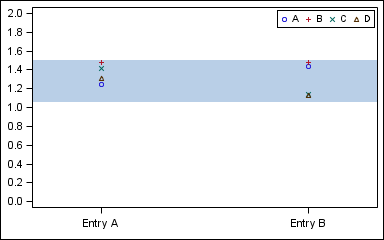
The "constant" bands are extended to the edge only if the X variable is numeric. So, change your X variable to numeric, and add a UDF for the labels and set x axis offsets to 0.2.
proc sgplot data=BandNum;
band x=x upper=1.5 lower=1.05;
scatter x=x y=y / group=group name='a';
yaxis values=(0 to 2 by 0.2) display=(nolabel);
xaxis offsetmin=0.2 offsetmax=0.2 display=(nolabel) values=(1 2);
keylegend 'a' / location=inside position=topright;
run;

Don't miss out on SAS Innovate - Register now for the FREE Livestream!
Can't make it to Vegas? No problem! Watch our general sessions LIVE or on-demand starting April 17th. Hear from SAS execs, best-selling author Adam Grant, Hot Ones host Sean Evans, top tech journalist Kara Swisher, AI expert Cassie Kozyrkov, and the mind-blowing dance crew iLuminate! Plus, get access to over 20 breakout sessions.
Learn how use the CAT functions in SAS to join values from multiple variables into a single value.

Find more tutorials on the SAS Users YouTube channel.
 Click image to register for webinar
Classroom Training Available!
Select SAS Training centers are offering in-person courses. View upcoming courses for:
-
2 replies
-
08-02-2012 07:59 AM
-
1369 views
-
0 likes
-
3 in conversation
-
