- Home
- /
- Programming
- /
- Graphics
- /
- BARCHART/SCATTERPLOT combination - any way to stop bars "floating" abo...
- RSS Feed
- Mark Topic as New
- Mark Topic as Read
- Float this Topic for Current User
- Bookmark
- Subscribe
- Mute
- Printer Friendly Page
- Mark as New
- Bookmark
- Subscribe
- Mute
- RSS Feed
- Permalink
- Report Inappropriate Content
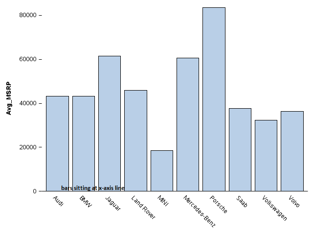
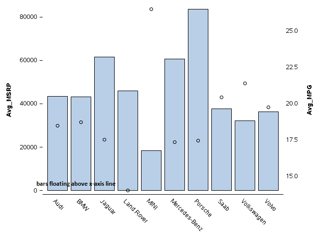
I have a combination BARCHART/SCATTERPLOT in GTL (EG 7.1/9.4). I've noticed for this combination that there's some sort of padding going on such that the y and y2 minimum values and hence the bars automatically float up a bit instead of sitting right on the x axis line as they do when not combined with the SCATTERPLOT. It's probably easier to understand visually so I attached a simplified version of the floating situation plus the same graph with the SCATTERPLOT statement commented out to illustrate the normal situation. Here's the applicable code:
proc sql;
	create table work.cars as

	select distinct Make, mean(MSRP) as Avg_MSRP, mean(MPG_CITY) as Avg_MPG
		from sashelp.cars
			where Origin = 'Europe'
				Group by Make;
run;
quit;

proc template;
	define statgraph test;
		begingraph / backgroundcolor=white border=false;
			layout overlay / walldisplay=none
				xaxisopts=(display=(line tickvalues ))
				yaxisopts=(display =(label tickvalues ticks))
				y2axisopts=(display=(label tickvalues));
				barchart x=Make y=Avg_MSRP;
				scatterplot x=Make y=Avg_MPG /yaxis=y2; /*comment this out to get the normal situation*/
			endlayout;
		endgraph;
	end;
run;

proc sgrender data=work.cars template=test;
run;
After playing with this for a while, I think I understand why this happens - the padding enables enough room for the SCATTERPLOT markers since otherwise they could be positioned right on or under the x axis line, which wouldn't look good.So I'm assuming this is a "working as designed" sort of thing.
I'm sure this seems like a minor issue, but - the x axis line is a brand standard requirement (otherwise I would just take it out), and a few of our users think the "floating bars" look sort of funny, especially when seen next to a graph where this does not happen. So my question is if there is any way to force the bars down to sit right on the x axis line in this sort of combination. I've played with many different options, but nothing so far has had the desired effect.
Thanks in advance for any help.


- Mark as New
- Bookmark
- Subscribe
- Mute
- RSS Feed
- Permalink
- Report Inappropriate Content
You are exactly right about why the bars are "floating" when overlaid with a scatter plot. Markers and lines generate an "offset" of the amount needed to ensure that a marker on the edge does not get clipped by half. However, if you are sure none of your markers are near the edge, you can use OFFSETMIN=0 and OFFSETMAX=0 on the x and y axes to get rid of the offset.
With newer plot statement like TEXT, we added a CONTRIBUTEOFFSET option that allows you to control if and where offsets should be added.
Also, with SGPLOT, we make the default x-axis Fit Policy is "split Rotate". This splits the tick values on white space to give you better arrangement. However, for GTL, you have to set it. Personally, I prefer split tick values instead of the long rotated ones.
- Mark as New
- Bookmark
- Subscribe
- Mute
- RSS Feed
- Permalink
- Report Inappropriate Content
That did the trick - thank you for the quick reply! ![]()
Don't miss out on SAS Innovate - Register now for the FREE Livestream!
Can't make it to Vegas? No problem! Watch our general sessions LIVE or on-demand starting April 17th. Hear from SAS execs, best-selling author Adam Grant, Hot Ones host Sean Evans, top tech journalist Kara Swisher, AI expert Cassie Kozyrkov, and the mind-blowing dance crew iLuminate! Plus, get access to over 20 breakout sessions.
Learn how use the CAT functions in SAS to join values from multiple variables into a single value.
Find more tutorials on the SAS Users YouTube channel.
 Click image to register for webinar
Classroom Training Available!
Select SAS Training centers are offering in-person courses. View upcoming courses for:


