- Home
- /
- Programming
- /
- Graphics
- /
- Anyone recognize this graph type?
- RSS Feed
- Mark Topic as New
- Mark Topic as Read
- Float this Topic for Current User
- Bookmark
- Subscribe
- Mute
- Printer Friendly Page
- Mark as New
- Bookmark
- Subscribe
- Mute
- RSS Feed
- Permalink
- Report Inappropriate Content
Hi,
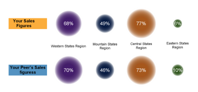
I'm working with some code that produces the graph below and the program is ugly (proc template). I seem to recall something similar in a SAS presentation or Training email in the last few years but can't put my finger on it. Does anyone recognize this type of graph with differing size circles representing relative percentages? Is this a custom graph or is there a SAS Proc that can generate them (other than proc template)?
Thanks!
--Ben

Accepted Solutions
- Mark as New
- Bookmark
- Subscribe
- Mute
- RSS Feed
- Permalink
- Report Inappropriate Content
It sounds like a BUBBLE plot to me but I may be missing something
- Mark as New
- Bookmark
- Subscribe
- Mute
- RSS Feed
- Permalink
- Report Inappropriate Content
This appears to be a custom graph, not from any SAS procedure I know of. Probably uses a BUBBLE plot, available in both GTL and SGPLOT.
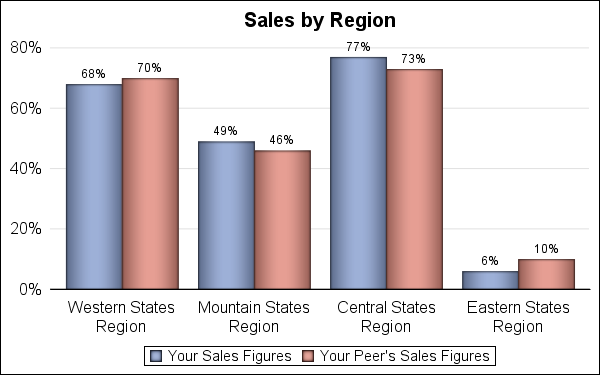
Generally, Usage of area for magnitude comparisons is not effective. Without the value labels, it would be hard to see which was higher. it woudl be preferable to use a clustered bar chart to represent this data that would deliver the data in a way that allows for better comparisons (below). But, often customers will ask for unique and different representation.
Code attached below. Some appearance options can be skipped.
%let gpath='.';
%let dpi=150;
ods html close;
ods listing image_dpi=&dpi gpath=&gpath;
data sales;
format Value percent8.0;
input Group $1-25 Category $26-50 Value;
datalines;
Your Sales Figures Western States Region 0.68
Your Sales Figures Mountain States Region 0.49
Your Sales Figures Central States Region 0.77
Your Sales Figures Eastern States Region 0.06
Your Peer's Sales Figures Western States Region 0.70
Your Peer's Sales Figures Mountain States Region 0.46
Your Peer's Sales Figures Central States Region 0.73
Your Peer's Sales Figures Eastern States Region 0.10
;
run;
ods graphics / reset width=4in height=2.5in imagename='Sales';
title 'Sales by Region';
proc sgplot data=sales noborder;
vbarparm category=Category response=value / group=Group
groupdisplay=cluster dataskin=pressed datalabel;
keylegend / title='';
yaxis display=(noline noticks nolabel) grid;
xaxis display=(nolabel noticks);
run;
- Mark as New
- Bookmark
- Subscribe
- Mute
- RSS Feed
- Permalink
- Report Inappropriate Content
It sounds like a BUBBLE plot to me but I may be missing something
- Mark as New
- Bookmark
- Subscribe
- Mute
- RSS Feed
- Permalink
- Report Inappropriate Content
Much appreciated!
--Ben
Don't miss out on SAS Innovate - Register now for the FREE Livestream!
Can't make it to Vegas? No problem! Watch our general sessions LIVE or on-demand starting April 17th. Hear from SAS execs, best-selling author Adam Grant, Hot Ones host Sean Evans, top tech journalist Kara Swisher, AI expert Cassie Kozyrkov, and the mind-blowing dance crew iLuminate! Plus, get access to over 20 breakout sessions.
Learn how use the CAT functions in SAS to join values from multiple variables into a single value.
Find more tutorials on the SAS Users YouTube channel.
 Click image to register for webinar
Classroom Training Available!
Select SAS Training centers are offering in-person courses. View upcoming courses for:


