- Home
- /
- Programming
- /
- Graphics
- /
- Annotating a Scatter plot with multiple Star Plots, rose plots or pola...
- RSS Feed
- Mark Topic as New
- Mark Topic as Read
- Float this Topic for Current User
- Bookmark
- Subscribe
- Mute
- Printer Friendly Page
- Mark as New
- Bookmark
- Subscribe
- Mute
- RSS Feed
- Permalink
- Report Inappropriate Content
Hello,
I would like to use star plots, rose plots or polar plots on a scatter plot.
A search with google has not turned up a solution (i did find out how to produce individual star plots).
If someone could point me in the right direction, I would really appreciate it.
Best
Dan
- Mark as New
- Bookmark
- Subscribe
- Mute
- RSS Feed
- Permalink
- Report Inappropriate Content
You need to tell us more. what exactly do you want? what did you find? why isn't it suitable?
- Mark as New
- Bookmark
- Subscribe
- Mute
- RSS Feed
- Permalink
- Report Inappropriate Content
Good Morning,
As requested here is some more detail.
I would like to create a bivariate scatter plot based on two continuous variables.
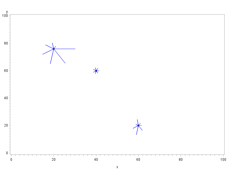
Rather than a simple dot or star representing the point, or a bubble which could differ in size based on a third variable, I would like to use a starplot (rose or polar plot) which would change shape based on 7 or 8 other variables.
The starchart procedure (at least as I understand it) can produce the starplots, but they are not organized on the plot based on two other continuous variables.
My thought would be to use gplot to create the scatter plot, but use annotate to create the starplot that would then be placed on the scatter plot at the appropriate point.
I hope that helps.
Best
Dan
- Mark as New
- Bookmark
- Subscribe
- Mute
- RSS Feed
- Permalink
- Report Inappropriate Content
Here's one way to do it ...
data foo;
input x y val1 val2 val3 val4 val5 val6 val7;
datalines;
40 60 1 1 1 1 1 1 1
20 76 1 2 3 4 5 6 7
60 20 1 2 1 2 3 2 1
;
run;
data anno_stars; set foo;
xsys='2'; ysys='2'; hsys='3'; when='a';
size_factor=1.8;
function='pie'; rotate=0; color='blue';
angle=(360/7)*1; size=size_factor*val1; output;
angle=(360/7)*2; size=size_factor*val2; output;
angle=(360/7)*3; size=size_factor*val3; output;
angle=(360/7)*4; size=size_factor*val4; output;
angle=(360/7)*5; size=size_factor*val5; output;
angle=(360/7)*6; size=size_factor*val6; output;
angle=(360/7)*7; size=size_factor*val7; output;
run;
goptions gunit=pct;
axis1 order=(0 to 100 by 20);
axis2 order=(0 to 100 by 20);
symbol1 value=circle height=2.0 color=black interpol=none;
proc gplot data=foo anno=anno_stars;
plot y*x=1 / vaxis=axis1 haxis=axis2;
run;
- Mark as New
- Bookmark
- Subscribe
- Mute
- RSS Feed
- Permalink
- Report Inappropriate Content
@GraphGuy You cheated! You are supposed to move and then draw!
After all these years, I never thought of using function pie to do it in one step.
There's always new tricks to learn...
- Mark as New
- Bookmark
- Subscribe
- Mute
- RSS Feed
- Permalink
- Report Inappropriate Content
Thank you Robert,
This is excellent!
It will do the job!
Any ideas aboutt changing the bars to stars?
Thank you again.
Best
Dan4
Don't miss out on SAS Innovate - Register now for the FREE Livestream!
Can't make it to Vegas? No problem! Watch our general sessions LIVE or on-demand starting April 17th. Hear from SAS execs, best-selling author Adam Grant, Hot Ones host Sean Evans, top tech journalist Kara Swisher, AI expert Cassie Kozyrkov, and the mind-blowing dance crew iLuminate! Plus, get access to over 20 breakout sessions.
Learn how use the CAT functions in SAS to join values from multiple variables into a single value.
Find more tutorials on the SAS Users YouTube channel.
 Click image to register for webinar
Classroom Training Available!
Select SAS Training centers are offering in-person courses. View upcoming courses for:


