- Home
- /
- Analytics
- /
- SAS Data Science
- /
- Tip: Create Graphs in a SAS Code Node Using %em_report
- RSS Feed
- Mark Topic as New
- Mark Topic as Read
- Float this Topic for Current User
- Bookmark
- Subscribe
- Mute
- Printer Friendly Page

- Mark as New
- Bookmark
- Subscribe
- Mute
- RSS Feed
- Permalink
- Report Inappropriate Content
You may know that you can use the SAS Code node in Enterprise Miner to incorporate custom code in your process flows. But did you know you can easily create interactive plots and table views in a SAS Code node? You can, and it only takes a few lines of code using the built-in %em_register and %em_report macros.
To get started, all you need are some data to plot and basic familiarity with %em_register and %em_report. I’ll demonstrate this using the SAS Code node to create some data from scratch and plot a graphical summary of the data.
This example assumes basic familiarity with the SAS Code node. If you haven’t used the SAS Code node, see the link at the end of this document for information on how to get started.
Example
Do the following in a SAS Code node:
Step 1: Register the dataset that you want to plot
This step is necessary but very simple. In a SAS Code node, type or copy and paste the following:
%em_register(KEY=randNorm, TYPE=data);
The %em_register macro call declares a dataset KEY that Enterprise Miner will recognize when we call a separate macro to plot the data. The KEY value is up to you. In this case, since the data are generated randomly, I’ve used “randNorm”.
Also notice that the TYPE is “data” because we are registering a dataset as opposed to a SAS catalog, file, or folder.
When %em_register is run, it defines a macro variable under the covers: &em_user_randNorm. We will use this variable as the name of the dataset we create using SAS Data step code in step 2. The macro variable will also be used by Enterprise Miner to manage the physical dataset we are creating. Specifically, %em_register ensures that the table is stored in the code node folder on the SAS server and that when the node is deleted, all tables properly registered are also correctly deleted.
Step 2: Create the data
Copy and paste the following code after the %em_register call. This SAS Data Step code creates a dataset named &em_user_randNorm with two random variables, X1 and X2. The dataset has 500 rows.
data &em_user_randNorm (drop= _:);
call streaminit(12345);
do _obs = 1 to 500;
x1 = rand('NORMAL',0,1);
x2 = rand('NORMAL',0,1);
output;
end;
run;
Step 3: Call %em_report to create the graph
Suppose we want to see a scatter plot of the two generated variables. Paste the following code into the SAS Code node below the Data Step code:
%em_report(KEY=randNorm,VIEWTYPE=scatter,X=x1,Y=x2,DESCRIPTION=Scatter of X1 by X2,AUTODISPLAY=y);
When you run the Code Node and examine the results, you will see a scatterplot of X1 and X2:
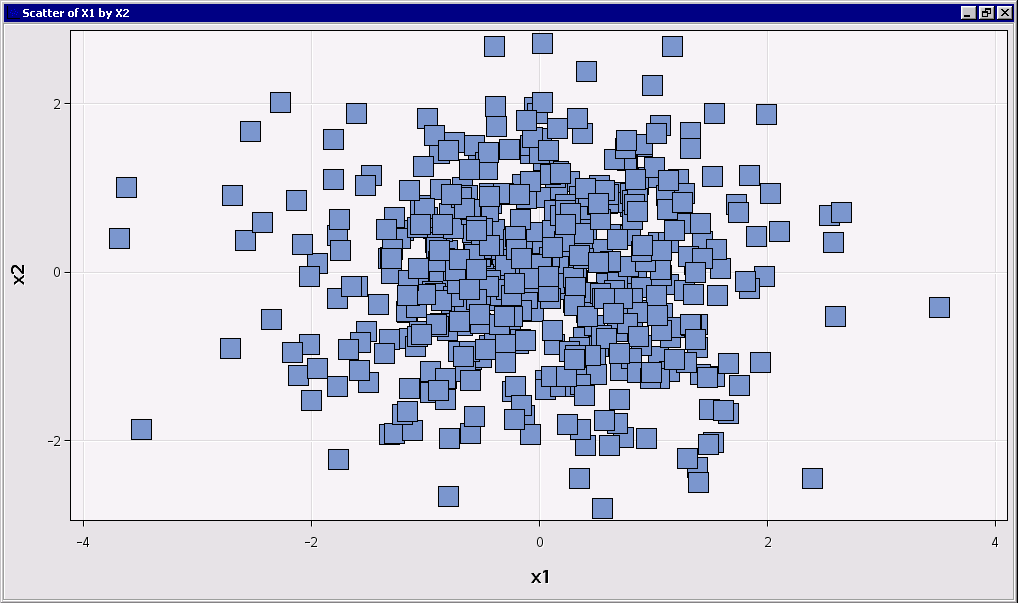
This plot may look familiar. That's because it is an interactive graph just like the output from the standard nodes in the Enterprise Miner tool bar. So you can hover on any point to see a more information in a tool tip, or right click on the chart to display a context menu with interactive customization options.
About %em_report
When you call %em_report, you provide a list of name-value pairs in parentheses.
As with %em_register, the KEY value is required. This should be the same value (randNorm) that we used in step 1. This specification tells %em_report to plot the &em_user_randNorm dataset.
Most of the other macro parameters tell Enterprise Miner how to plot your data. In this case we requested a scatterplot (VIEWTYPE=scatter) with x1 on the x-axis and x2 on the y-axis. We also requested a title (DESCRIPTION) of “Scatter of X1 by X2”.
The final parameter (AUTODISPLAY) tells Enterprise Miner to display the graph as default output for the node (as opposed to requiring you to choose the scatterplot from a menu.) But all graphics created using %em_report are always available from the View menu of the results of the Code node, whether AUTODISPLAY is turned on (Y) or off (N).
This Example in Context
So why would anyone want to generate data and plot it with a SAS Code node?
Imagine that you want to understand how well an analytical technique works with data that have particular characteristics. If your interest is in segmentation, you might generate data with known clusters arranged in a particular configuration in input space, then compare the segmentations obtained using different clustering techniques.
The flow would look something like this:
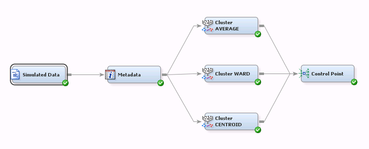
This flow consists of a SAS Code node that generates the data for the simulation, a Metadata node to assign roles for variables in the simulation dataset, and three Cluster nodes connected to a Control Point node. Each Cluster node uses a different segmentation method.
When you run the Simulated Data node, you would be able to examine your simulated data to confirm visually that they have the desired characteristics--the particular characteristics that you choose to summarize using %em_report. Then you could proceed to run the rest of the flow. You could even extend this approach, using the SAS Code node to vary the characteristics of the generated data (e.g., orientation or degree of separation between clusters) and seeing how they affect the segmentation results.
But you are not limited to using generated data with the %em_report macro. You could also use data from an upstream Data Source node, possibly after manipulating it (e.g., applying custom transformations) with your SAS Code Node. In this case the principles are the same as with the generated data, but your Data step code would need some adjustments:
%em_register(type=Data,key=MyKey);
data &em_user_MyKey;
set &em_import_Data;
/*custom transformation code goes here*/
run;
%em_report(
key=MyKey,
/*rest of plot specifications go here */
);
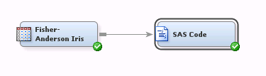
The flow would consist of a Data Source node followed by your SAS Code Node. For example:
Summary
We’ve seen how to generate and register data within a SAS Code node in Enterprise Miner and plot a scatterplot using the %em_report macro.
The %em_report macro supports many other view types including tables, bar charts, line charts, histograms—even constellation, lattice and 3D plots. To learn more about the supported view types and to see many more examples, see “Examples Using %EM_REPORT” in the SAS Enterprise Miner Extension Nodes Developer's Guide:
http://support.sas.com/documentation/cdl/en/emxndg/65358/PDF/default/emxndg.pdf
If you would like to learn more about how to incorporating custom SAS code in your Enterprise Miner flows, the same document can help you get started using the SAS Code node.

Don't miss out on SAS Innovate - Register now for the FREE Livestream!
Can't make it to Vegas? No problem! Watch our general sessions LIVE or on-demand starting April 17th. Hear from SAS execs, best-selling author Adam Grant, Hot Ones host Sean Evans, top tech journalist Kara Swisher, AI expert Cassie Kozyrkov, and the mind-blowing dance crew iLuminate! Plus, get access to over 20 breakout sessions.
Use this tutorial as a handy guide to weigh the pros and cons of these commonly used machine learning algorithms.

Find more tutorials on the SAS Users YouTube channel.
-
0 replies
-
04-03-2014 02:32 PM
-
3847 views
-
1 like
-
1 in conversation
-
