- Home
- /
- Analytics
- /
- SAS Data Science
- /
- Dysplaying SAS Reports in the Results Pane of an EM Code Node
- RSS Feed
- Mark Topic as New
- Mark Topic as Read
- Float this Topic for Current User
- Bookmark
- Subscribe
- Mute
- Printer Friendly Page
- Mark as New
- Bookmark
- Subscribe
- Mute
- RSS Feed
- Permalink
- Report Inappropriate Content
Hey All,
I am interested in generating some automatic graphs to validate my model fits.
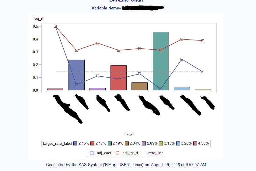
In particular I want graphs that show the frequency of the leveles of a variable as a bar graph and the target_rate and coeficient assigned to that category as line graphs (see example):
I have created code that programatically generates these graphs (I include the code for class variables below as refrence)
%let stat_nm= %substr(&EM_IMPORT_DATA.,%length(&EM_LIB.)+2,%length(&EM_IMPORT_DATA.) - (%length(&EM_LIB.)+1) - 6) ;

%let stat_tbl = &EM_LIB..&stat_nm._Class;


proc sql;
	select
		model into :model_nm separated by ''
	from &EM_LIB..&EM_NODEID._CMETA_TRAIN
		where Role = 'TARGET';
quit;

%let effect_tbl = &EM_LIB..&model_nm._EFFECTS;

proc sql;
	create table work.class_vars_raw as
		select
			base.*,
			base.event_count/(base.event_count+base.non_event_count) as target_rt,
			(base.event_count+base.non_event_count) as freq,
			(base.event_count+base.non_event_count)/ttl_tbl.num_subs as freq_rt,
			base.level_fix,
			eff_tbl.effect,
			eff_tbl.effectlabel,
			coalesce(eff_tbl.coefficient,0) as coefficient,
			eff_tbl.classlevel
		from (
			select
				variable,
				level,
				trim(prxchange("s/[^A-Za-z0-9]//",-1,trim(substr(level,1,32-length(variable))))) as level_fix,
				sum(
					case
						when targetvalue = '0'
						then count
					end
				) as non_event_count,
				sum(
					case
						when targetvalue = '1'
						then count
					end
				) as event_count

			from &stat_tbl.
				where role = 'INPUT'

				group by 1,2,3
		)as base

		left join(
			select
				variable,
				sum(count) as num_subs
			from &stat_tbl.
				group by 1
		) as ttl_tbl
			on base.variable = ttl_tbl.variable

		left join (
			select
				variable,
				effect,
				trim(prxchange("s/[^A-Za-z0-9]//",-1,trim(classlevel))) as level_fix,
				effectlabel,
				coefficient,
				classlevel
			FROM &effect_tbl.
		)as eff_tbl
			on  eff_tbl.variable = base.variable
			 and upcase(base.level_fix) = upcase(eff_tbl.level_fix)
	;
quit;

proc sql;
	create table work.class_vars as
		select
			base.*,
			put(base.target_rt,percent10.2) as target_rate_label,
			base.target_rt/max_tgt as adj_tgt_rt,
			base.coefficient/max_coef as adj_coef,
			0 as zero_line
		from work.class_vars_raw as base

		left join (
			select
				variable,
				max(abs(target_rt)) as max_tgt,
				max(abs(coefficient)) as max_coef
			from work.class_vars_raw
				group by 1
		) as max_tbl
			on base.variable = max_tbl.variable
	;
quit;

/* -------------------------------------------------------------------
   Code generated by SAS Task

   Generated on: Thursday, August 18, 2016 at 3:25:05 PM
   By task: Bar-Line Chart

   Input Data: BIApp_USER:WORK.CLASS_VARS
   Server:  BIApp_USER
   ------------------------------------------------------------------- */

/* -------------------------------------------------------------------
   Sort data set BIApp_USER:WORK.CLASS_VARS
   ------------------------------------------------------------------- */

PROC SQL;
	CREATE VIEW WORK.SORTTempTableSorted AS
		SELECT T.LEVEL, T.freq_rt, T.adj_coef, T.adj_tgt_rt, T.zero_line, T.target_rate_label, T.VARIABLE
	FROM WORK.CLASS_VARS as T
;
QUIT;
SYMBOL3
	INTERPOL=JOIN

	HEIGHT=10pt
	VALUE=NONE
	CV=CX969696
	CO=CX969696
	LINE=4
	WIDTH=2
	CI=CX969696
;
SYMBOL2
	INTERPOL=JOIN

	HEIGHT=10pt
	VALUE=SQUARE
	LINE=1
	WIDTH=2

	CV = _STYLE_
;
SYMBOL1
	INTERPOL=JOIN

	HEIGHT=10pt
	VALUE=SQUARE
	LINE=1
	WIDTH=2

	CV = _STYLE_
;
Legend2
	FRAME
	;
Legend1
	FRAME
	;
Axis1
	STYLE=1
	WIDTH=1
	MINOR=NONE


;
Axis2
	STYLE=1
	WIDTH=1


;
Axis3
	STYLE=1
	WIDTH=1
	MINOR=NONE
	major=NONE
	LABEL=NONE
	value=NONE


 ;
TITLE;
TITLE1 "Bar-Line Chart";
FOOTNOTE;
FOOTNOTE1 "Generated by the SAS System, on %TRIM(%QSYSFUNC(DATE(), NLDATE20.)) at %TRIM(%SYSFUNC(TIME(), TIMEAMPM12.))";
PROC GBARLINE DATA=WORK.SORTTempTableSorted
;
	BAR	 LEVEL
 /
	SUMVAR=freq_rt
	SUBGROUP=target_rate_label
FRAME	TYPE=SUM
	MISSING
	COUTLINE=BLACK
	RAXIS=AXIS1
	MAXIS=AXIS2
	LEGEND=LEGEND2
;
	PLOT / SUMVAR=adj_coef
	TYPE=SUM
	AXIS=AXIS3
	LEGEND=LEGEND1
;
	PLOT / SUMVAR=adj_tgt_rt
	TYPE=SUM
	AXIS=AXIS3
;
	PLOT / SUMVAR=zero_line
	TYPE=SUM
	AXIS=AXIS3
;
	BY VARIABLE;

/* -------------------------------------------------------------------
   End of task code.
   ------------------------------------------------------------------- */
RUN; QUIT;

TITLE; FOOTNOTE;
GOPTIONS RESET = SYMBOL;
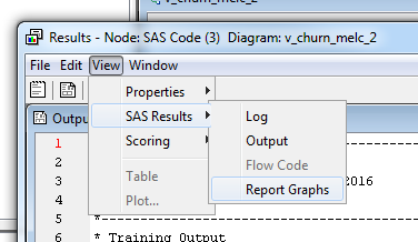
The problem is when i put this into the report code section of an em code node, it does not display it in the rersults window, to see them i have to navigate to the report.
I have read that you cna have it display by using the %EM_MODEL macro, but I can't seem to find a way to use the GBARLINE plot with %EM_MODEL.
Is there a better way to display these graphs? Also, in EG they look alot nicer and have hoverable tool tips, whereas in EM they do not, is there a way to add that functionality?
P.S. I'm running EM 13.2 and depot 9.04 M2
- Mark as New
- Bookmark
- Subscribe
- Mute
- RSS Feed
- Permalink
- Report Inappropriate Content
Hi. I think you are referring to the %em_report macro. It does have an AUTODISPLAY option and supports reference lines, paneling and grouping but I'm not sure about overlays. If you haven't already, check out the options supported in the extension node guide.
Actually, I wonder if you are trying to overload the chart with too much information. For example the legend and the zero reference line at 1.5 seem puzzling. Would you not be better off with separate (stacked) charts for frequencies and rates?
Ray
- Mark as New
- Bookmark
- Subscribe
- Mute
- RSS Feed
- Permalink
- Report Inappropriate Content
Hi,
To clarify, the line graphs on that chart are on a secondary axis, the zero line there represents the 0 of that secondary axis.
The idea here is to see the corelation between the coeficients and the target rate on the individual categories, overlayed with the frequency of a category. (often the size of the bucket explains small inconsistencies in the corelation mentioned above).
Theoretically I could look at the data seperatly, i suppose that is a solution, but i would try to place them next to each other so I can overlay them in my head, so that seems sub-optimal.
Don't miss out on SAS Innovate - Register now for the FREE Livestream!
Can't make it to Vegas? No problem! Watch our general sessions LIVE or on-demand starting April 17th. Hear from SAS execs, best-selling author Adam Grant, Hot Ones host Sean Evans, top tech journalist Kara Swisher, AI expert Cassie Kozyrkov, and the mind-blowing dance crew iLuminate! Plus, get access to over 20 breakout sessions.
Use this tutorial as a handy guide to weigh the pros and cons of these commonly used machine learning algorithms.
Find more tutorials on the SAS Users YouTube channel.


