Lets perform Cluster analysis with SAS Visual Analytics
There are many benefits of segmenting data, I will mention a few here:
- it permits you to get better insights into your customers.
- It lets you increase revenue, by understanding customers in more detail and targeting communications in a way that they are more receptive to.
- It allows you to easier conduct an analysis of your data stored in your database, helping to identify potential opportunities and challenges based within it.
Let’s look at a simple example to demonstrate benefits of segmentation. The data used in example is charitable donations made to an American veterans’ association.
In SAS Visual Analytics in the Object pane, double-click Cluster and select in Data pane necessary variables onto the cluster example. Five clusters are created by default.

On the Options pane, changing the Plot layout option to stack can make it easier to discern the clusters.

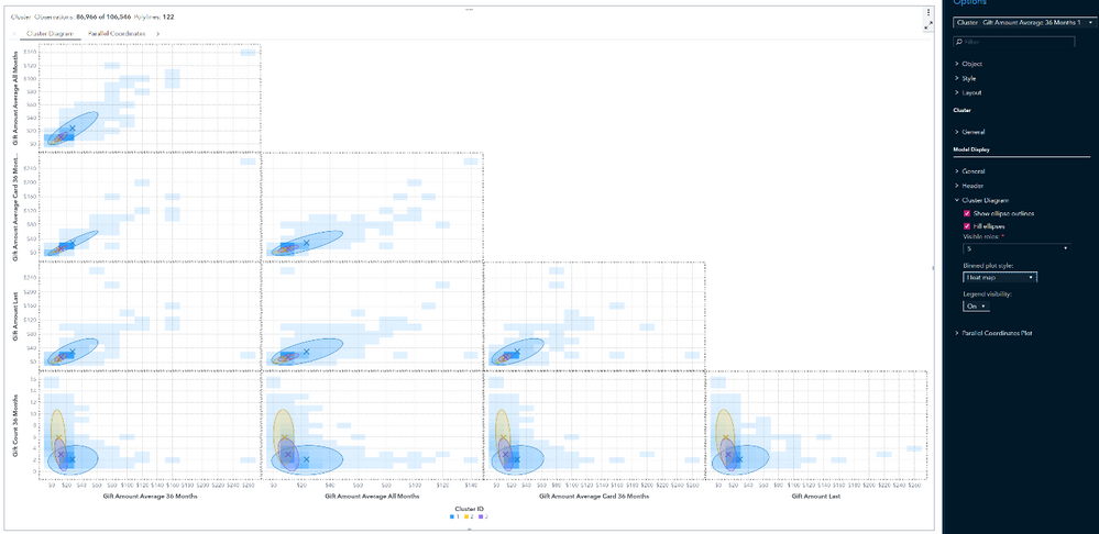
The cluster matrix displays a two-dimensional projection of each cluster onto a specified number of effect pairs. These projections are useful for spotting cluster similarities and differences within the plotted effect pairs.

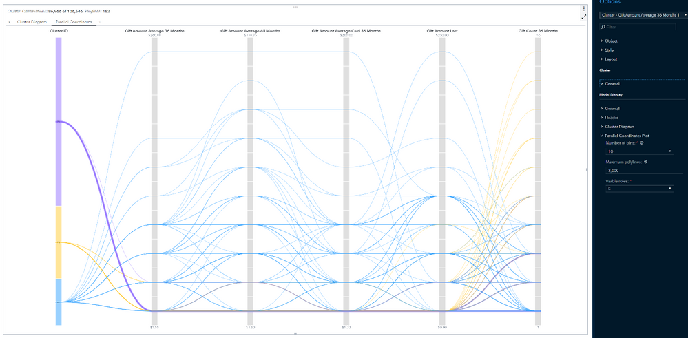
The parallel coordinates plot shows patterns in the data and clusters. In this plot, the cluster ID is on the far left. Each variable is a column in which its binned range of values are displayed vertically. Color-coded polylines are drawn from each cluster.
They show which range of values the cluster contains for every variable that is displayed along the top. Using the Visible roles option under the Parallel Coordinates section on the Options pane, you control the number of variables displayed at the top.
You can use the parallel coordinates plot to make several inferences about the data. You can adjust the plot to explore the data based on cluster membership, a specified range for one or more variables, or both.

When there are several clusters, it can be confusing to determine how each cluster classifies the data. To view the polylines for a single cluster only, select that cluster ID on the far left. Notice that the polylines for all other clusters are dimmed. This enables you to focus on one cluster. Hold down the Ctrl key and click multiple clusters to show only those clusters.

Click a variable name at the top of the plot to select that variable. This action changes the color gradient of the polylines so that larger values are darker than smaller values. You can click and drag from the top or bottom of a variable range to adjust the range of values that is shown. You can repeat this step for multiple variables.

When you combine the selection of clusters and variable ranges, you can restrict the display to the data that interests you.
The details table is displayed when you click the Maximize button. The table contains the Centroid statistics, Cluster Summary and other cluster information.


