- Home
- /
- SAS Communities Library
- /
- When Are The Big Football Weekends? - SAS Visual Analytics Knows!
- RSS Feed
- Mark as New
- Mark as Read
- Bookmark
- Subscribe
- Printer Friendly Page
- Report Inappropriate Content
When Are The Big Football Weekends? - SAS Visual Analytics Knows!
- Article History
- RSS Feed
- Mark as New
- Mark as Read
- Bookmark
- Subscribe
- Printer Friendly Page
- Report Inappropriate Content
My favorite time of year is fast approaching...football season! I love everything about American football, both college and the NFL. The two teams I support are the Carolina Panthers and the NC State Wolfpack. Throughout the season, if either team is playing at home, you will find me cheering them on in each team's respective stadium. When the game schedules are released, I'm always curious as to when the "Big Weekends" are (the weekends where I go to both a Panthers and NC State home game).

This year I decided to use SAS Visual Analytics to build a visualization that displays both the NC State and the Panther's home games. Doing so allows me to easily pick out the "Big Weekends." A schedule chart is an ideal choice to show this.
Built Schedule Chart
The built schedule chart that comes with SAS Visual Analytics Designer has the ability to display events of varying duration that overlap across time. However, there is one limitation when it comes to using the schedule chart: it can't be used as the source of interactions. This means that you can't select a particular segment of time and use that selection to brush or filter another object.
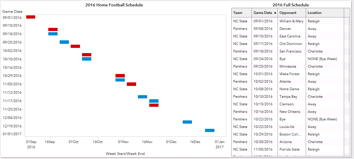
For example, in the dashboard below, I have used the out of the box schedule chart to show only the home games for the two teams. The table on the right shows the full schedule of home and away games.
I would like to be able to click a time segment in the schedule chart and have the the table filter show me the details for the game I have selected. The schedule chart does not allow this (even when a group role is assigned). When I'm in the interactions view, the option to use the schedule chart as the source of an interaction isn't available (the pencil doesn't appear when I roll my mouse over the object).
Building a Custom Graph
Fortunately, we can build our own custom graph that looks almost identical to the out of the box schedule chart and have this feature enabled! Below, I explain how to make this plot using the SAS Visual Analytics Graph Builder as part of the community custom graph series.
It's fairly easy once you start using the VA Graph Builder from the right panel in VA Home (look for Custom Graph) or from the object tab in the left panel in Visual Analytics Designer.
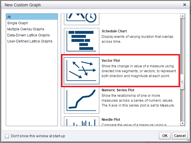
In Visual Analytics 7.3, there is a Vector Plot available in the New Custom Graph gallery. From this gallery that is on the initial page, scroll down and select the Vector Plot graph.
Edit Roles
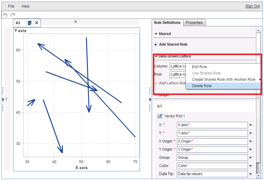
Once you have selected this plot, the next step is to edit the roles that come with the stock Vector Plot template. First, we will remove the two Data-Driven Lattice roles. This can be achieved by clicking the small arrow to the right of these roles and selecting Delete Role.
Do this for both the Column and Row Roles under the Data Driven Lattice menu.
Next, continue to edit the roles that come with the stock Vector Plot. These edits will enable the plot to show the data the way we want. First, edit the X role under Vector Plot 1. This can be achieved by clicking the small arrow to the right of the role and selecting Edit Role. After clicking Edit Role you will be presented with a dialog box asking how you wish to edit the role. For this role, we want to rename it "Week End" and change the classification to Datetime.
Click OK. You will then be presented with a dialog box asking you to confirm that both the X and X Origin classifications will now be Datetime. Click OK.
Using the same method, change the Y role under Vector Plot 1 be Datetime. You will also confirm you want the Y Origin classification to be Datetime.
You should also rename all the roles to be more appropriate for the data we are going to feed the visualization. This can be done via the same method for how we renamed the X role. However, we do NOT need to change the classification. For each role, simply select Edit Role and edit the names as below:
- X = Week End
- Y = Game Day
- X Origin = Week Start
- Y Origin = Game Day
- Group = Location
We now need to share two of the roles. The two roles we will share are: Game Day (originally Y) and Game Day (originally Y Origin). This can be achieved by clicking the small arrow to the right of the Y Origin (now called "Game Day") role and selecting "Create Shared Role With Another Role". Select the "Game Day" Role. You will be presented with a dialog screen of what to name your new shared role. Name it "Game Day" and leave the classification as Datetime.
Edit Properties
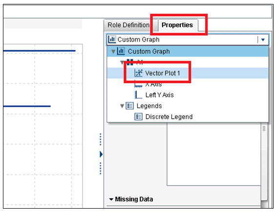
We will now need to edit some of the properties of our new custom graph. Click the "Properties" tab on the upper right of the screen. From the main drop down at the top, select "Vector Plot 1".
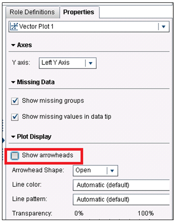
The properties for the Vector Plot will be displayed. From here, uncheck the box "Show arrowheads".
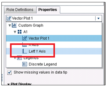
Next, from the top drop down on the "Properties Tab" select "Left Y Axis".
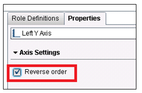
Under the Left Y Axis Properties, check the option "Reverse Order".
Now you've completed your custom graph! Click File -> Save and save your graph with an appropriate name. I chose to name mine "Football Home Schedules".
Use Graph in a Report
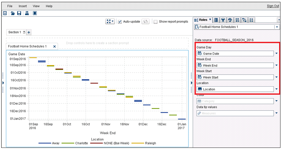
The final step is to use your graph in a report. For the data, you can use the data named "Football_Season_2016.csv" that is attached to this post as a csv file. Be sure this data is available in SAS Visual Analytics Designer. Place your newly created custom graph on the report canvas and map the data to the graph as shown in the Roles tab on the right of the screen shot below:
Edit Custom Graph Properties
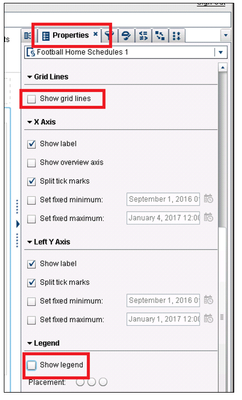
Next, we will need to edit the properties of our new custom graph. Select the "Properties" tab uncheck the options "Show grid lines" and "Show legend".
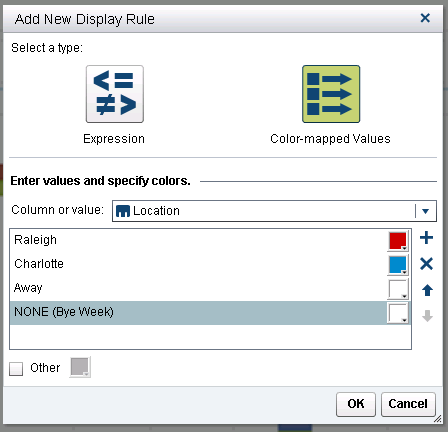
The last step is to color the segments on the plot to the appropriate colors of the Wolfpack and Panthers. In order to do this, we will create a display rule. If you have never created a display rule before, instructions on how to do so can be found here (under the "Add Display Rules to a Graph Using Color-Mapped Values" section).
Create a display rule for your schedule chart which matches the screen shot below:
If you're having trouble getting the colors for the Wolfpack, Panthers, or other values correct, here are the HTML codes for them:
Wolfpack - CC0000
Panthers - 0088CE
Away - FFFFFF
NONE (Bye Week) - FFFFFF
Edit Graph Styles
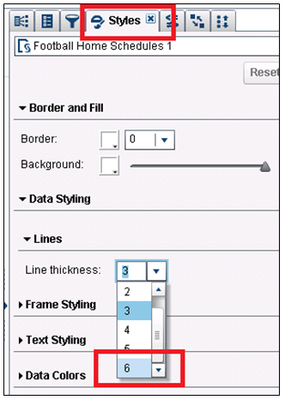
The final step to make our custom graph really look like the out of the box schedule chart is to edit the styles of the graph. Select the "Styles" tab and for "Line Thickness" select "6".
Add Table
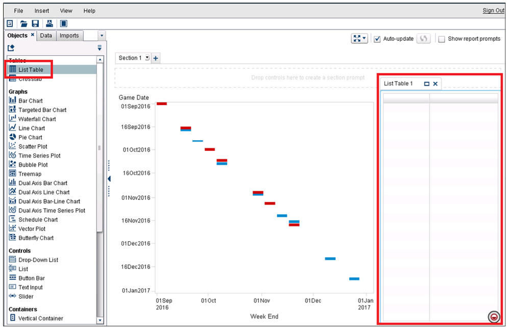
Your custom schedule chart is now working. Now, all we have to do is add the table. From the "Objects" tab, under the "Tables" section, drag a table to the left of the graph already on the reporting canvas:
For your new table object, add the following variables in this order:
- Team
- Game Date
- Opponent
- Location
Once added, sort the table by the "Game Date" variable.
Interactive Schedule Chart
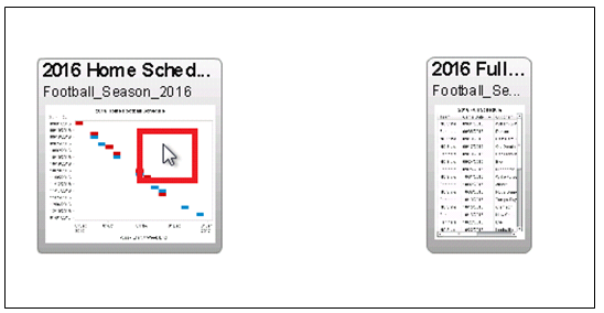
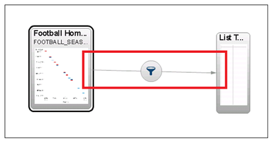
The best part is next. Since we have built our own schedule chart, we can use it as the source of interactions. Click the interactions tab. Roll your mouse over the graph object and you will see the pencil. This means that the desired interaction is now possible! Click and drag the pencil toward the list table and create a filter interaction.
Click "Close" to exit the interactions view.
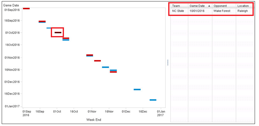
Now your two objects will interact. You've built an interactive schedule chart that can filter the table! Below I have selected an NC State home game in the graph and the table shows me the details of the game: October 1st, against Wake Forest in Raleigh.
Pretty cool! If you like, you can continue to label the objects as you see fit. I added the following labels:
- Graph - "2016 Home Football Schedules"
- Table - "2016 Full Schedules"
Use the Report to Visualize the "Big Weekends"
In the screen shot below, I've opened the report in SAS Visual Analytics Viewer. I have selected all the weekends that have both a Panthers and NC State home game (once selected, the line turns grey). The graph shows me visually when the "Big Weekends" are and the table tells me the details (game date and opponent).
Looks like there's going to be a total of 4 "Big Weekends" this year! Can't wait! GO Pack! GO Panthers!
How to Make the Example Work for You
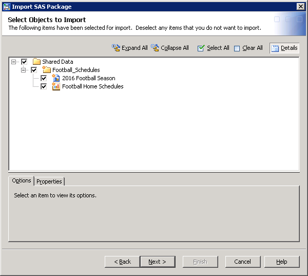
This example was created in SAS Visual Analytics 7.3. Attached is a SAS package file containing the sample report and custom graph. Also, as mentioned before, the data in csv file format is also attached. Load the csv file into memory on your Visual Analytics instance and you will be able to import this package if you have access to the SAS Management Console 7.3. Please refer to these instructions.
If you do not have access, contact your SAS Visual Analytics Administrator. Be sure to select the report when importing.
- Mark as Read
- Mark as New
- Bookmark
- Permalink
- Report Inappropriate Content
The possibilities with VA are endless.
Don't miss out on SAS Innovate - Register now for the FREE Livestream!
Can't make it to Vegas? No problem! Watch our general sessions LIVE or on-demand starting April 17th. Hear from SAS execs, best-selling author Adam Grant, Hot Ones host Sean Evans, top tech journalist Kara Swisher, AI expert Cassie Kozyrkov, and the mind-blowing dance crew iLuminate! Plus, get access to over 20 breakout sessions.
Free course: Data Literacy Essentials
Data Literacy is for all, even absolute beginners. Jump on board with this free e-learning and boost your career prospects.
