- Home
- /
- SAS Communities Library
- /
- Using Path Analysis to visualize customers’ attendance to marketing ev...
- RSS Feed
- Mark as New
- Mark as Read
- Bookmark
- Subscribe
- Printer Friendly Page
- Report Inappropriate Content
Using Path Analysis to visualize customers’ attendance to marketing events
- Article History
- RSS Feed
- Mark as New
- Mark as Read
- Bookmark
- Subscribe
- Printer Friendly Page
- Report Inappropriate Content
Analyzing customers’ attendance to marketing events or workshops helps to better understand current trends and customer interests. In this article, I will explain how you can visualize customers’ attendance using the Path Analysis object in SAS Visual Analytics.
The business need
Many companies are using Customer Relationship Management (CRM) systems to record customers' attendance to different marketing events or activities targeting specific customers. In this business case, we will visualize customers' attendance to different marketing events. The objective is to identify how many customers attended (Attended), registered and did not attend (No Show) or customers who attended a specific event and did not register to other(s) (Not Registered).
When you prepare a marketing event, you have a specific audience in mind. It is important to analyze if that identified audience attended or not to better target future events and take corrective actions whenever needed.
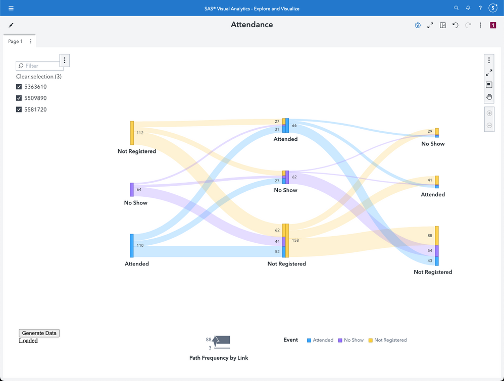
Here is the kind of report, we will design:
Select any image to see a larger version.
Mobile users: To view the images, select the "Full" version at the bottom of the page.
As you can see, we have selected three events which appear in a defined sequence (from left to right) in the path analysis object. Each event has information about the customers' attendance. The lines between each status give information about the importance of the flow.
Please note that the report shows event IDs and not the event name. The objective is to anonymize the data. You can of course display the event names.
The data
The most important part in a visualization is the underlying data. In the current case study, the data set comes from a CRM database and is loaded into a CAS table.
The status variable in the source data has only two possible values: Attended, No Show. As you may have noticed in the picture above, we also have a value for “Not Registered” customers. This is a calculated column and should be generated for all the contacts who at least registered once to one of the selected events. We will see in the next section of this article how the “Not Registered” value can be generated.
Another important point about the data is the amount of data which might be available in the CRM database. Knowing that we want to create a "Not Registered" value for the status, it might be a good idea to work on a subset. We don't want to generate a cardinal product of all customers and all the marketing events in the CRM database nor in the CAS table. To avoid generating such a "long" table, we will use a Viya job which will create a user-specific CAS table under the CASUSER library. That table will then be used as source for the path analysis object.
The Viya Job
SAS Viya Job is a stored SAS code which can be executed on demand using the SAS Job Execution web application or through URL based calls. We will use the last technique in our report. If you want more information about SAS Viya Jobs, please refer to these articles:
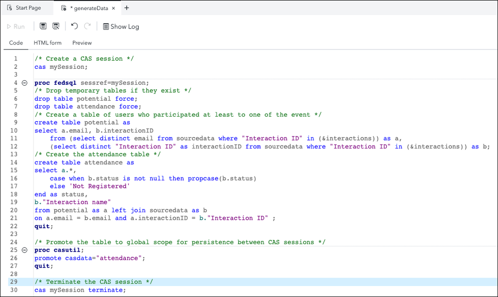
The code for the job is the following:
The lines 9 to 12 are generating a table which contains all the customers who attended at least to one of the events.
Lines 16 and 17 are generating the status for the "Not Registered" customers. The surrounding code handle the creation of the table which will be used in the report.
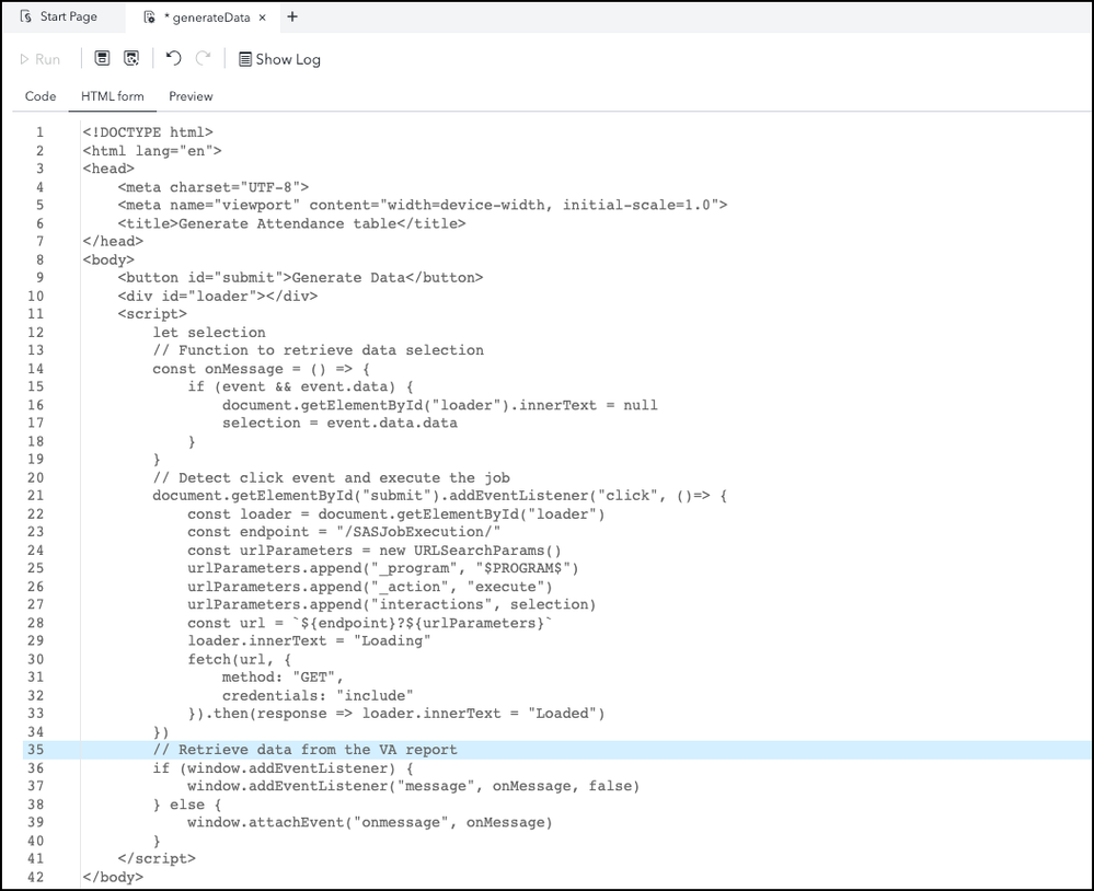
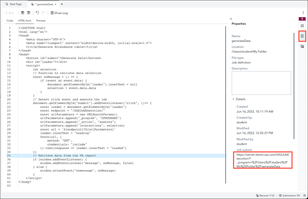
The job also has an HTML form to collect information for the selected events and to interact with the end-user through a button. The code for the HTML page is:
To improve the performance of the job execution. The Job Execution Compute context has been configured for reusability and pooling as described in this article.
The report
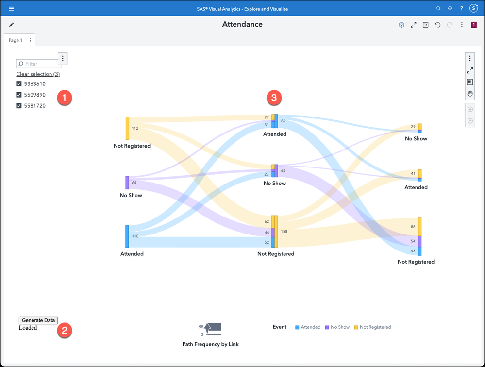
So far, we have seen the job definition, we explored the data and business need. It is time to create the report. We have only three objects in the report.
- A List Control object which points to the source data loaded into CAS from the CRM database. In this case, we used the event id to anonymize the data. You can of course use a more descriptive variable.
- Data-Driven Content object which points to the Viya job we defined. The event ID is the only information passed to the object. The URL for the Data-Driven Content is the one from the job created earlier. It can be retrieved in SAS Studio.
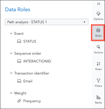
3. A Path Analysis object which is based on the Attendance table located into CASUSER CASLib. This table is generated on the fly based on the selection done in the List Control object and the execution of the job underlying the Data-Driven Content object.
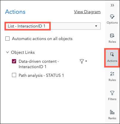
In terms of interaction between the objects, the List Control object filters the Data-Driven Content object.
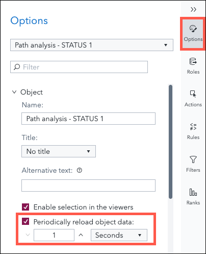
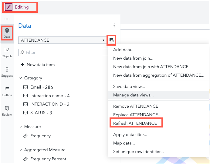
As we are updating the CAS table using a job, we need to force the refresh of the Attendance table to display the generated data. This should be done using the following option on the Path Analysis object.
Please note that the automatic refresh will only be effective in View mode. If you view the report in Edit mode, the data will not be refreshed unless you explicitly request it.
The demo
We have now all the components in place. The report has been saved and is now opened in View mode.
Conclusion
Path Analysis is a great visualization when analyzing the link between different events. In our use case, we had to generate data in order to analyze the attendance of a customers to different marketing events. Using the path analysis helps identifying the trends in attendance and can be use to take corrective actions when needed.
From a technical perspective, we have seen how it is possible to integrate a Viya Job into a Visual Analytics report and pass data to it based on a selection done in another report element. This technique can also be used for data entry like in Add rating functionality to your Visual Analytics report.
If you have questions or have a business use case you would like to discuss, please don’t hesitate to contact me.
Find more articles from SAS Global Enablement and Learning here.
- Mark as Read
- Mark as New
- Bookmark
- Permalink
- Report Inappropriate Content
Good demo concept
April 27 – 30 | Gaylord Texan | Grapevine, Texas
Registration is open
Walk in ready to learn. Walk out ready to deliver. This is the data and AI conference you can't afford to miss.
Register now and lock in 2025 pricing—just $495!
SAS AI and Machine Learning Courses
The rapid growth of AI technologies is driving an AI skills gap and demand for AI talent. Ready to grow your AI literacy? SAS offers free ways to get started for beginners, business leaders, and analytics professionals of all skill levels. Your future self will thank you.
- Find more articles tagged with:
- Data-Driven Content
- GEL
- Path Analysis
- sankey
- visual analytics
- viya
- Viya Jobs
