The interactive tables and charts displayed in Enterprise Miner nodes are designed by data mining experts to summarize modeling results in an easy-to-digest format. But there are several reasons why you may want to customize the output:
- To enhance or highlight information in a chart
- To gain a different perspective on your results
- To prepare results for presentation or publication
- Personal taste
I will walk through customization of interactive charts with four examples – from the simplest to the more advanced:
- Make cosmetic changes to default node output
- Recast default node output as new plot type
- Generate plot from a summary data table
- Use SAS Code node to restructure node table and plot it using the %em_report macro.
Example 1: Make Cosmetic Changes
Not surprisingly, the simplest changes to make are those having to do with chart labels and titles. For example, take the segment plot—a pie chart of segment frequencies—produced by the HP Cluster node:
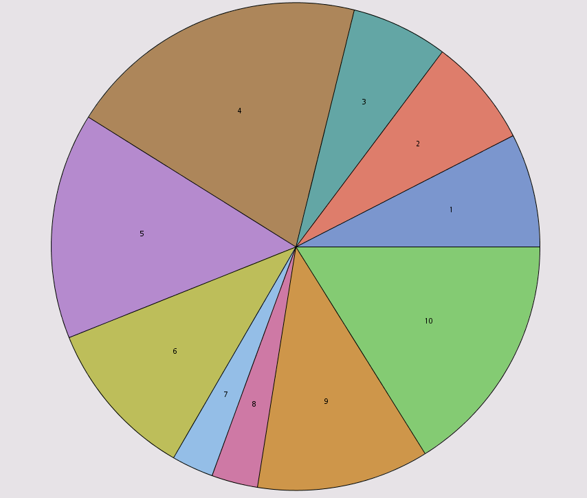
Each slice shows segment number as a label by default. You can easily add segment sizes and percentages to the slice labels.
Steps:
1. Run a cluster analysis using the HP Cluster node.
2. In the HP Cluster node results window, select the pie chart and right click on it to view available options. (You can also view available options using the pull-down Edit menu.)
3. Choose Graph Properties.
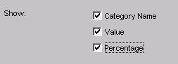
This opens the Properties – Pie dialog box.
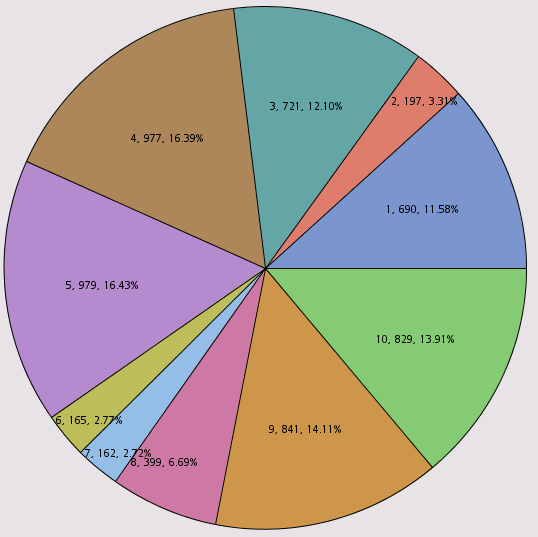
4. In the Pie panel, select Value and Percentage checkboxes.
5. Press Apply.
Segment sizes and percentages appear within each slice.
You could easily make other cosmetic changes to the chart, such as adding a title, using the Properties dialog box. But note that these changes to the default charts are only temporary—if you close the Results window and reopen it, the Segment chart will revert to its original form, without your customized labels. Sometimes that’s all you need—you may just want to take a quick screen shot to share with a colleague. But if you want your changes to to persist when you close and reopen your node results, you’ll need to create a new chart, rather than modifying the default pie chart. I’ll illustrate that in the next example.
Example 2: Recast a Chart
Although adding labels makes it easier to compare narrow slices, detailed slice labels can sometimes look crowded or busy. Besides, bar charts can facilitate comparisons when there are small slices. So let’s recast the pie chart as a horizontal bar chart like this one:
Steps:
1. Select the pie chart and press Plot ( ) button or choose Plot from View menu.
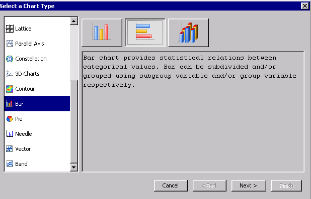
This opens the Select Chart Type dialog:
By choosing Plot, we are creating a new chart, rather than editing the original. Both the original pie and the new one will be visible the next time we open results for the HP Cluster node. The new chart will use the same underlying data as those that were used to create the original pie chart.
2. Choose the Bar, then the Vertical Bar option:
3. Click Next.
4. Assign chart roles as follows: Cluster = Category; Frequency = Response.

5. Press Finish.
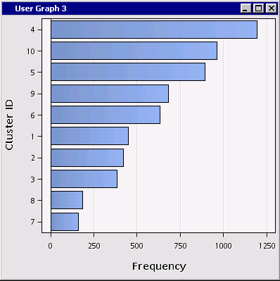
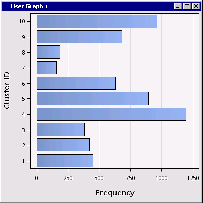
A horizontal bar chart is produced:
Now all we need to is to sort the bars in descending order of frequency.
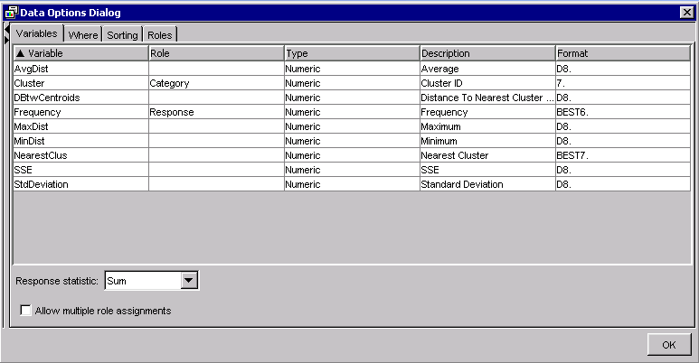
6. Right click on the bar chart and choose Data Options.
This opens the Data Options dialog:
7. In the Sorting tab, choose Response: Ascending.
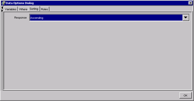
8. Press OK to dismiss the dialog.
Now the bars (segments) are sorted nicely in order of segment size:

Example 3: Create a Plot from a Data Table
Some node results are summarized in data tables without an accompanying chart. For example, the Cluster Centroids data table in the HP Cluster node:
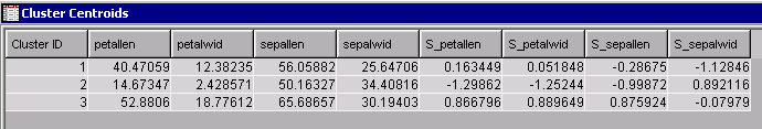
You can construct custom plots from these raw tables of results, for example, a profile plot of the cluster centroids:
By the way, this type of plot may not be suitable if you have a large number of inputs or they are measured on different scales. For this particular analysis I’ve used Fisher's Iris Data, whose four interval inputs (flower attributes) are all measured in millimeters. In addition, I've chosen the HP Cluster option to standardize the inputs.
Steps:
1. Select the Cluster Centroids table and choose Plot.
This opens the Select a Chart Type dialog.
2. Choose Line
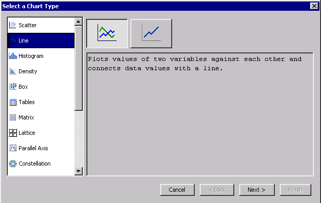
3. Press Next.
4. In the Select Chart Roles step, define roles as shown below:
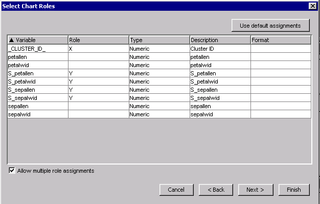
Note that I’ve selected the Allow Multiple Role Assignment checkbox. If it were left unchecked, you wouldn’t be able to assign more than one Y role.
5. Finish
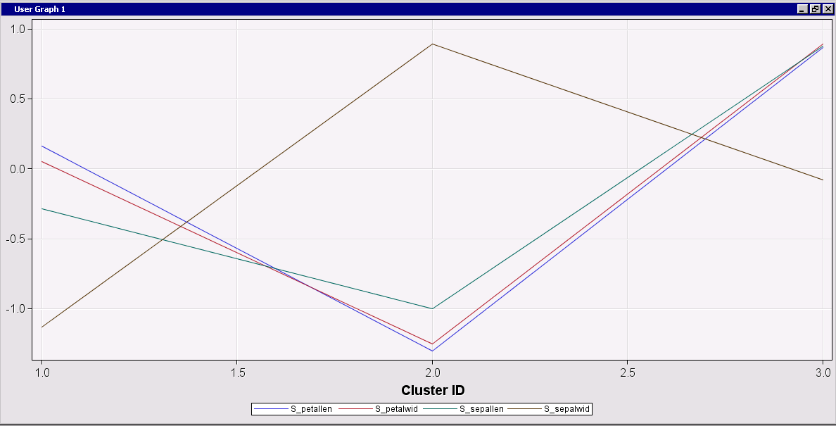
The profile plot is produced:
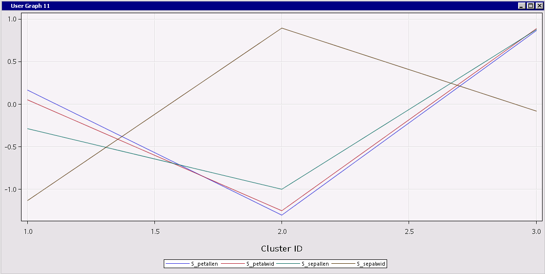
Examining the chart, you can easily compare the clusters. For example, relative to the other clusters, Cluster 2 has short, narrow petals, and short but wide sepals. Cluster 3 has relatively large petals and sepals.
Example 4: Use SAS code to restructure summary data and plot it
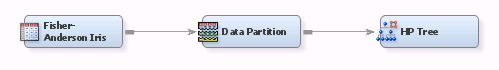
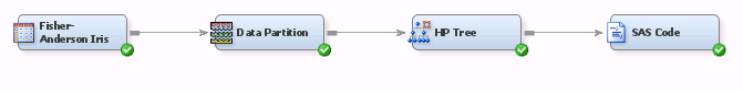
You may encounter cases where you want to plot results data that aren’t quite ready to plot. In these cases you can restructure the data before plotting it. For example, imagine that you have run a flow to produce a tree:
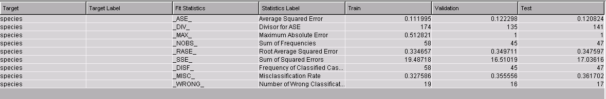
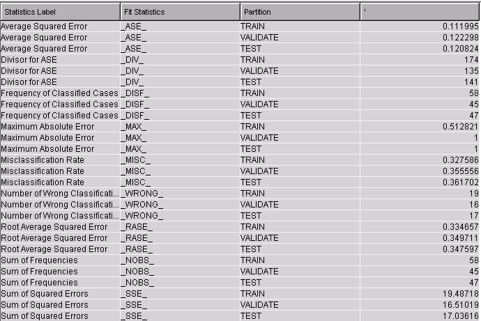
The HP Tree node produces a table of fit statistics by partition:
Suppose you want to create a chart to compare the partitions on each fit statistic. You can use the lattice feature to plot the fit statistics as a series of stacked charts:

In order to create this plot, we first need to restructure the data so the train, validation, and test values are arranged in a single column, rather than in a separate column per partition. While you cannot restructure the data in Results view, you can do it with a SAS Code node.
Steps:
1. Attach a SAS Code node to your flow.
2. Copy and paste the following SAS code into your code node:
proc sort data=&em_lib..hptree_emreportfit out=treeFitStats;
by label stat;
run;
proc transpose data=treeFitStats
out=FitStatsT
prefix=Value
name=Statistic
label=Label;
by Label Stat;
var Train Validate Test;
run;
%em_register(type=data,key=FitStatsT);
data &em_user_FitStatsT;
set FitStatsT;
label statistic="Partition" value1 = "";
run;
%em_report(
key=FitStatsT,
viewtype=Lattice,
latticeType=bar
viewtype=bar,
latticeY=Label,
x=Statistic,
y=Value1,
autodisplay=Y
);
3. Run the node.
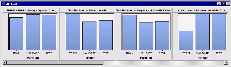
When you examine results for the SAS Code node, you should see a plot like the following:
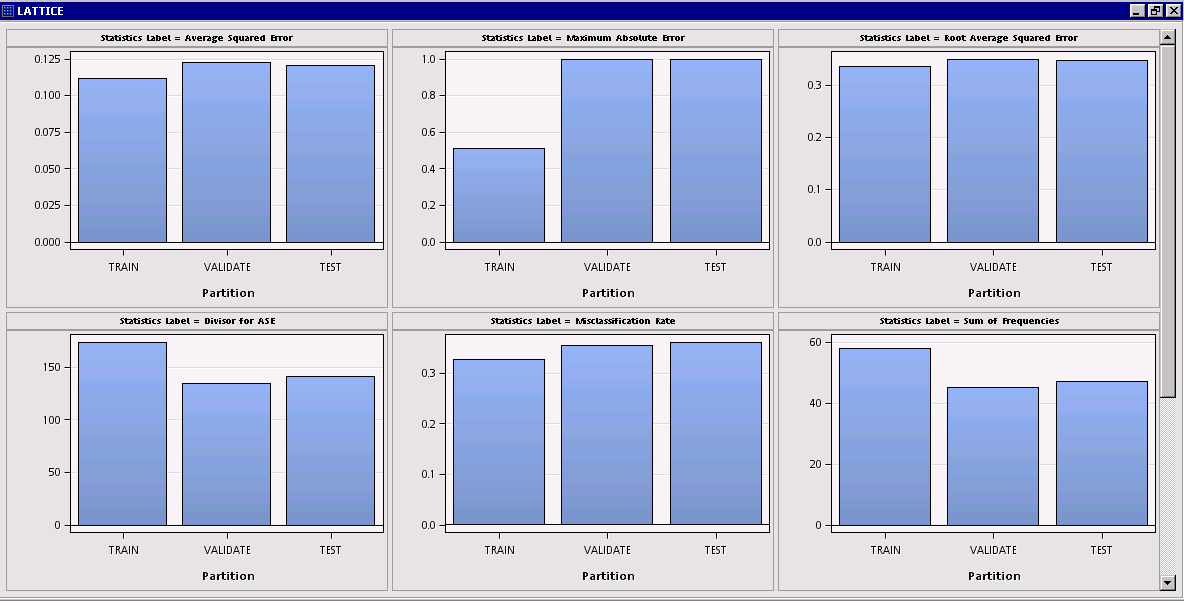
Since the individual plots have a common X axis but different Y scales (Max Absolute Error, Misclassification rate, etc.), let’s interactively turn off wrapping so each plot appears in its own row:
4. Right click on the plot and choose Graph Properties.
5. In the Properties – Lattice dialog, uncheck Wrap.
6. Press OK.
The various fit statistics are now stacked in a single column with a common X (partition) axis.
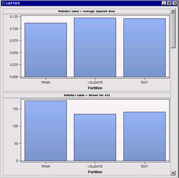
This plot is essentially the graphical analogue of the original data table, which displayed each statistic in a separate row.
Alternatively, we might have turned off display of Y-axis values and ticks in Graph Properties to encourage focus on the relative bar heights without reference to their actual scales:
By the way, if you select the lattice chart and click the Table icon ( ) you can view the restructured data that were used to create the plot:
More About the SAS Code Used In This Example
The code you pasted into the SAS Code node does four things:
1. Sort and transpose the fit statistics:
This step is done using SAS procedures. This creates a new transformed dataset called FitStatsT.
proc sort data=&em_lib..hptree_emreportfit out=treeFitStats;
by label stat;
run;
proc transpose data=treeFitStats
out=FitStatsT
prefix=Value
name=Statistic
label=Label;
by Label Stat;
var Train Validate Test;
run;
The built in &em_lib macro variable points to the location of the fit statistics dataset on the SAS server. But what about the name of the dataset?
Like most Enterprise Miner nodes, the HP Tree node produces several datasets. Each dataset uses the node ID as a prefix—in this case, “HPTree.” The rest of the dataset name usually has some correspondence to the title used in node results. The dataset used in this example is named “hptree_emreportfit.” I found the dataset by running Proc Contents specifying “data=&em_Lib.._all_” (not shown here) and examining the output.
2. Register the restructured data using the built-in %em_register macro:
%em_register(type=data,key=FitStatsT);
3. Use Data step code to create the dataset to plot:
Since we used the KEY value of FitStatsT in the previous step, the dataset must be assigned the name &em_user_FitStatsT.
data &em_user_FitStatsT;
set FitStatsT;
label statistic="Partition" value1 = "";
run;
4. Use the built-in %em_report macro to create a Lattice Bar chart that displays partition value on the X axis and uses fit statistic label as the lattice variable.
Here it is important to use the same KEY (FitStatsT) as in step 3.
%em_report(
key=FitStatsT,
viewtype=Lattice,
latticeType=bar
viewtype=bar,
latticeY=Label,
x=Statistic,
y=Value1,
autodisplay=Y
);
For more on using the built-in %em_register and %em_report macros, see the earlier tip, Create Graphs in a SAS Code Node Using %em_report.
Summary
We’ve seen how to customize interactive results produced by EM nodes, from making cosmetic edits to creating new charts that persist in node results. We’ve also seen how to use the SAS Code node to manipulate node output datasets so they conform to plotting requirements.
Hopefully this tip will help you start tailoring node results to your needs. We’ve only scratched the surface, though. To learn more about the rich set of chart customization options offered in Enterprise Miner, I suggest opening node results for your favorite supervised or unsupervised modeling node and exploring the options listed under Graph Properties and Data Options.
Keep in mind that you can also create graphs interactively using the Graph Explore node. The difference is that the Graph Explore node uses input data, whereas most other nodes present summaries of results.

