- Home
- /
- SAS Communities Library
- /
- That model looks good on your data: How to use fit Lines and Overfitti...
- RSS Feed
- Mark as New
- Mark as Read
- Bookmark
- Subscribe
- Printer Friendly Page
- Report Inappropriate Content
That model looks good on your data: How to use fit Lines and Overfitting with Visual Analytics
- Article History
- RSS Feed
- Mark as New
- Mark as Read
- Bookmark
- Subscribe
- Printer Friendly Page
- Report Inappropriate Content
This post focuses on using fit lines in SAS Visual Analytics, and also covers the general topic of overfitting models.
A great advantage of SAS Visual Analytics (VA) over our competitors’ business intelligence tools is that we provide real analytics under the covers, while keeping it easy to use. We call this the “democratization of analytics” or bringing analytics to the people. This means taking analytics out of the exclusive purview of data scientists and statisticians, and making it accessible to the average business user or marketer.
Visual Analytics includes advanced analytics that you don’t find in many Business Intelligence (BI) tools, including:
- Fit Lines
- Correlations
- Decision Trees
- Forecasting
Guard rails for your analyses
Intelligence is built into Visual Analytics to guide users to use appropriate methods. For example, if you are forecasting, the methods may be Winter’s methods, or exponential smoothing, or ARIMA, all of which are appropriate forecasting methods.
In contrast, I have heard frightening tales of people using other software tools to do “forecasting” by using ordinary least squares with time as the independent variable. This is the kind of thing that will make a knowledgeable data scientist gasp with horror! It is not appropriate.
Visual Analytics' internal intelligence helps prevent these kinds of mistakes by finding the appropriate model for your data. In a sense, Visual Analytics tries to provide guard rails to keep a business user from going off track and getting wrong results.
But just because there are guard rails on the road doesn’t mean you should close your eyes and let the guardrails keep you from going off a cliff. Likewise, remember that Visual Analytics is a visual tool, so use your eyes! Using your eyes along with common sense and a general understanding of models will keep you on the right road.
Separating signal from noise: the problem with overfitting
The first thing we need to remember is the goal of supervised learning. The goal is to be able to build a model from data where we know the outcome, and then generalize to predict outcomes from new input data. One big barrier to generalizing is overfitting. 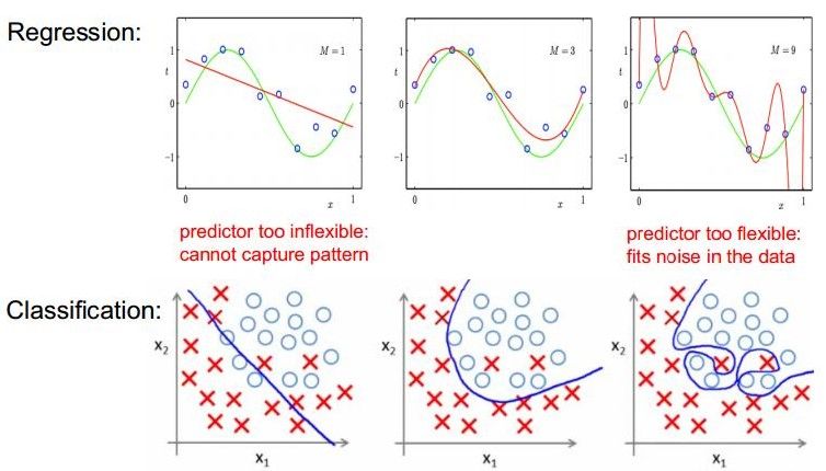
If we overfit the training data set, then it won’t generalize well from new data and it won't give us good predictions. Remember that we are trying to separate the signal from the noise; we don’t want our model to capture the “noise” (error). Overfitting commonly occurs if our model is too complex, for example having too many inputs relative to the number of observations. A model that has been overfit has poor predictive performance, as it overreacts to minor fluctuations in the training data.
Underfitting's problematic too
Likewise underfitting does not capture the signal adequately so we lose information, and we don't get the best predictions that we could. If the data actually follow a quadratic model, but we fit a linear model, we underfit.
Occam’s razor (the law of parsimony) teaches us that the model should be only as complicated as it needs to be. Penalties for overfitting can be applied to reduce this problem. Also, ensemble models can be more accurate than single models. They may reduce bias, variance, and overfitting, and thus generalize better.
Common overfitting mistakes sometimes results from including:
-
unnecessary inputs
-
unnecessary square or cubed or other exponential terms
-
unnecessary interaction terms
Also, some models tend to overfit more than others. For example, we see in the demonstrated in the graphic below that a neural network is a universal approximator and can exactly fit any training data…but we must take care not to overfit neural networks, so that our model will generalize and predict well with new data. I recommend always using an untainted test data set.
Individual decision trees are more likely to overfit that ensemble models such as a random forests or gradient boosting models.
Fit Lines
Visual Analytics lets you view data with a fit line overlain on it. This is a great visualization and can help you use your eyes and common sense to understand your data.
A fit line in Visual Analytics is a simple model from a single input variable and an outcome variable. Fit lines can be:
Linear y = β0 + β1x
straight line where β0 is y-intercept and β1 is slope of the line 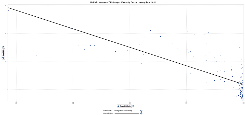
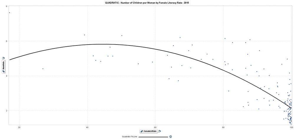
One point of inflection, may be concave up


Two points of inflection, “S-shape” 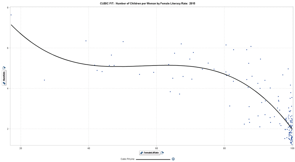
P-Spline (Smoothing technique that lets you capture many inflection points) 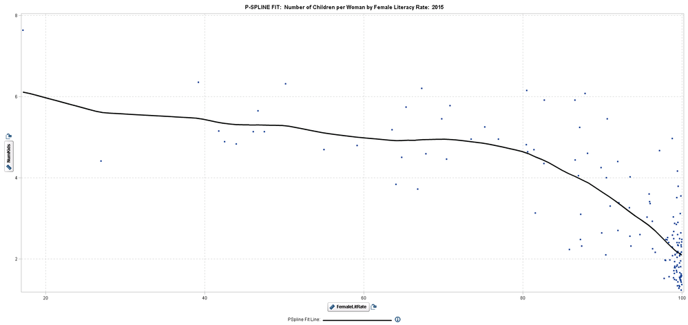
How to find the right fit
The Best Fit method uses backward variable selection to select the highest order model that is significant. It selects among linear, quadratic, and cubic fit lines, but no penalty is applied for higher order models. So it is actually the tightest fit, which may not really be the "best" fit. Just be aware of this.
If your data are poorly behaved (noisy), then not using penalties, is like letting poorly behaved American football players play with no penalties for violating the rules. You will end up with trouble and broken bones and people losing teeth, i.e., you end up with ice hockey.
So use your eyes along with use common sense and judgment to take advantage of the “visual” in visual analytics when using the “best fit” option. Then decide for yourself if you think a higher order fit is warranted or if a linear fit is adequate for your purposes. Remember that Visual Analytics is a tool for exploring your data and discovering relationships.
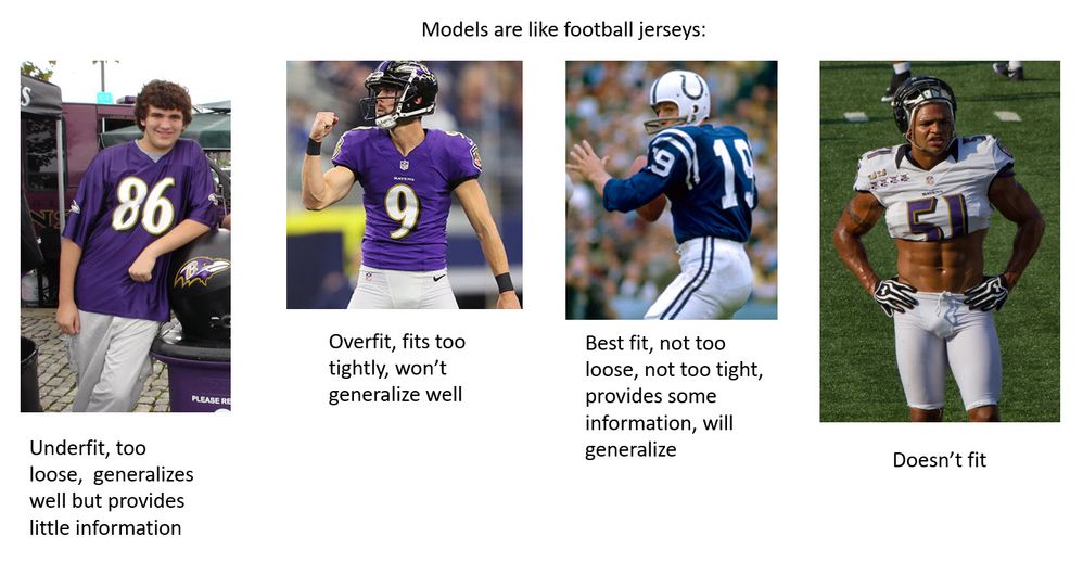
Be aware that the "best fit" may overfit, as demonstrated by the jersey on Number 9 Justin Tucker. His jersey fits him perfectly, but it won't fit Joe Flacco or Cristiano Ronaldo or Paul Pogba.
Outliers and Influential Data Points
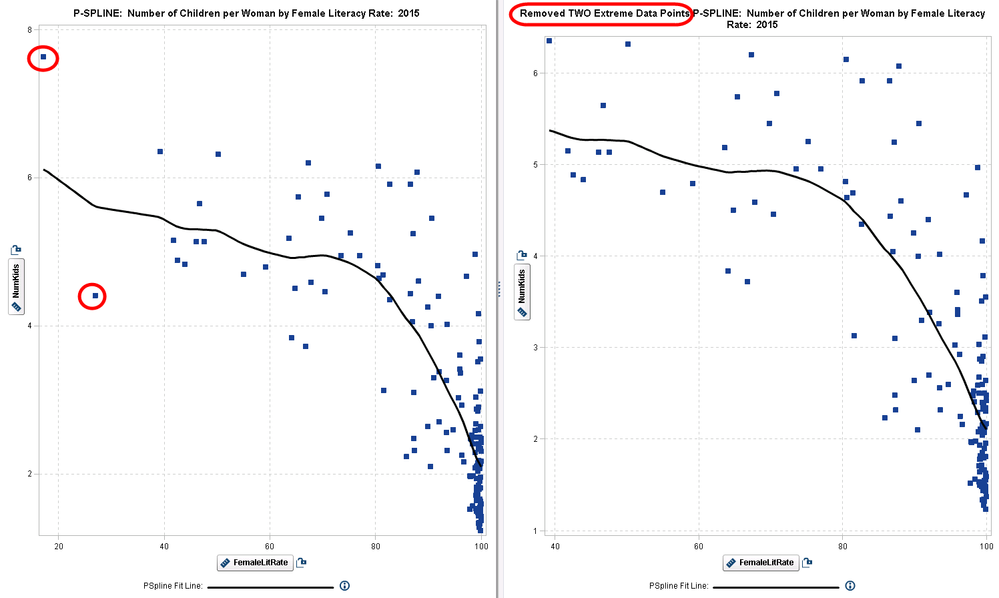
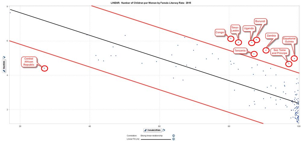
In the graph each data point represents a country. Average Number of Children per Woman is plotted on the vertical (y) axis and Female Literacy Rate is on the horizontal (x) axis. If we select a linear fit we can see a few outliers.
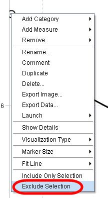
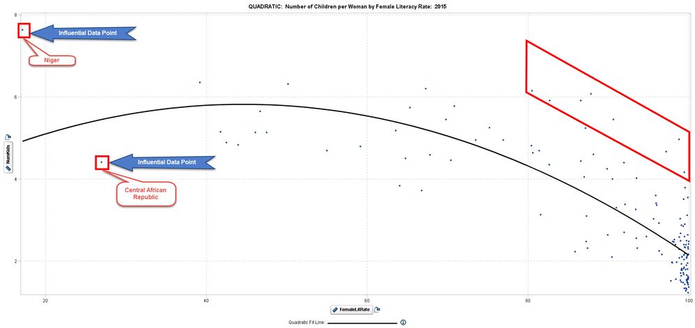
If we change to a quadratic fit line, suddenly Niger (which fit closely to our original linear model) becomes an outlier. You may want to evaluate Niger and Central African Republic to see how influential these points are to your fit line.
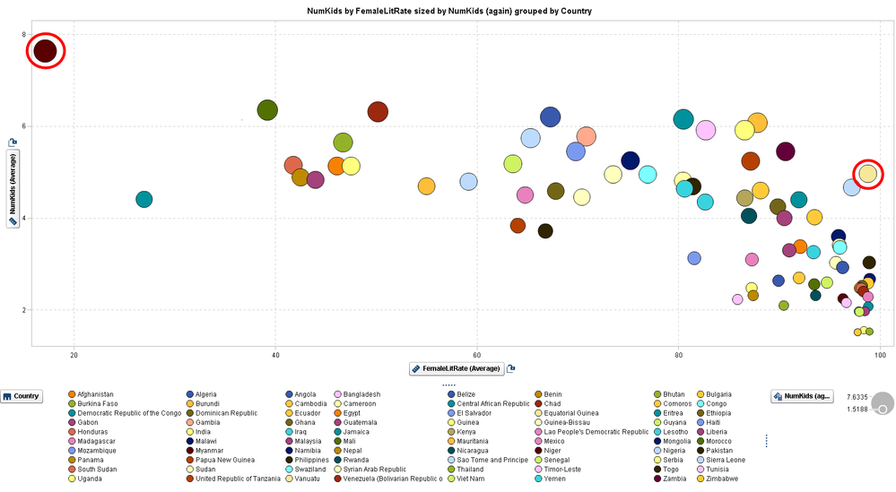
Bubble plots let us look for outliers by seeing 3 variables at a time, the x axis, the y axis, and the size of the bubble. Here a large bubble on the far right bottom would indicate an outlier for further investigation. Outliers can be evaluated as potential mistakes in your data, extreme values worthy of note, and influential observations that may be driving your model.
Always keep in mind that your main goal is to be able to generalize your model to new data so that you can make the best decision possible. If you underfit, then you don't get enough useful information to make good predictions and decisions. If you overfit, then the model will fit your training data, but it won't generalize to fit new data. The best fit will provide useful information, but still generalize well; this gives you the best decision.
Don't miss out on SAS Innovate - Register now for the FREE Livestream!
Can't make it to Vegas? No problem! Watch our general sessions LIVE or on-demand starting April 17th. Hear from SAS execs, best-selling author Adam Grant, Hot Ones host Sean Evans, top tech journalist Kara Swisher, AI expert Cassie Kozyrkov, and the mind-blowing dance crew iLuminate! Plus, get access to over 20 breakout sessions.
Free course: Data Literacy Essentials
Data Literacy is for all, even absolute beginners. Jump on board with this free e-learning and boost your career prospects.
Get Started
- Find more articles tagged with:
- GEL

