- Home
- /
- SAS Communities Library
- /
- SAS takes another look at survey data from the US presidential electio...
- RSS Feed
- Mark as New
- Mark as Read
- Bookmark
- Subscribe
- Printer Friendly Page
- Report Inappropriate Content
SAS takes another look at survey data from the US presidential election
- Article History
- RSS Feed
- Mark as New
- Mark as Read
- Bookmark
- Subscribe
- Printer Friendly Page
- Report Inappropriate Content
Editor's note: SAS programming concepts in this and other Free Data Friday articles remain useful, but SAS OnDemand for Academics has replaced SAS University Edition as a free e-learning option. Hit the orange button below to start your journey with SAS OnDemand for Academics:
For today's installment of Free Data Friday, I wanted to explore data on the recent US Election and was excited to find out about 
Get the data
You can get the dataset from the Perception of Electoral Integrity Dataverse. I also recommend you download the questionnaire associated with the dataset, as well as the codebook, to get a better understanding of the data and the results. From the website, the survey “…evaluates the integrity of the US presidential election held on 8 November 2016. Based on a survey collecting the views of US-based political scientists…”
Get Started with SAS OnDemand for Academics
Getting the data ready
The data was already in a format that I could use, and there were no missing or clearly incorrect data.
Results in a Mosaic Plot
Because this is a rather large survey with numerous categorical variables, I decided I should use mosaic plots to explore the responses. I admit, I have never used these types of plots before as they’ve never made sense to me – but I was determined to try, and I’ve realised they are not only easy to understand, but actually very powerful tools.
Luckily for me, SAS comes with the Mosaic Plot task, so all I have to do is fill in the blanks. Behind the scenes, SAS Studio uses PROC FREQ to create the mosaic plot. SAS’ Rick Wicklin describes the concepts and code in his popular blog post about mosaic plots.
How to understand a Mosaic Plot
A very good, simple introduction to interpreting a mosaic plot can be found at this Vanderbilt University Medical....
Basically, all the data is represented by a square; if we had only two variables (Male / Female), the example shows that a vertical line is used to split the square into the respective proportions.
If we add a second variable (the example uses Survived, 1 / 0) then the horizontal line splits each gender into the proportions for that group. So in the example, it’s very apparent there were more males on board, but a larger percentage of women survived. We will now take this and apply it to our Electoral data.
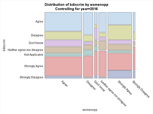
The first plot I’m doing is comparing “Women had equal opportunities to run for office” with “Boundaries discriminated against some parties."
So it’s very apparent that the large majority of specialists Agreed with Women having the same opportunities, and of those, the majority strongly agreed that boundaries did discriminate against some parties. When Agree and Strongly Agree are combined the majority is overwhelming.
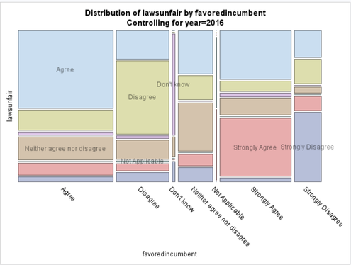
Next, I’ll compare “Electoral Laws were unfair to smaller parties” and “Electoral Laws favoured the governing party or parties”:
The majority of experts agreed / strongly agreed that the Electoral Laws favoured the incumbent, and that they were also unfair to the smaller parties.
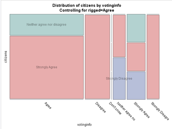
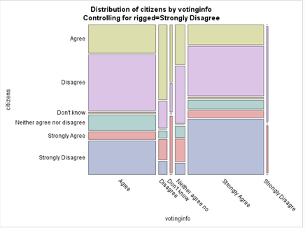
The final example is “Election laws restricted citizens’ rights” and “Information about voting procedures was widely available”. For this plot, I wanted to stratify by if the experts thought the election was rigged (there's a Stratify By field on the Mosaic plot task). I’ll only show a couple of the interesting plots as each Response generates an output.
For all the experts that agreed that the election was rigged, the large majority agreed that information was available, but also strongly agreed that the citizens’ rights were restricted. All the experts that disagreed that voting information was easily accessible strongly agreed that the laws restricted the rights.
What I find interesting is there seems to be a lot more variety in the answers from those experts who Strongly Disagreed about rigging in the election; there isn’t the clearly defined groups as in the above plot.
Now it’s your turn!
Did you find something else interesting in this data? Share in the comments. I’m glad to answer any questions.
Don't miss out on SAS Innovate - Register now for the FREE Livestream!
Can't make it to Vegas? No problem! Watch our general sessions LIVE or on-demand starting April 17th. Hear from SAS execs, best-selling author Adam Grant, Hot Ones host Sean Evans, top tech journalist Kara Swisher, AI expert Cassie Kozyrkov, and the mind-blowing dance crew iLuminate! Plus, get access to over 20 breakout sessions.
Free course: Data Literacy Essentials
Data Literacy is for all, even absolute beginners. Jump on board with this free e-learning and boost your career prospects.
Get Started
- Find more articles tagged with:
- Data for learning
- Free Data Friday
