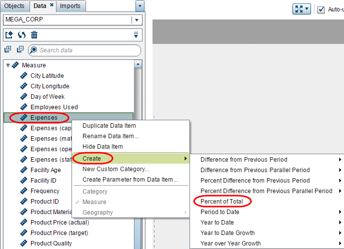
In SAS Web Report Studio, the ability to right-click and add the percent of total to a crosstab is a great reporting tool, enhancing the “at-a-glace” value of the report. SAS added this capability in SAS Visual Analytics 7.1, including the ability to create a reusable percent of total data item by right-clicking on any measure!
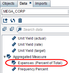
Once created it will appear on the Data tab under the Aggregated Measure grouping automatically.
This means that the visual percent of total is available for any measure for use in your visualizations. When I say visual percent of total, I mean the _ByGroup_, where the percent of total is an aggregated measure that is evaluated on the fly, depending on the groupings and role assignments you have for the visualization.
Let’s look at some ways to use the percent of total aggregated measure:
Crosstabs
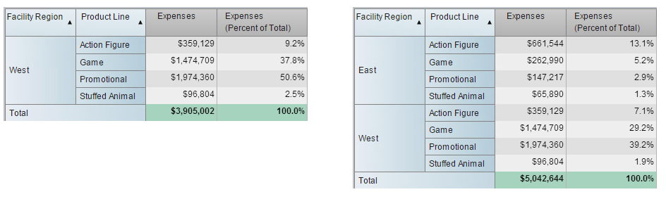
Granted the title of this article is to show how to use the percent of total beyond adding it as a column, but I want to illustrate the visual or _ByGroup_ aspect I mentioned above. Look at the two crosstabs below. Notice that for each crosstab, the Total for the Expenses (Percent of Total) data item sums to 100%, but there are different selections of visible Facility Regions. The crosstab on the left only displays the West region and the crosstab on the right displays both East and West regions. Here you can see that the Expenses (Percent of Total) measure is aggregated on the fly and will adjust to any applied filters or interactions. Therefore, be sure you have the desired controls and interactions in place and that your visualization is displaying your intended results.
Gauges
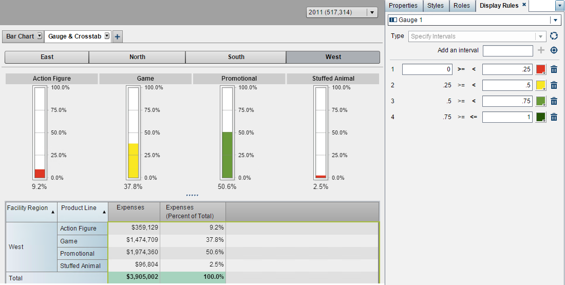
When designing gauges, determining the display rule intervals can require a lot of forethought. This is partly because the display rule intervals require absolute static values and do not accept column role assignments at this time. This can be especially tricky if you have a category where one group significantly out performs or under performs the others. This can lead to some values not registering on the gauge at all or values maxing out the gauge, neither of which is helpful when looking for patterns or trends to understand how the group is performing when evaluated to the next.
One solution to this is to use the percent of total aggregated measure as the gauge’s measure role and use a breakdown between 0 to 1 for the display rule. This way each group value will use the same 0 to 100% scale. And as a bonus, your display rule could possibly be reused on multiple occasions if you always like to see the same breakdown of 100%.
Bar Charts
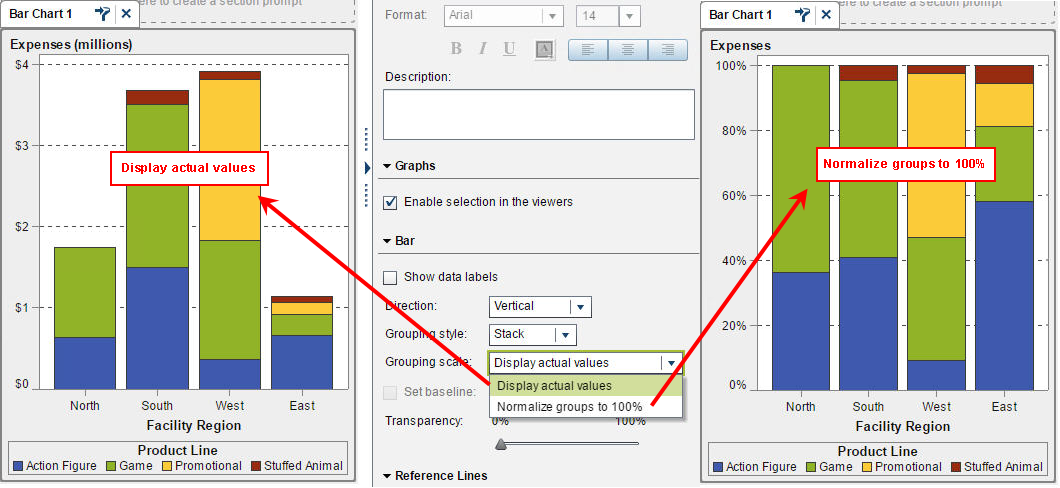
The bar chart was actually the inspiration for this article. A feature in SAS Visual Analytics 7.1 allows for a stacked bar char to use either actual values or normalize groups to 100%. That means no matter which measure is assigned to the role, the bar chart will automatically create the percent of totals for each group and graph it against a 0 to 100% scale.
See the example below that shows what happens when you toggle between the two Grouping scale options:
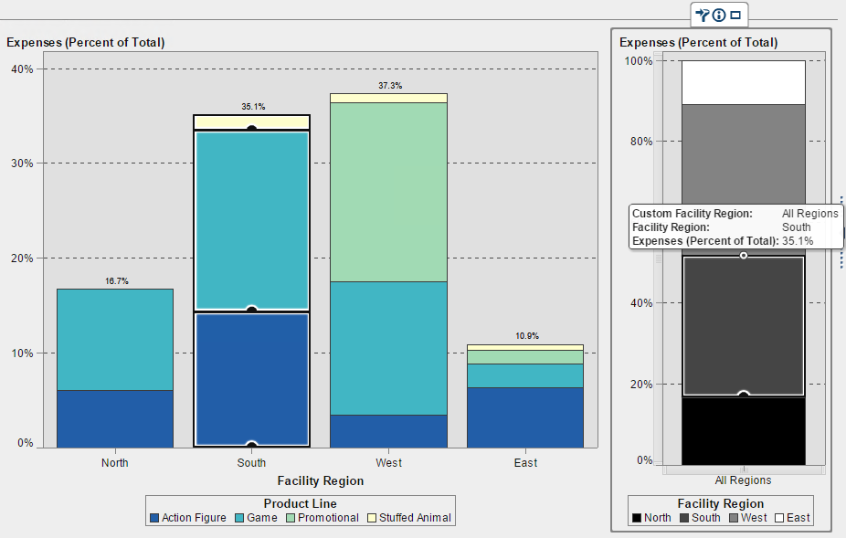
Aside from this feature in SAS Visual Analytics 7.1 that will atomically generate and use the percent of totals, let’s look at how you could use the percent of total aggregated measure in other ways on a bar chat. Keeping in mind that the aggregated percent of total will always show the visual or _ByGroup_ aggregation, the chart on the left – in hues of blue – shows the breakdown of Product Lines amongst Facility Region. The aggregation of all Regions will equal 100%. To enforce this concept I created a Custom Category to bucket all of the regions together in an “All Regions” category, so that I could have one bar represent the percent of totals for the regions. As you can see when using a brush interaction, the All Regions breakdown corresponds to the Region stacked totals from the chart on the left.
How will this functionality meet your reporting needs? Which part of it is most helpful to your daily work?
.jpg")
