It's NCAA March Madness Basketball Tournament bracket time in the US and after getting 117 brackets for my pool this year, I wanted to see a breakdown of who was picked to win the tournament. Obviously Kentucky was the far and away favorite, but who else got some picks? This was a good chance to try out a round trip using SAS Add-In for Microsoft Office (SAS Add-In) and SAS Visual Analytics (SAS VA) to make a cool report.
First, I copied the data from my online pool into Excel. Nothing is quicker than Excel for splitting off all the (2) and (3) for everyone's multiple brackets. It also let me change any entry names that really weren't appropriate for work.
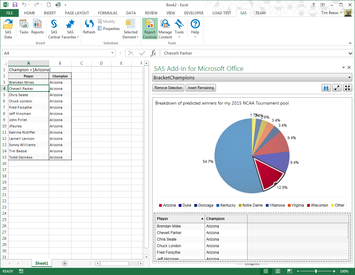
Next, I used the "Upload to LASR" task that we have in SAS Add-In and SAS Enterprise Guide. This let me put the data into a LASR library so that I could create an interactive SAS VA report. I logged into Visual Analytics Designer and created a simple report, showing a pie chart with the percent of picks for each team to win the NCAA championship. I added a table that was filtered by the pie chart so that as I clicked on each slice of the pie, I could see which players picked the selected team to win. Everything was looking good in SAS VA.
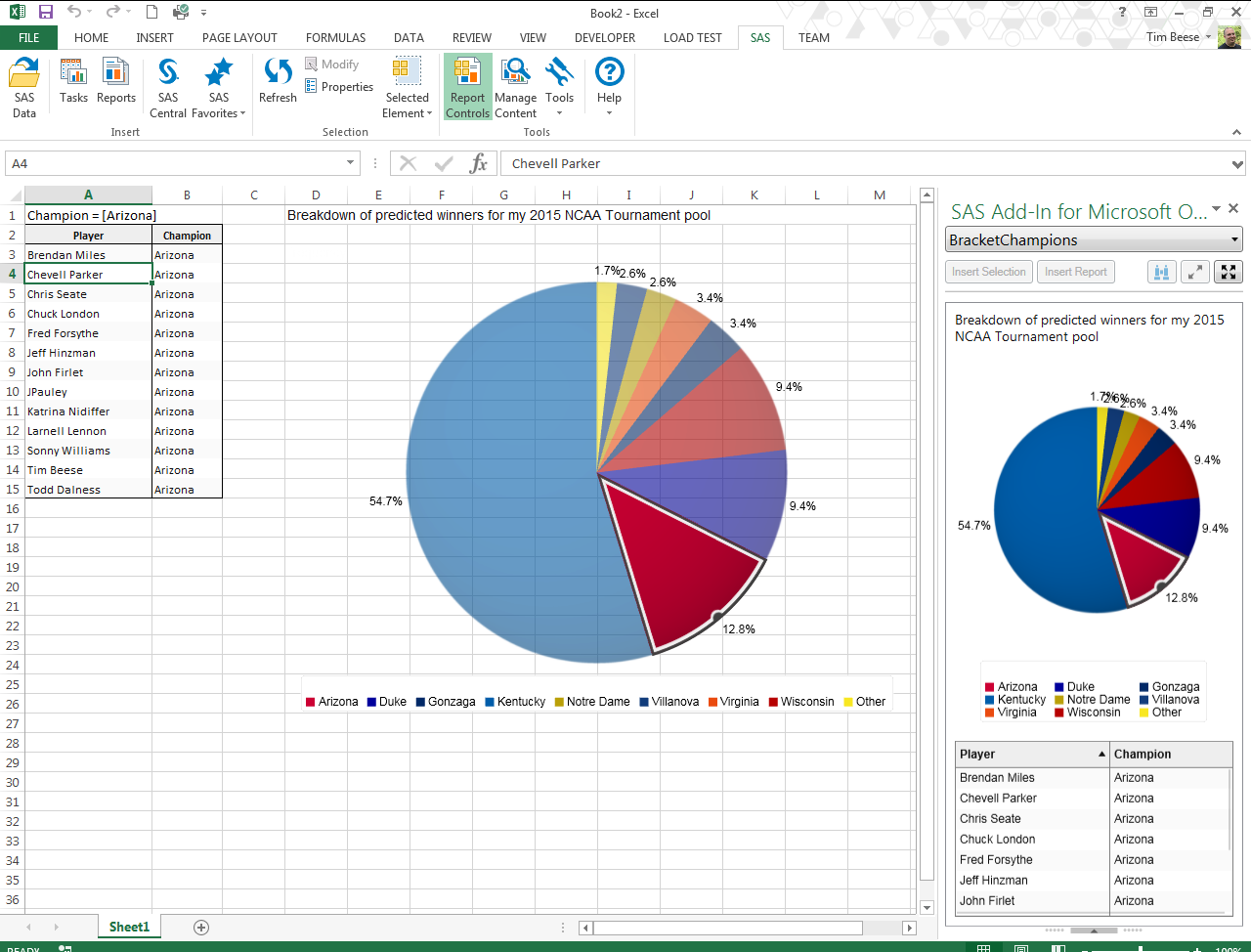
Finally, the icing on the cake ... I opened the report back into Excel, using SAS Add-In, and I was able to get the same experience in one of Excel's custom task panes. I could insert the table into Excel, and as I selected different slices of the pie, the data would update in both the custom task pane, as well as the worksheet.
Here are a few screenshots to give you an idea of what came out: (click to enlarge)
– Building this report was very easy in Visual Analytics Designer. I even found a website that had the RGB values for each college team, so I could make the slices of my pie match the team's color exactly.

– This shows the interactive nature of the report inside of Excel. As I click on each slice of the pie, my spreadsheet is updated with the filtered results from the table below.
– I can also create a full report and insert each element from the report to a specified location inside of my spreadsheet. If I want my report to contain the pie chart as well, I can choose the exact layout in my spreadsheet.
Now I just need some more interesting March Madness data. Does anyone have any good data lying around?

