- Home
- /
- SAS Communities Library
- /
- Let me root for the home team! But does it really matter in the World ...
- RSS Feed
- Mark as New
- Mark as Read
- Bookmark
- Subscribe
- Printer Friendly Page
- Report Inappropriate Content
Let me root for the home team! But does it really matter in the World Cup?
- Article History
- RSS Feed
- Mark as New
- Mark as Read
- Bookmark
- Subscribe
- Printer Friendly Page
- Report Inappropriate Content
After the emotional, close, shootout-ending match with Chile that nearly knocked out Brazil on Saturday, it makes you wonder how much of a home team advantage hosting countries really have. Out of all 19 World Cups, six hosting countries have won the final – giving them an edge over competition 31.5 percent of the time.
This SAS Visual Analytics geomap shows the spread of countries (in purple or green) that have hosted the World Cup. Green represents hosting countries that have won.
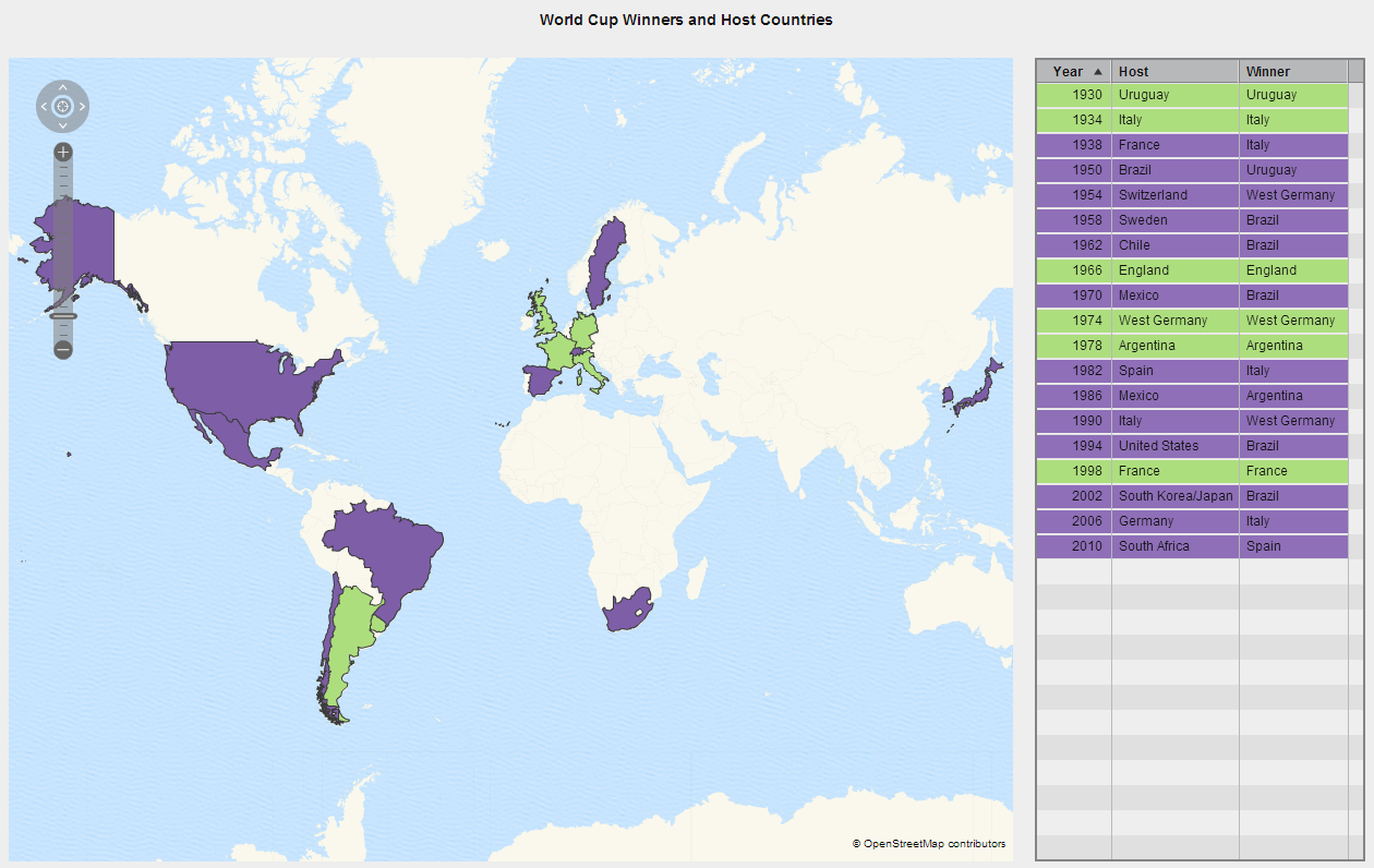
Data came from the Planet World Cup web site.
Are you surprised by the hosting country/win ratio? Think being the home team makes a difference? Consider this insight as Brazil heads into its next challenge against Colombia. How much influence does its host position have over that game?
Follow this community for more World Cup visualizations as the tournament moves in to quarter-finals.
- Mark as Read
- Mark as New
- Bookmark
- Permalink
- Report Inappropriate Content
Thanks for sharing the visualizations and thought provoking analyses. I noticed that there have been a number of infographics on the world cup too and it is interesting to see the summarizations in this form. http://kupdates.com/2014-world-cup/2014-fifa-world-cup-infographic/ Cool ball name... :smileycool:
With infographics being a great way to present an analysis, are there any plans to either build infographics in SAS Visual Analytics or interface with other software in the future?
Kind Regards,
Michelle
- Mark as Read
- Mark as New
- Bookmark
- Permalink
- Report Inappropriate Content
Infographics are creative attention grabbers for sure. If designed well, I believe they can be equally as effective. As we can see from the example World Cup infographic Michelle provided, they typically have background images, large numbers and pictures representing metrics, and larger text all precisely position and sized. Customizing the style and layout of all objects on the screen is key. Visual Analytics provides some capabilities that can help you design infographics today, and the SAS product team is considering other enhancements that would help.
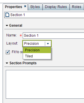
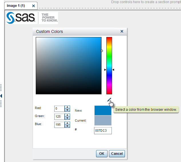
A few specific things come to mind that might help you create your infographics in Visual Analytics now. You might be familiar with some or all of them already, and using them in combination should help the most. Even though tile layout is the default, you can switch to the precision layout section-level property to gain control over the size and placement of the section content. For example, you can overlap multiple objects controlling the arrangement or layers (front to back). You can insert images, and combined with precision layout mode you can use an image as a background for the entire infographic or individual graphs by setting the background color to transparent for the graphs on top of the image. You can set the background color and font characteristics for the entire report in the designer for a single infographic using the style tab in the right pane at the report level. Color is one of the most important characteristics of an infographic, and the colors often need match those of an official corporate brand. The designer lets you specify custom color codes anywhere color can be set. There is an easy trick you can use to match a color in a corporate brand. If you insert an image, even temporarily during design, of a corporate logo or screen capture of the external website, you can use the color picker tool in the custom colors dialog window to capture the custom color from the inserted image. Using these along with the other object style settings for borders, fonts, alignment, etc., you can create aesthetically appealing reports today that could meet the needs for certain infographics you are asked to create.
SAS Office Analytics combined with Visual Analytics can help for some infographic designs. Many infographics today are being created in part with various graphic design tools and some manual steps are common. SAS does not currently have specific plans to integrate directly with these other third party graphic design tools, though SAS is interested in hearing what tools and steps folks are using today to create infographics to better understand how Visual Analytics can help create them.
SAS is already considering enhancements to Visual Analytics in order to help design even more effective infographic displays. In the upcoming Visual Analytics 7.1 release, you will have the ability to apply custom colors or transparency to the background and borders of all objects. Beyond the 7.1 release, SAS is considering adding support for a large single number object, which is essentially a metric with a large font and a display rule having no gauge or graph associated with the number. Similar to a single number object type, inserting metrics within text objects could help when you need to add context to the number. Exporting individual report objects, containers and sections as images from reports could help if you have the need to import insights from Visual Analytics into another document design tool for final presentation design and publishing. Infographics seem to be gaining in popularity to capture the attention of a broad audience, and it’s an opportunity to make them more insightful with Visual Analytics.
What types of enhancements would be most useful for your infographics? How are you and others in your organization creating infographics today?
Thanks,
Rick Styll
- Mark as Read
- Mark as New
- Bookmark
- Permalink
- Report Inappropriate Content
Hello, sharing this related blog post and good discussion on report design:
- Mark as Read
- Mark as New
- Bookmark
- Permalink
- Report Inappropriate Content
Hi @RickStyll_SAS,
I've been talking to some existing SAS Visual Analytics customers and they've told me that some executives are steering away from traditional dashboards and wanting more infographic style reporting. I recall us having a discussion here about creating an infographic type report by changing the section layout and using the standard SAS VA report objects and thought I'd post the question here in case others wanted to collaborate too.
Are there plans in a future release to have native infographic style report objects that could be used for a dashboard with capabilities to navigate to detail reports or analytics?
Kind Regards,
Michelle
- Mark as Read
- Mark as New
- Bookmark
- Permalink
- Report Inappropriate Content
Michelle,
As always, thank you for sharing your insight and experience on what you’re hearing about reporting trends from customers. To address your question, it depends on the specific infographic style objects you are referring to. One of the most common infographic type of objects is the single number, usually displayed in a larger font, that represents some overall percentage or a total. Related, infographics usually have numeric facts embedded within some text, for example, a title. SAS is planning to deliver dynamic text in a future release of Visual Analytics to address these two requirements.
Michelle, we'd love to hear more from you and others on this community about what types of objects and capabilities that you would like to see added to Visual Analytics to help you better create infographic style dashboards.
Rick
- Mark as Read
- Mark as New
- Bookmark
- Permalink
- Report Inappropriate Content
Hi Rick,
Thanks for your response and insight to the new dynamic text object in a future Visual Analytics release. This is definitely a request I've heard. And it would be useful to also have an image (arrow up or arrow down) that can dynamically appear when the data is updated. This way trends are easily and more dynamically reported on based on display rules or comparing the figure (being greater or less) with the previous figure before it was updated.
With regards to specific types of objects and capabilities I'll encourage those to add their contributions here.
Thanks for the update!
Kind Regards
Michelle
- Mark as Read
- Mark as New
- Bookmark
- Permalink
- Report Inappropriate Content
I realize there is a workaround for what I'm about to suggest - but I'd like it if it was easier to create.
The examples below are really trying to point to one feature - display a number with text and then be able to use the display rules to communicate if the measure is better or worse.


Ready to see what SAS Viya Copilot can do?
Visit the Tips & Tricks page for setup guidance, demos, and practical examples that show how Copilot supports your workflows.
Get Started →SAS AI and Machine Learning Courses
The rapid growth of AI technologies is driving an AI skills gap and demand for AI talent. Ready to grow your AI literacy? SAS offers free ways to get started for beginners, business leaders, and analytics professionals of all skill levels. Your future self will thank you.
- Find more articles tagged with:
- world_cup_visualizations
