- Home
- /
- SAS Communities Library
- /
- How to customize your SAS Visual Analytics report: Part 2 - Augment da...
- RSS Feed
- Mark as New
- Mark as Read
- Bookmark
- Subscribe
- Printer Friendly Page
- Report Inappropriate Content
How to customize your SAS Visual Analytics report: Part 2 - Augment data with custom categories
- Article History
- RSS Feed
- Mark as New
- Mark as Read
- Bookmark
- Subscribe
- Printer Friendly Page
- Report Inappropriate Content
This is my second article in a series of three that walks through different ways to customize your SAS Visual Analytics report. Check out the first entry on creating a custom graph.
As I mentioned in my last post, creating reports in SAS Visual Analytics is a very iterative process. You start by building a graph and you may soon realize you need additional data. This post will walk you through how easy it is to augment your data with a custom category.
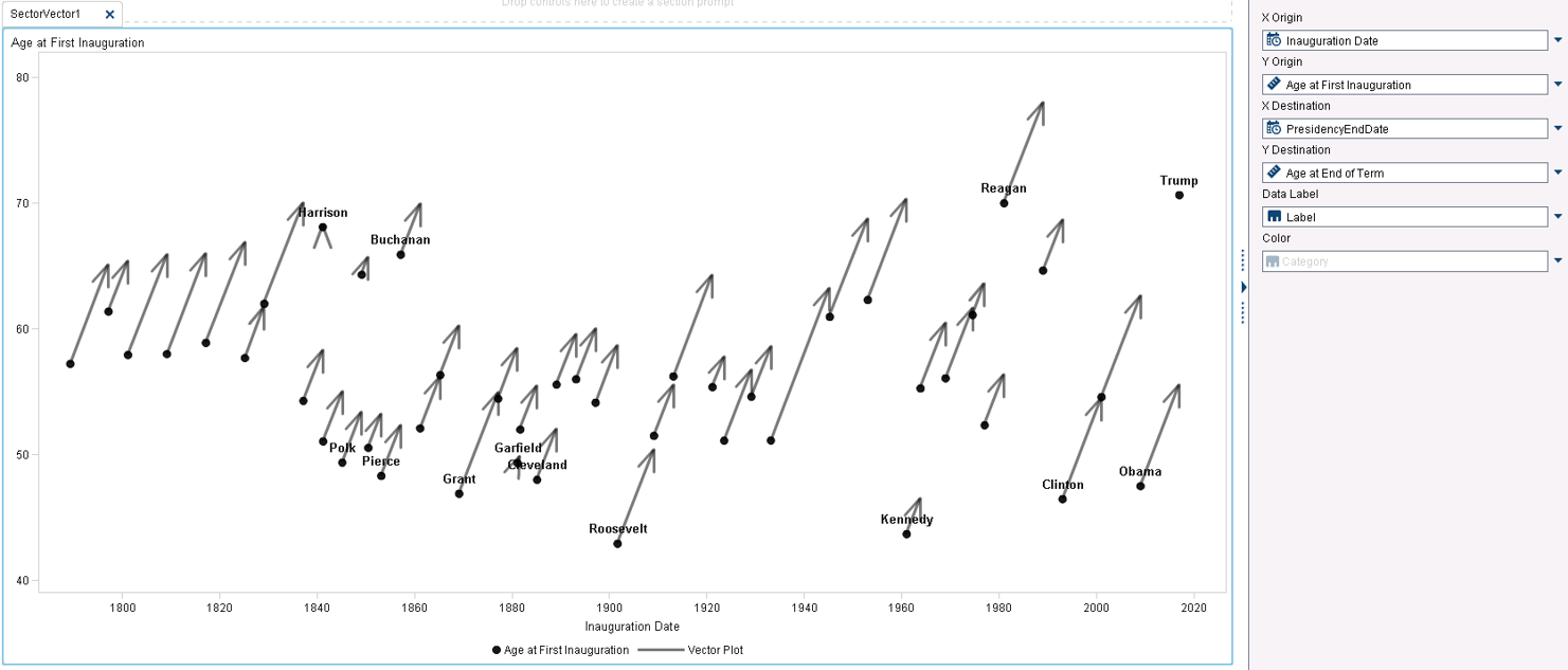
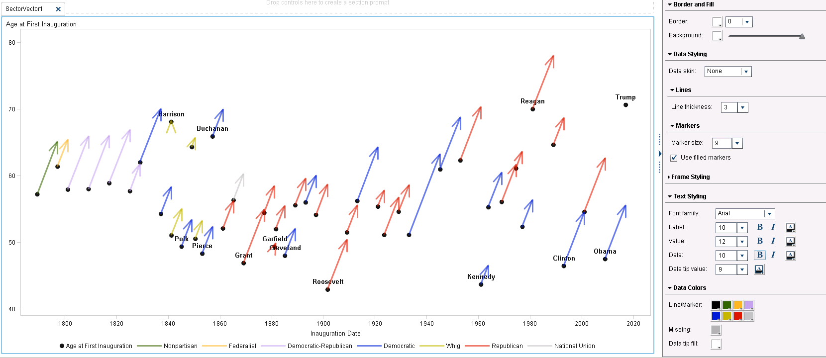
We pick up this article where we left off in part 1: a custom scatter/vector plot graph element that shows the age of each president at first inauguration. We have dragged this custom graph into the center workspace, added measures, categories and a label which produced the report below. We are now ready to continue building out our report.
To give this graph more visual information, we could add the party affiliation of each president. What are our options?
- The first choice of most users would be to find a table that has the name of each president and their party affiliation. We could join this data to the existing data and load the new augmented data into SAS Visual Analytics.
- Another way, which we will explore in this article, is to create a custom category within SAS Visual Analytics. Once created, this category can be used within your report.
How to create a custom category
- In Report Designer, click on the Data tab.
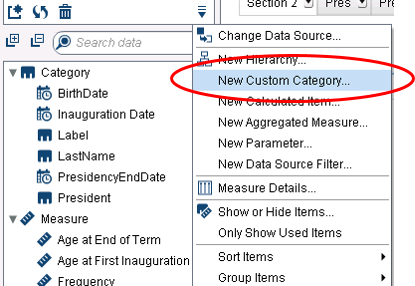
- Click on the
icon (Options) and select “New Custom Category."
-
Base the custom category on the category “President.” Click Next.
- Name it Presidential Party.
- On the right pane of the pop up window you will notice Label1.
- Double click on Label 1 to rename it to your first presidential political category.
- Drag in all the presidents from the left that belonged to that first party.
- Click on "New Label"
- Rename it to the name of your second presidential political party.
- Once again, drag in all the presidents from the left that belonged to that party.
- Continue until all presidents have been assigned to a party
- Note that any unassigned presidents will be grouped into a category called “Other”. This default can be changed, but it is a catch-all to make sure all members of the category are represented. You could also show unassigned members as missing, or as-is.
- Click “OK” when complete.
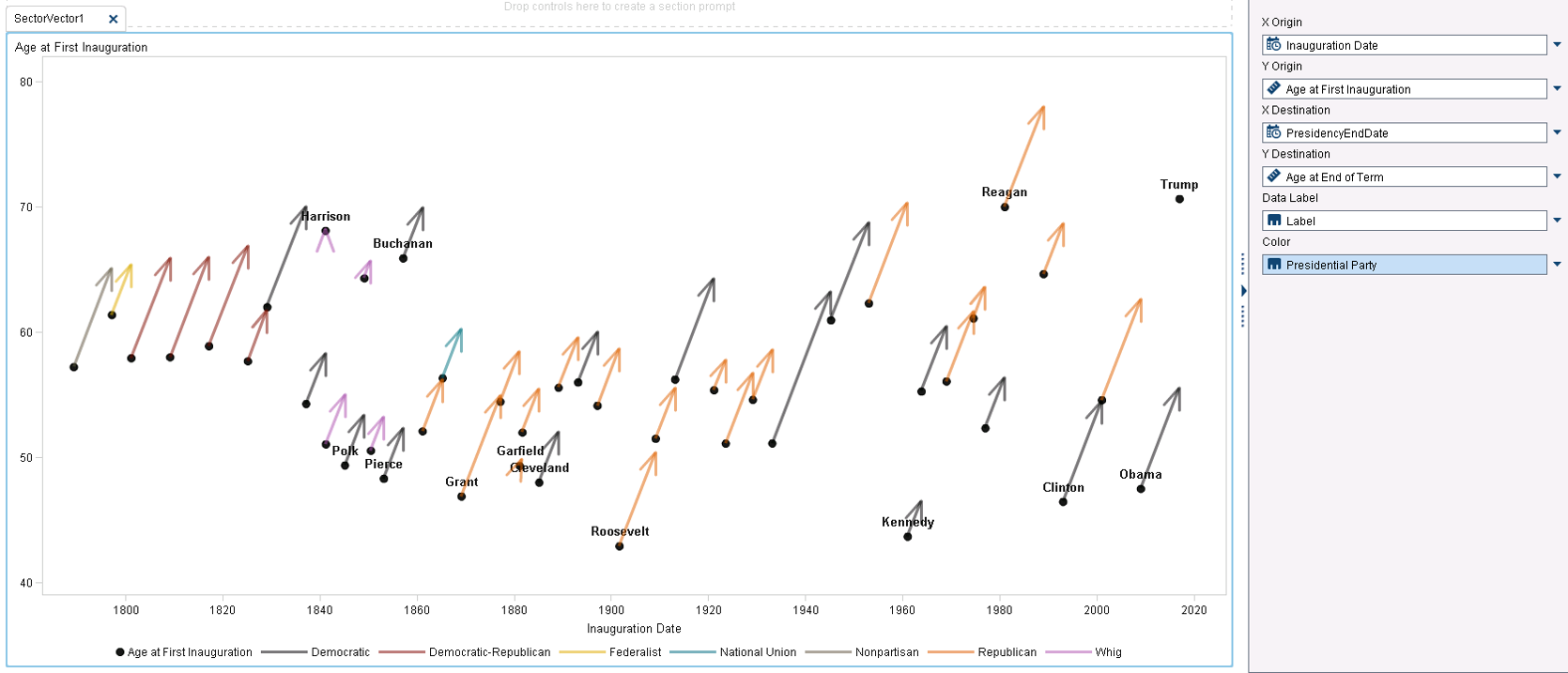
Drag the new custom category to the “Color” role for the report.
Each party is now represented by color, as noted by the legend at the bottom. However it is quite possible that you will want to change the colors of each party, as well as change the order in how they are displayed in the legend. We will do those steps next.
How to change order
- By default, the party order in the legend will be in Alpha-Numeric order. For this example, I will change the order to the first time that party was affiliated with a president.
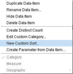
- Right click on the Presidential Party category (custom category above).
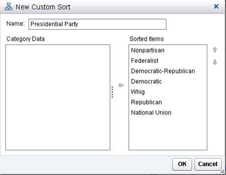
- Click on “New Custom Sort.”
- Move all of the available party affiliations to the right, in the order you desire.
- Note - once created, you can always reorder by using the up/down arrows on the right side. Click OK.
- Hover over the presidential parties in the legend (near the middle). Once the blue bubble with the category "Presidential Party" appears, right click and sort > ascending.
- Now when you view the graph element in the Report Designer, the legend has now been reordered.
- You may also notice that once you apply the custom sort that the vector colors have also changed. This is because the colors are applied in the order specified in the “Styles” tab.
- Next we will change the colors associated with a party.
How to change colors
- On the Styles tab, expand the Data Colors section at the bottom.
- The colors in the Styles palette are applied in the sort order. When you change the first color, it will apply to the scatter plot dot and label.
- The next color will change the vector of the party that is first in the list (Nonpartisan).
- Continue to change the remaining colors to represent each political party. In my example, the colors of each political party did not necessarily matter, except I changed Democrat to blue and Republican to Red, as is the current day association.
So now we have a chart that not only shows the length of the presidential term over the course of years, but the color of each line represents the party affiliation of each president. The political party was not in the original data source, so we created it not by adding new data and joining it to the original data source, but by creating and applying a new custom category. We also created a custom sort order and specified the color of each political party.
Quickly adding some additional options like custom sort and custom categories allows you to fine-tune your reports and dashboards to make an even bigger impact.
Don't miss out on SAS Innovate - Register now for the FREE Livestream!
Can't make it to Vegas? No problem! Watch our general sessions LIVE or on-demand starting April 17th. Hear from SAS execs, best-selling author Adam Grant, Hot Ones host Sean Evans, top tech journalist Kara Swisher, AI expert Cassie Kozyrkov, and the mind-blowing dance crew iLuminate! Plus, get access to over 20 breakout sessions.
Free course: Data Literacy Essentials
Data Literacy is for all, even absolute beginners. Jump on board with this free e-learning and boost your career prospects.
Get Started
- Find more articles tagged with:
- How to customize a SAS Visual Analytics report
