- Home
- /
- SAS Communities Library
- /
- How to Export your SAS Graphs and Tables with Ease in SAS
- RSS Feed
- Mark as New
- Mark as Read
- Bookmark
- Subscribe
- Printer Friendly Page
- Report Inappropriate Content
How to Export your SAS Graphs and Tables with Ease in SAS
- Article History
- RSS Feed
- Mark as New
- Mark as Read
- Bookmark
- Subscribe
- Printer Friendly Page
- Report Inappropriate Content
Editor's note: SAS programming concepts in this and other Free Data Friday articles remain useful, but SAS OnDemand for Academics has replaced SAS University Edition as a free e-learning option. Hit the orange button below to start your journey with SAS OnDemand for Academics:
I, like many people around the world, love McDonald’s. However, every time I go, I hear my mom’s voice in my head saying how bad it is for me, that I should eat my vegetables, etc. I usually justify it by telling myself it’s once in a while, I’ve had a hard week, etc.
But then I found McDonald’s nutritional data and starting playing around with it. Turns out mom's right. There is a lot of salt and fat in their food, at least according to their U.S. menu. I figured I should share this information with my mom to show her that she’s right -- and show off my SAS skills 🙂
So for today's installment of Free Data Friday, I'll use this fast-food data to highlight ways you can export your graphs from SAS.
Get the data
The data can be downloaded on Kaggle; it’s an extremely small-sized file (<10kb) but has a lot of information. The file imported into
Get Started with SAS OnDemand for Academics
Get the data ready
The data was already in a format that I could use, as it was in standard CSV format.
The results
Although I ran multiple analyses, I’m going to focus on one scatterplot that I did. The steps to export the other graphs are the same.
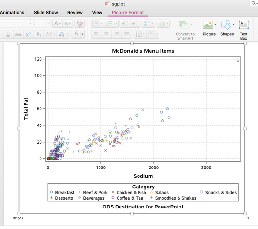
Using the Scatterplot Task, I put Sodium on the x-axis and Total Fat on the y-axis. I grouped by Menu Category (Breakfast, Desserts, etc).
(Note: The extreme outlier is the 40-piece Chicken McNugget box, which I’m really hoping is intended for groups of people and not just one person!)
When I go into the code for the task, I see this (comments removed to reduce space):
ods graphics / reset imagemap;

proc sgplot data=work.importl
scatter x=Sodium y=Total_Fat / group=Category transparency=0.0 name=’Scatter’;
xaxis grid;
yaxis grid;
run;
ods graphics / reset;
I copy that code, then I open up the Snippet under “Data” called “Generate PowerPoint Slide." I leave the top portion (of course, you can change the TITLE and FOOTNOTE) and highlight over the part that reads:
title 'Horsepower by Type and Origin';
proc sgplot data=sashelp.cars;
  dot type / response=horsepower limits=both stat=mean
      markerattrs=(symbol=circlefilled size=9);
  xaxis grid;
  yaxis display=(nolabel) offsetmin=0.1;
  keylegend / location=inside position=topright across=1;
  run;
I replace that with the code from the Scatterplot task. When I run the Snippet, I get prompted to open the downloaded file (this will vary based on operating system and browser you’re using) and then I open the newly created PowerPoint file.
You may notice that some of the markers and fonts have changed from when we saw the scatterplot in SAS University Edition; I’m looking into why this happened, but hoping someone here knows.
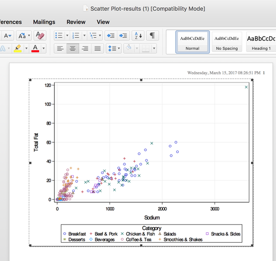
Although PowerPoint is great, it’s not your only option. When you have your graph open, at the top left corner are a couple of buttons. They are, in order, Export to HTML, Export to PDF, and Export to Word (as an RTF).
Here’s the output in Word (note the colour change of the markers):
And the PDF (the same as what we’re seeing in SAS University Edition):
SAS University Edition makes it very easy to export your tables and graphs to whatever format you need – whether it’s for a presentation, a report, or to send to someone for their review, with a couple of clicks you’ll be all set.
Now it’s your turn!
Did you find something else interesting in this data? Share in the comments. I’m glad to answer any questions.
- Mark as Read
- Mark as New
- Bookmark
- Permalink
- Report Inappropriate Content
Darth Pathos said:
You may notice that some of the markers and fonts have changed from when we saw the scatterplot in SAS University Edition; I’m looking into why this happened, but hoping someone here knows.
My guess would be that somewhere in the background the way things were sent to PowerPoint defaulted to a different style from the “Generate PowerPoint Slide." than from the base code window.
I know that would be the case if using ODS RTF and ODS PDF destination statements without specifying the same style for each. That seems to be something similar with the "Export to" tasks since the Word and PDF versions also used different markers.
- Mark as Read
- Mark as New
- Bookmark
- Permalink
- Report Inappropriate Content
@ballardw as usual, your thoughts are appreciated. what i can't figure out is why it happens - a red "X" is a red "X" regardless of the program. I'm wondering if the colours / markers are specified in the ODS statement or using PROC TEMPLATE if the exports would remain consistent. Something I'll hopefully have time to test this weekend.
Have a great evening
Chris
Don't miss out on SAS Innovate - Register now for the FREE Livestream!
Can't make it to Vegas? No problem! Watch our general sessions LIVE or on-demand starting April 17th. Hear from SAS execs, best-selling author Adam Grant, Hot Ones host Sean Evans, top tech journalist Kara Swisher, AI expert Cassie Kozyrkov, and the mind-blowing dance crew iLuminate! Plus, get access to over 20 breakout sessions.
Free course: Data Literacy Essentials
Data Literacy is for all, even absolute beginners. Jump on board with this free e-learning and boost your career prospects.
Get Started
- Find more articles tagged with:
- Data for learning
- Free Data Friday


