- Home
- /
- SAS Communities Library
- /
- Enhancing SAS VA user experience by improving visuals
- RSS Feed
- Mark as New
- Mark as Read
- Bookmark
- Subscribe
- Printer Friendly Page
- Report Inappropriate Content
Enhancing SAS VA user experience by improving visuals
- Article History
- RSS Feed
- Mark as New
- Mark as Read
- Bookmark
- Subscribe
- Printer Friendly Page
- Report Inappropriate Content
Improving user experience for SAS Visual Analytics:
I was recently tasked with managing a project to create new and updated reports for the SAS Visual Analytics Try Before You Buy webpage. We had a phenomenal group of talented individuals who contributed to the report design and build. After we finished building the reports we decided to go one step further and consult with some SAS UI experts. We meet with Britt Gillis and Micheal Sies to give us some feedback. The suggestions below came from our discussions with these experts.
Colors and Styles
Remember that colors are symbolic:
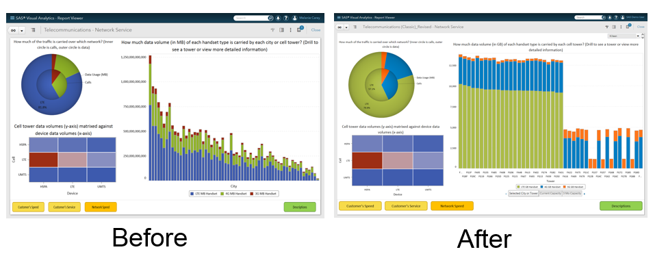
If you are going to use red to represent “bad” and green to represent “good” you shouldn’t use them in other charts on the same section to represent a category or measure value. It’s very confusing when a user see’s those colors being used to draw attention to a problem on one chart and then sees the same color on another chart representing a category. For example, the before image below uses red in the heat map to draw attention to a problem area. However, notice how red is also being used in the other charts to represent the 3G handsets. In the after image, we’ve changed the pie and bar charts so that red is no longer being displayed. This makes it much easier for the user to quickly identify issues.
Stick to similar color families where possible:
Within a particular section of the report you should try to stick to similar color families. For example, use cool colors such as blue, green and grey on one screen versus using every color.
Use the same colors throughout the report for the same category values:
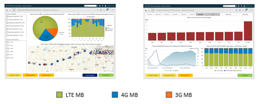
When possible you should use the same colors to represent the same category values throughout the report. In the example below you can see that in both of the sections displayed, lime green is used to represent LTE MB, light blue 4G MB and orange 3G MB. This makes it much easier for the user to quickly identify what type of network is being displayed no matter where they are in the report.
Flat or None for the style is now the “in” thing to use:
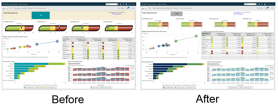
It is now the trend to use the flat or none style for your charts instead of the gradient look produced with the matte or gloss style. In the example below, you can see that the gauges and bar charts styles have been changed to the none style. This example also shows how we now only use red to highlight problem areas.
Text
Title charts/graphs:
For chart and graph titles it is important to make them obvious and distinct from axis titles. They should be bold and have a larger font than the chart axis titles.
Legibility of text:
When possible, use dark colored text on a light background or vice versa. It is really hard to read light colored text when it is on a light colored background.
Layout
Look at each layout with fresh eyes:
It’s important to remember that when a user first glances at your report they may not have the background knowledge about the data that you have. Does the report draw the user’s eye to potential issues? Is it easy for a new user to understand what the data is showing or do they need to spend time studying the charts before they can comprehend the information?
Group like graphs together:
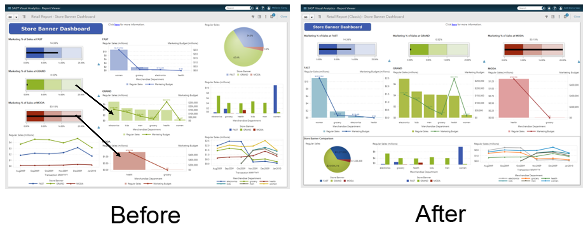
If you have charts that pertain to the same or similar element they should be grouped together for easy reading. In the example below, notice how the green and red gauge and their corresponding bar/line chart are not aligned. In the after diagram the charts are aligned and there is now a box around the charts that compare across the store banners. This makes it much easier for the viewer to quickly understand which charts are related.
Try not to cram too many graphs into one space:
If you have too many charts in one page it takes much longer for the user to grasp where one piece of information ends and another begins. You need to leave some breathing room for the user’s eye. In the example above we have many charts on the page. However, by using the outlined box we quickly illustrate that the charts within that box are related and separate from the information in the charts above the box.
TDWI:
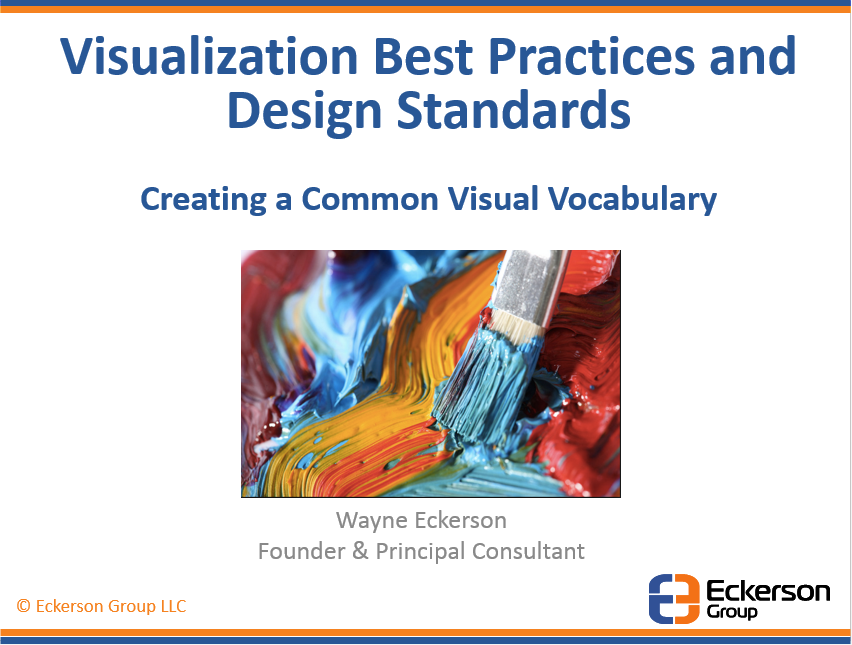
Recently I attended a TDWI conference where I took a course on Visualization Best Practices and Design Standards taught by Wayne Eckerson of the Eckerson Group. This next section will highlight some of the key points from the session (images used below are from Wayne Eckerson’s slide deck).
Know your users:
When developing a report you should understand the company’s culture. Some of the older companies like more conservative reports without a lot of images. However, the more hip and younger companies seem to like the use of images. You also need to understand who will be utilizing the reports. The more mature user likes a dense report where they can see many pieces of information on one screen. However, the less mature user needs a sparse display (with more clicks for drill through) so that they can quickly understand the issues and be guided to the details faster.
Know your data:
Understanding your data and the information you want to portray is very important.
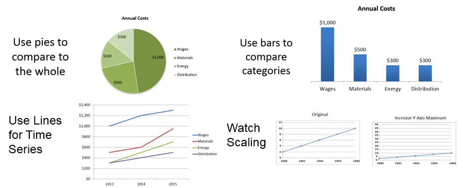
- When you want to compare one category to the whole use pie charts. However, when you want to compare one category to another the bar chart should be used.
- Avoid using 3-D charts as it distracts the viewer’s eye from the information you want to portray.
- Scaling can be very important to the story. When you want to show a big change use a smaller scale, however, if you want to make something look “not so bad” (like a growth in cost) then increase your y-axis maximum (see blow line chart).
Highlight the Message:
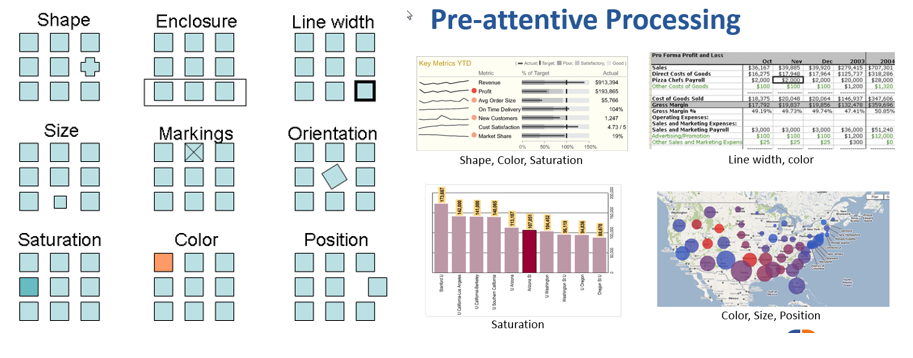
According to Wikipedia “Pre-attentive processing is the subconscious accumulation of information from the environment. All available information is pre-attentively processed. Then, the brain filters and processes what is important.”
Here are some ways you can create pre-attentive processing.
- For trend and status information use arrows or + and – signs or sparklines.
- For status use a stoplight (conditional highlighting) but only for those in trouble. For example if a certain category value is in the green don’t show any color or image. If there is an issue then use color or an image. This way the user is quickly drawn to the problem.
- Use bullet charts to replace gauges and dials.
- When you know you have mature users and you want to show a dense display make sure you remove clutter (unnecessary pixels… if something on your screen doesn’t help tell the story don’t use it. For example, remove images that don’t actual contain important information).
- Using too much color can be distracting. Use color for conditional highlighting of important information only. If the data isn’t important don’t color it.
- Use saturation (lighter and darker versions of the same color) to draw the users eye to important information.
Refer to the image below for examples.
Impel to Action:
Where possible, link directly to the source detail.
Make Every Pixel Count:
As was mentioned previously, every pixel should help tell the story. Your goal should be to convey the most amount of information in the least amount of space with the least amount of ink.
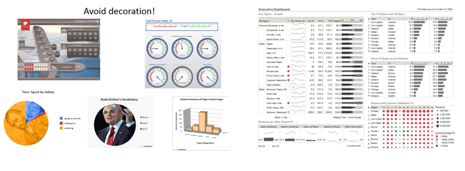
- Decoration can overwhelm the data so avoid using it.
- In some gauges the eyes are drawn to the circle and not the data. Therefore, the story of the data is not coming through.
- Don’t use 3-D charts.
- Remember that less is more!
The images on the left show how decoration can overwhelm the data. The image on the right shows how you can show lots of data with minimal amounts of distraction quickly drawing the user’s attention to issues.
Conclusion:
Creating and designing reports can take so much time that we often ignore the importance of the report’s visuals. I hope the information presented above provides some quick checks for you to use when finalizing your reports.
Melanie Carey,
Senior Solutions Architect
SAS Institute
Don't miss out on SAS Innovate - Register now for the FREE Livestream!
Can't make it to Vegas? No problem! Watch our general sessions LIVE or on-demand starting April 17th. Hear from SAS execs, best-selling author Adam Grant, Hot Ones host Sean Evans, top tech journalist Kara Swisher, AI expert Cassie Kozyrkov, and the mind-blowing dance crew iLuminate! Plus, get access to over 20 breakout sessions.
Free course: Data Literacy Essentials
Data Literacy is for all, even absolute beginners. Jump on board with this free e-learning and boost your career prospects.
