- Home
- /
- SAS Communities Library
- /
- Creating an R Shiny app with SAS Viya
- RSS Feed
- Mark as New
- Mark as Read
- Bookmark
- Subscribe
- Printer Friendly Page
- Report Inappropriate Content
Creating an R Shiny app with SAS Viya
- Article History
- RSS Feed
- Mark as New
- Mark as Read
- Bookmark
- Subscribe
- Printer Friendly Page
- Report Inappropriate Content
There is not one solution or programming language that will deliver everything you need. That is why customizing the platform you already master is where you find value. In order to accomplish this, I've seen customers move directly to coding, in lieu of SAS user interfaces. This provides freedom and full control on how things get executed. This holds true for analytics and SAS Viya. In this post I'll discuss an application, written in R Shiny, as a low-code solution demonstrating SAS integration through APIs with open source languages.
Utilizing SAS APIs as an interface allows you to:
- utilize the knowledge you already know, for example R, Python, Lua, etc
- build things the way you imagined, to what makes sense for you
- integrate SAS processes to your systems:
- embed SAS scoring capabilities on a website
- run SAS processing in real time for data quality control
- mix/match language specific capabilities with the SAS engine
- incorporate all platform capabilities - from data access to deployment to integration.
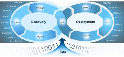
Let's first introduce SAS Viya and how it is designed to facilitate the analytics life cycle using APIs.
SAS Viya

Data preparation
It is not just about offering a basic set of self-service data preparation capabilities like visual joins, filter data, column transformation, profiling, etc. Focus more on required capabilities for analytical model development like variable selection/treatment, handling missing values, training-validation data partitioning and more.
Explore
Visual exploration is key for any data scientist. We do not want you to explore biased hypothesis, miss key findings, and draw incorrect or incomplete conclusions. Otherwise it will adversely affect decisions and outcomes. Hence, visual exploration is key to the analytical life cycle – before and after you build the model.
SAS Viya also offers statistical procedures ranging from classic statistics to machine learning with automated machine learning, forecasting and optimization, as well as visualization capabilities.
Deployment
This phase is where customers assemble everything they build in the the data prep and explore steps. Deployment includes putting a model into production, setting up a full ETL + Visualization process, etc.
Deployment potentially creates headaches for IT and Analysts. This is due to the monitoring and upkeep requirements once a model is put into production. SAS has model management capabilities to alert when a model decays in performance and setup retraining. Not only that, but it will also help IT govern tables used in projects, project lineage and access to system.
Now that we know what SAS Viya offers, let's see how we can integrate with open source.
 Open source integration
There any many ways to interact with the platform. This article by my SAS colleague Mark Thomas is an excellent overview of open source integration points with SAS Viya.
In his article, Mark breaks down SAS Viya interaction with open source in four categories:
- open-source applications leveraging SAS execution engines
- SAS applications leveraging open-source execution engines
- application development/integration
- data integration
For more details, I highly recommend reading more in Mark's article.
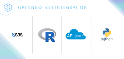
The effort to integrate is part of the API-first approach which has in recent years changed how we consume information and also a shift on education. Nowadays, access to programming skills are much easier than years ago. Suffice it to say, SAS recognizes the value of openness and provides tools for integration through its APIs.
Today we will focus on R integration. We'll create an R Shiny application and interface with SAS.
R Shiny
R Shiny is a package that allows you to build interactive web applications straight from R. The library is extendable with CSS themes, HTML widgets, and JavaScript actions. I won’t go into details in this post on the details of R Shiny but getting set up and started is quite easy from an RStudio session.
For our use case in this post, we’ll use R Shiny to write and test code on the RStudio interface to create the application. The R code backing the application sends requests to SAS using the SAS Scripting Wrapper for Analytics Transfer (SWAT) package for R. SAS acts as the source for data storage and processes any computational or analytical requests, returning the results back to the application.
We can also choose from a variety of themes depending on what we are trying to build. R Shiny provides the ability to render tables, plots, filters, input fields and create different screens, like a regular application without even bothering with HTML, CSS, and/or JS. I recommend the R Shiny tutorial for more information on set up and functionality.
Now that we are familiar with our tool set, let's dive into the example.
The final application
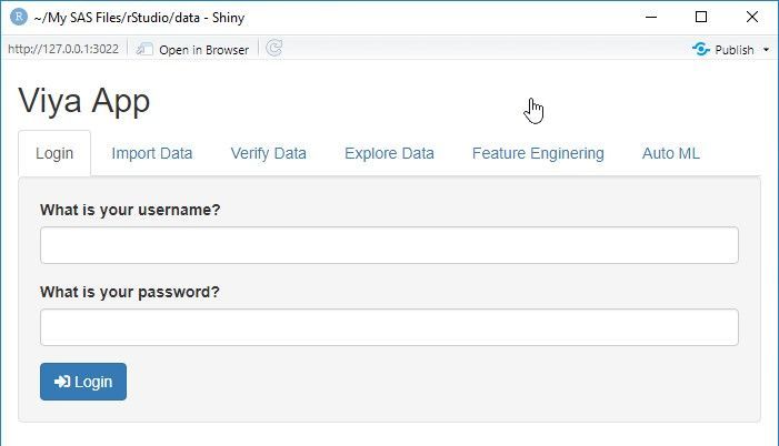
To introduce our app, let’s start at the end. Below is the application login screen once the app is up and running.

The app is built to upload a data set, perform some data management tasks, and train models. How do we get there? It’s really pretty simple. Let’s find out. The following video takes you through the entire application build process. You may also follow the details, with sample code through the rest of this article.
The code
We break the R Shiny code down into three distinct sections:
- R code – functions used make calls to SAS via SWAT as well as data wrangling and model architecture setup.
- Design the UI – this is pure R code to setup the Shiny UI. We define tabs, buttons, fields and what gets rendered on screen.
- Define the server – define what to do with response outputs from SAS.
R code
This is the section for R code for connecting, data manipulation, model training and visualization. The R code here uses SWAT to connect to SAS and run CAS Actions, which is a set of functions to perform operations in SAS.
I will not go through the whole code on this blog, but you can check the full code on the repository in GitHub.
This code you will see below is a subset of the full code just to demonstrate how to tie the back end (SAS Viya) with the front end (R Shiny).
#####################################
# R code for data manipulation,
# model training and visualization
#####################################

# Connect function
connect <- function(username, password, lib) {
  conn <<- CAS('your-host', port=8777, caslib = 'casuser',   username = username,   password = password, protocol = "http", no_gen_actions=1)

  # load actionsets
  gen.functions(conn, 'table')
  gen.functions(conn, 'simple')
  gen.functions(conn, 'builtins')

  return(cas.builtins.serverStatus(conn))
}

# Generate summay statistics for a specific CAS Table
explore_tbl <- function(tbl) {
  cols <- c("Column", "Min", "Max", "N", "NMiss", "Mean",	"Sum")
  summary_tbl <- data.frame(cas.simple.summary(conn, table={name=tbl}))[1:7]
  colnames(summary_tbl) <- cols
  return(summary_tbl)
}

# Upload SAS dataset to CAS
upload_tbl <- function(tbl_path) {
  str1 <- gsub("\\","/", tbl_path["datapath"], fixed=TRUE)
  name = unlist(strsplit(as.character(tbl_path["name"]), split='.', fixed=TRUE))[1]
  cas.table.dropTable(conn, caslib="casuser", name=name, quite=TRUE)
  tbl <- cas.read.sas7bdat(conn, str1, casOut=list(name=name, caslib="casuser", replace = TRUE))
  tbl <- defCasTable(conn, table=name)
  tbl_sum <- explore_tbl(name)
  return(tbl_sum)
}
The UI
This R Shiny code below is the beginning of the code creating the user interface we displayed earlier. This is the page layout for the tabs Login, Import Data, etc.
########################################
#             Defining the UI
#    Creating the panels and tabs
########################################

if (interactive()) {
  ui <- fluidPage(
    titlePanel("Viya App"),
    tabsetPanel(
      tabPanel(title = "Login",
               sidebarLayout(
                 sidebarPanel(
                   tags$head(tags$style(type="text/css", "
                       #loadmessage {
                         position: fixed;
                          top: 50%;
                          left: 50%;
                          transform: translate(-50%, -50%);
                          width: 100%;
                          padding: 5px 0px 5px 0px;
                          text-align: center;
                          font-weight: bold;
                          font-size: 100%;
                          color: #000000;
                          background-color: rgba(0,255,0,0.5);
                       }")
                   ),
                   textInput(label = "What is your username?", inputId = "username"),
                   passwordInput(label= "What is your password?", inputId = "pwd"),
                   submitButton("Login", icon("sign-in-alt")),
                   conditionalPanel(condition="$('html').hasClass('shiny-busy')",
                                    tags$div("Loading...",id="loadmessage"))
                 ),
                 mainPanel(
                   tableOutput("connection"),
                 )
               )
      ),
      tabPanel(title = "Import Data",
               sidebarLayout(
                 sidebarPanel(
                   fileInput(inputId = "csv_file", label="File", multiple = FALSE, accept = NULL, width = NULL)
                 ),
                 mainPanel(
                   tableOutput("tbl_import"),
                 )
               )
      )
    )
  )

  ########################################
  #         Defining R Shiny Server
  #    Creating calls to R code and
  #    rendering it on the panels
  #    defined above on the UI
  ########################################

  < insert code from the section below here >
}
The R Shiny server
And finally, we need to bring everything together by defining the server. The code snippet below outlines how to render the information returned from SAS, in the application.
########################################
#         Defining R Shiny Server
#    Creating calls to R code and
#    rendering it on the panels
#    defined above on the UI
########################################

  server <- function(input, output, session) {

    output$connection <- renderTable ({
      validate(need(input$username, ''))
      validate(need(input$pwd, ''))
      connect(input$username, input$pwd, 'CASUSER')
    })

    output$tbl_import <- renderTable({
      validate(need(input$csv_file, ''))
      upload_tbl(input$csv_file)
    })

    output$tbl_profile <- renderTable({
      validate(need(input$tbl_to_profile, ''))
      explore_tbl(input$tbl_to_profile)
    })

    output$tbl_list <- renderTable({
      validate(need(input$library_to_explore, ''))
      list_tables(input$library_to_explore)})

    # then, render the output table
    output$tbl_import <- renderTable({
        validate(need(input$csv_file, ''))
        upload_tbl(input$csv_file)
    })

shinyApp(ui, server)
Application details
For the final section of this post let’s briefly look at the application, how it functions and what it can do.
The application is comprised of six tabs: Login, Import Data, Verify Data, Explore Data, Feature Engineering and Auto ML. Let’s explore each tab.
Login
The login tab is used for authentication to the SAS server. When credentials are provided, you can see the calls being invoked in RStudio. This holds true for any action taken on any tab.
Import Data
In this section you will be able to import data and view summary statistics (min, max, Nobs, missing, etc)
Verify Data
You provide the name of the library where the data lives and see which tables you have available in memory, as well as run summary statistics for each of them.
Explore Data
You will be able to analyze the data using Cardinality and Missing Percentage graphs . These graphs will be generated using the table name you fill in. The plots can be explored using zoom in/out and selection pane.
Feature Engineering
One of the steps the data scientist can go through is creating new features. SAS has developed the Feature Machine Action. In this section you will be able to select from a range of options to generate features by analyzing:
- High cardinality
- High kurtosis
- High skewness
- Low entropy
- Low indices of qualitative variation
- Missing values
- Outliers
Auto ML
In the final step of the project, you will run the models using the generated features. You can select one or more models. SAS will train those models, score the data set and generate the ROC and misclassification metrics for you to compare those models.
Conclusion
In this article we saw how to build a simple application using R Shiny and SAS Viya. This is just the beginning, but demonstrates how to take advantage of the APIs SAS offers. If you want to see the full code, go to our GitHub repository. There you will find the code and and a copy of the video with the demonstration of the app we created. The full app will follow through the analytical life cycle and implement Data Exploration, Feature Engineering and Machine Learning training and model comparison.
- Mark as Read
- Mark as New
- Bookmark
- Permalink
- Report Inappropriate Content
Nice work Lucas!!
- Mark as Read
- Mark as New
- Bookmark
- Permalink
- Report Inappropriate Content
Fantastic work ! #smb
- Mark as Read
- Mark as New
- Bookmark
- Permalink
- Report Inappropriate Content
Love it! Thank you @lucasdepaula , @joeFurbee
- Mark as Read
- Mark as New
- Bookmark
- Permalink
- Report Inappropriate Content
This is absolutely awesome, thank you so much. Especially excited, since Shiny has also been published for Python as well, challenging the common Python frontend frameworks.
Catch up on SAS Innovate 2026
Dive into keynotes, announcements and breakthroughs on demand.
Explore Now →SAS AI and Machine Learning Courses
The rapid growth of AI technologies is driving an AI skills gap and demand for AI talent. Ready to grow your AI literacy? SAS offers free ways to get started for beginners, business leaders, and analytics professionals of all skill levels. Your future self will thank you.

