- Home
- /
- SAS Communities Library
- /
- Building Control Charts for SAS Visual Analytics on Viya.
- RSS Feed
- Mark as New
- Mark as Read
- Bookmark
- Subscribe
- Printer Friendly Page
- Report Inappropriate Content
Building Control Charts for SAS Visual Analytics on Viya.
- Article History
- RSS Feed
- Mark as New
- Mark as Read
- Bookmark
- Subscribe
- Printer Friendly Page
- Report Inappropriate Content
Control Charts
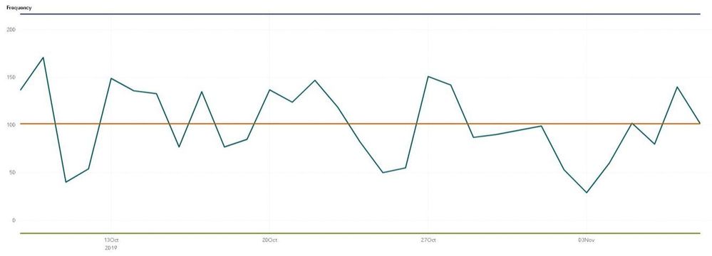
Control charts are traditionally used for monitoring process stability and control. The elements of a control chart include:
- A time series.
- A central line for detecting shifts or trends, often the average.
- An Upper Control Limit (UCL), often three standard deviations, or three sigma, above the average.
- A Lower Control Limit (LCL); often three standard deviations, or three sigma, below the average.
Beyond manufacturing, control charts can be useful for monitoring changes in fraud over time, such as changes in the frequency of fraudulent transactions, the percentage of fraudulent transaction, and the funds lost due to fraud. Moving above the UCL could set off alarms for human intervention to improve an existing fraud model or create new fraud rules. Monitoring before and after model or rule changes can help determine the effectiveness of those changes. The applications of control charts in fraud monitoring could help organizations save money, so let’s discuss how to create a control chart in Visual Analytics on Viya. Before moving on, if you are interested in a more in-depth primer to control charts or want to build control charts in SAS Studio, please see this video.
Visual Analytics and Control Charts
Out-of-the-box, SAS Visual Analytics on Viya does not include a control chart object. In addition, the reference lines in the time series object are static – they will not dynamically change as the data changes. But that is not a problem for us! To create a dynamic control chart, meaning a chart that changes the average, UCL, and LCL lines, based on a rolling date period, we will build a custom graph, make calculated items, and filter the chart by date. In-depth step-by-step instructions on creating controls charts in SAS Visual Analytics on Viya are below!
Build a Custom Graph
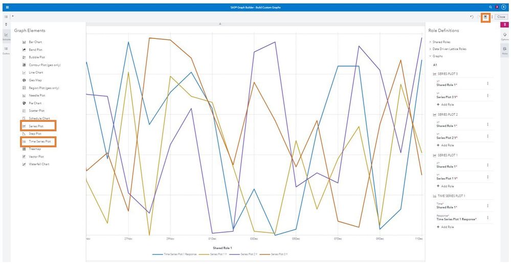
First, we must build a custom time series graph that includes three additional series lines. To build a custom graph, do the following:
- Open the left-hand menu on Viya and select Graph Builder, which is under “Build Graphs” in Viya 3.4 and under “Build Custom Graphs” in Viya 3.5.
- Once in Graph Builder, select “New Custom Graph”.
- From the left-hand “Elements” menu, drag a “Time Series Plot” onto the canvas. This will represent the measure being monitored over time.
- Next, drag a “Series Plot” onto the graph three times. These lines will represent the average, the UCL, and the LCL lines.
- Save the chart by clicking the save icon in the upper right-hand corner
To use the custom chart in Visual Analytics, do the following:
- Open the left-hand “Objects” menu and then click into the options menu.
- From the options menu, click “Import custom graphs…” and select the saved custom graph.
Make Calculated Items
Prior to creating calculated items, you need to decide your time period and time frequency. In this example, I will be making these calculations on a daily frequency and will represent the chosen time period as the “Number_of_Days” from today.
To create a calculated item, do the following:
- Select “New data item” from the left-hand “Data” menu.
- From the resulting drop down menu, select “Calculated item”.
- Next, create the following five calculated items:
- Control Chart Measure.
- Control Chart Average.
- Control Chart Sigma.
- Control Chart UCL.
- Control Chart LCL.
Control Chart Measure
The Control Chart Measure represents what you are monitoring. In the following example, I will look at frequency, but you can modify the calculations to look at percentage or costs. The chart will be filtered to only include the monitoring period and when an aggregated item is applied to an object, it will only aggregate the observations in that object.
To create Control_Chart_Measure, do the following:
- Drag the “Count” aggregation from the “Aggregated (simple)” operator menu onto the visual calculate item canvas.
- Specify _ByGroup_ in the aggregation. This will aggregate based on the groupings in our chart, which will be by day (or whichever time frequency you decide).
- Drag an ID variable into the aggregation.
- Specify a name for your calculated item, such as Control_Chart_Measure, and save the item.
Control Chart Average
To create Control_Chart_Average, do the following:
- Drag the “Count” aggregation from the “Aggregated (simple)” operator menu onto the visual calculate item canvas.
- Specify _ForAll_ in the aggregation. This will count the total number of items in this period.
- Drag an ID variable into the aggregation.
- Drag “x/y” from the “Numeric (simple)” operator menu onto the canvas such that the aggregation is the numerator.
- Specify the number of days as the denominator.
- Specify a name for your calculated item, such as Control_Chart_Average, and save the item.
Control Chart Sigma
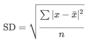
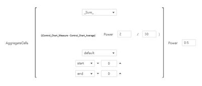
Sigma represents the standard deviation within this time period. Standard deviation can be calculated as square root of the the sum of the differences between the mean and the actual value squared divided by the number of observations. This piece is the most complicated aspect since it requires a nested aggregation.
To create the Control_Chart_Sigma calculated item, do the following:
- Drag “AggregateCell” from the “Aggregated (tabular)” operator menu onto the visual calculate item canvas.
- Select “_Sum_” as the aggregation for the “AggregateCell” operator.
- Leave the aggregation direction as “Default” in the “AggregateCell” operator.
- Change the range to be from “Start” to “Finish” in the “AggregateCell” operator.
- Drag “Power” from the “Numeric (advanced)” operator onto the calculation such that “AggregateCell” is raised to a power. Specify 0.5 as the power.
- Drag “x/y” from the “Numeric (simple)” operator into the open position.
- Specify the number of days as the denominator.
- Drag “Power” from the “Numeric (advanced)” operator such that the power is applied before the division. Specify 2 as the power.
- Drag “x-y” from the “Numeric (simple)” into the open position.
- Drag Control_Chart_Measure into the first open position in the subtraction.
- Drag Control_Chart_Average into the second open position in the subtraction.
- Specify a name for your calculated item, such as Control_Chart_Sigma, and save the item.
Control Chart UCL
The UCL line needs to be three sigma, or three standard deviations above the mean. Thus, we will multiple sigma by three and add the mean. To create Control_Chart_UCL, do the following:
- Drag “x+y” from the “Numeric (simple)” operator menu onto the visual calculate item canvas.
- Drag Control_Chart_Average into the first open position in the addition.
- Drag “x*y” from the “Numeric (simple)” operator menu onto second open position of the addition.
- Type three into the first open position in the multiplication.
- Drag Control_Chart_Sigma into the second open position in the multiplication.
- Specify a name for your calculated item, such as Control_Chart_UCL, and save the item.
Control Chart LCL
The LCL line needs to be three sigma, or three standard deviations below the mean. Thus, we will multiple sigma by three and subtract it from the mean. To create Control_Chart_LCL, do the following:
- Drag “x-y” from the “Numeric (simple)” operator menu onto the visual calculate item canvas.
- Drag Control_Chart_Average into the first open position in the subtraction.
- Drag “x*y” from the “Numeric (simple)” operator menu onto second open position of the subtraction.
- Type three into the first open position in the multiplication.
- Drag Control_Chart_Sigma into the second open position in the multiplication.
- Specify and name for your calculated item, such as Control_Chart_LCL, and save the item.
Putting It Together and Filtering By Date
Now you should have a custom chart and several calculated items. Drag the custom graph onto the Visual Analytics canvas and assign roles to your date variable, Control_Chart_Measure, Control_Chart_Average, Control_Control_Chart_UCL, and Control_Chart_LCL. The final step is to add a filter for date which will ensure that the calculations are for the correct time period. To add the filter, do the following:
- Click the custom graph object to select the object.
- From the right-hand menu, select “Filters”.
- From “Filters” select “+ New Filter” and use your date variable as the filter.
- Next to the date filter, select the options menu. From the options menu select “Advanced Edit…”.
- From under the “Conditions” menu, select “Last 30 Days” and drag it onto the filter canvas.
- Change the 30 to match the number of days.
- Hit “OK” to apply the filter.
Now you should have a control chart in Viya Visual Analytics to monitor changes on a regular basis over a set time period.
Questions? Comments? Please feel free to leave a comment!
- Mark as Read
- Mark as New
- Bookmark
- Permalink
- Report Inappropriate Content
Hi @SophiaRowland I'm trying to replicate your Control Chart, but I didn't understood how you create your “Number_of_Days” from today. You create the variable on VA from your date variable or was on your dataset?
Thanks in advance
- Mark as Read
- Mark as New
- Bookmark
- Permalink
- Report Inappropriate Content
Hello @fj181. In this example, Number_of_Days is up to you. If you want your control chart to go back a week, you would replace Number_of_Days with 7, if you want your control chart to go back a month, you would replace Number_of_Days with 30, etc.
Catch up on SAS Innovate 2026
Dive into keynotes, announcements and breakthroughs on demand.
Explore Now →SAS AI and Machine Learning Courses
The rapid growth of AI technologies is driving an AI skills gap and demand for AI talent. Ready to grow your AI literacy? SAS offers free ways to get started for beginners, business leaders, and analytics professionals of all skill levels. Your future self will thank you.
- Find more articles tagged with:
- Control Charts
- SAS Custom Graphs
- SAS Visual Analytics
- SAS Viya


