- Home
- /
- SAS Communities Library
- /
- 10 tips for creating SAS Mobile BI data visualization reports
- RSS Feed
- Mark as New
- Mark as Read
- Bookmark
- Subscribe
- Printer Friendly Page
- Report Inappropriate Content
10 tips for creating SAS Mobile BI data visualization reports
- Article History
- RSS Feed
- Mark as New
- Mark as Read
- Bookmark
- Subscribe
- Printer Friendly Page
- Report Inappropriate Content
Your manager needs to report on sales numbers to executives during a break at an offsite conference … tomorrow. You run these reports daily, but want to make sure they convey perfectly on the iPad or iPhone your boss will be using. This and subsequent articles will describe 10 tips for creating reports in SAS Mobile BI, the mobile interface for SAS Visual Analytics, to get them just right.
Before we dive in, a bit of background on SAS Mobile BI. It is a native application for both the iOS and Android platforms, which means you can access user interface (UI) platform-specific reports offline. So even though SAS Mobile BI is a native app, it remains consistent in form, fit and function across platforms.
Back to the tips. The following aspects are essential to consider when designing effective reports in SAS Mobile BI. I’ll explain the first in more detail below, and then devote follow-up articles to the others in the coming weeks.
- Understand the business question and make reports visually appealing
- Build once and view everywhere
- When to use tethered and offline modes
- Maximize content by using containers
- Employ the right prompt controls
- Improve report performance with predefined filter values
- Use report parameters for “what-if” analyses
- See more to the story with Info Windows
- Share and collaborate on reports
- Prepare and troubleshoot
Understand the business question and scope the report
What business questions does the report need to answer for a business user? List those out and build your reports from there.
Each section should focus on one specific piece of the question. This structure will help your manager easily understand the analysis and see a clear path to view and explore further.
Be sure to size and scope the report, organizing it into sections. It may be tempting to add all the metrics you can think of to a section so that it covers all possible questions that may be asked today and tomorrow. This will make it confusing, unreadable and more often miss the very essence of the report. You’ll find that a one-size-fits-all approach makes the report too bulky, negatively affecting the performance when downloading and updating the report. More is not always better.
Make reports visually appealing
A well-used report is a good-looking report. The onus is on the report author to design a report which is pleasing to look at and easy to use without requiring explanation. It should be intuitive for the business user.
Keep in mind that reports are consumed on mobile devices that have smaller form factors, unlike web interfaces on bigger monitors. So limit the number of visuals that are displayed in a section at any given time. Studies show that the optimal number of visual objects per section for display is no more than six. If there is a need to have more than six objects on a section, consider using containers, explained in a future post.
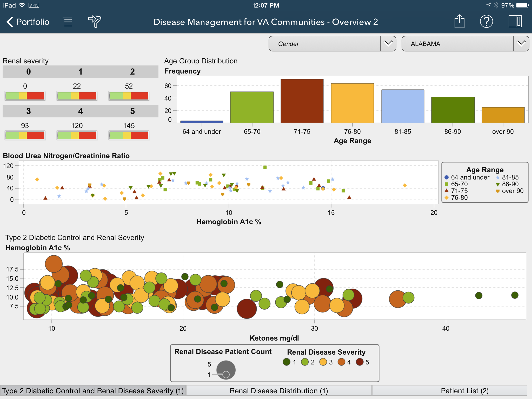
Here is an example of a report with too many visuals that reduces the readability and usability of this report.
Here is the picture of the same report with some of the visuals put into a stack container. All the visuals are there but are re-organized.
Want more tips on creating mobile reports? Subscribe to the SAS Visual Analytics section (click Subscribe in the pink-shaded bar of the section) of the SAS Communities Library for future posts.
Don't miss out on SAS Innovate - Register now for the FREE Livestream!
Can't make it to Vegas? No problem! Watch our general sessions LIVE or on-demand starting April 17th. Hear from SAS execs, best-selling author Adam Grant, Hot Ones host Sean Evans, top tech journalist Kara Swisher, AI expert Cassie Kozyrkov, and the mind-blowing dance crew iLuminate! Plus, get access to over 20 breakout sessions.
Free course: Data Literacy Essentials
Data Literacy is for all, even absolute beginners. Jump on board with this free e-learning and boost your career prospects.
Get Started
- Find more articles tagged with:
- SAS Mobile BI Tips


