- Home
- /
- Programming
- /
- Graphics
- /
- proc sgplot / custom scale for xaxis
- RSS Feed
- Mark Topic as New
- Mark Topic as Read
- Float this Topic for Current User
- Bookmark
- Subscribe
- Mute
- Printer Friendly Page
- Mark as New
- Bookmark
- Subscribe
- Mute
- RSS Feed
- Permalink
- Report Inappropriate Content
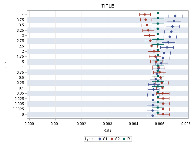
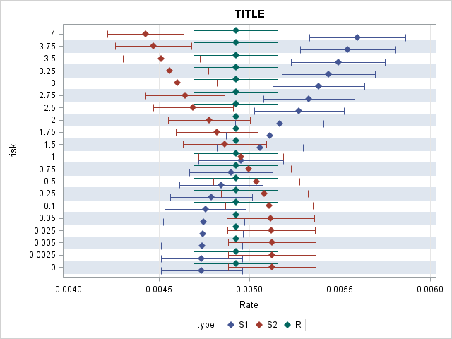
I'd like to create a Plot 1 without the empty space with no information. Ideally, I want to show xaxis only for the range of 0.004-0.006 keeping CI95% brackets as narrow as shown in plot1. However, every time I use min, max, offsetmin, offsetmax options or values=from to by, or xaxis min=0.004 options in the code, 95%CI brackets become so wide as shown in Plot 2 which is not desirable. Please help how to create Plot 1 but without the empty space in front.
Plot 1. Desirable dimension and style of plot for narrow CI95%. But I would like to eliminate the space without information until from 0 to 0.004
Plot 2. Undesirable style but resulted from code with xaxis min=0.004
k
proc sgplot data=data;
   scatter y=Risk x=Rate/ xerrorlower=LowerCL xerrorupper=UpperCL
           markerattrs=(symbol=diamondfilled)
           group=Type groupdisplay=cluster;
   xaxis grid min=0;
   yaxis grid colorbands=odd discreteorder=data type=discrete;
   label Rate = "Rate";
run;
I
Accepted Solutions
- Mark as New
- Bookmark
- Subscribe
- Mute
- RSS Feed
- Permalink
- Report Inappropriate Content
The CI bar widths are scaled to the x-axis based on the values you provide in the LowerCL and UpperCL variables in the data set. It is the same in both the graphs. Plot 1 has bigger range on the x-axis, so the same bar widths look smaller. The only way to change them is if you change the values in the LowerCL and UpperCL variables in the data set.
- Mark as New
- Bookmark
- Subscribe
- Mute
- RSS Feed
- Permalink
- Report Inappropriate Content
Don't set the min=0 on the xaxis statement. Then you will not get the empty space.
The CI bar widths depend on the values in the data you are providing and scaled with the x-axis.
- Mark as New
- Bookmark
- Subscribe
- Mute
- RSS Feed
- Permalink
- Report Inappropriate Content
Thanks Sanjay. Commenting out min=0 resulted in widened 95CI. Desirable plot is narrow and tall CI95 as shown in plot 1.
proc sgplot data=p.alb_conc;
   scatter y=Risk x=Rate/ xerrorlower=LowerCL xerrorupper=UpperCL
           markerattrs=(symbol=diamondfilled)
           group=Type groupdisplay=cluster;
/*   xaxis grid min=0.004;*/
   yaxis grid colorbands=odd discreteorder=data type=discrete;
   label Rate = "Rate";
   title 'hi';
run;- Mark as New
- Bookmark
- Subscribe
- Mute
- RSS Feed
- Permalink
- Report Inappropriate Content
The CI bar widths are scaled to the x-axis based on the values you provide in the LowerCL and UpperCL variables in the data set. It is the same in both the graphs. Plot 1 has bigger range on the x-axis, so the same bar widths look smaller. The only way to change them is if you change the values in the LowerCL and UpperCL variables in the data set.
- Mark as New
- Bookmark
- Subscribe
- Mute
- RSS Feed
- Permalink
- Report Inappropriate Content
- Mark as New
- Bookmark
- Subscribe
- Mute
- RSS Feed
- Permalink
- Report Inappropriate Content
If you leave out the NOAUTOLEGEND you will get the default legend at the bottom. You can customize its position by using a KEYLEGEND / position=right across=1;
April 27 – 30 | Gaylord Texan | Grapevine, Texas
Registration is open
Walk in ready to learn. Walk out ready to deliver. This is the data and AI conference you can't afford to miss.
Register now and save with the early bird rate—just $795!
Learn how use the CAT functions in SAS to join values from multiple variables into a single value.
Find more tutorials on the SAS Users YouTube channel.
SAS Training: Just a Click Away
Ready to level-up your skills? Choose your own adventure.


