- Home
- /
- Programming
- /
- Graphics
- /
- overlay graph of predicted probabilities from two glimmix models
- RSS Feed
- Mark Topic as New
- Mark Topic as Read
- Float this Topic for Current User
- Bookmark
- Subscribe
- Mute
- Printer Friendly Page
- Mark as New
- Bookmark
- Subscribe
- Mute
- RSS Feed
- Permalink
- Report Inappropriate Content
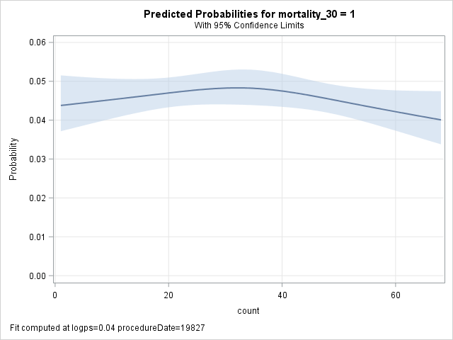
I am trying to overlay two plots of count vs. predicted probability with confidence intervals from glimmix output. I would like to show the predicted probabilities by group (glimmix was run by group, only two groups). I attempted to do this using proc plm and effectplot, but I don't see a way to overlay plots when there is no interaction term present in the model.
Thank you!
- Mark as New
- Bookmark
- Subscribe
- Mute
- RSS Feed
- Permalink
- Report Inappropriate Content
If it’s not in the plots options you’ll have to capture the data and create your own plot.
@psh23 wrote:
I am trying to overlay two plots of count vs. predicted probability with confidence intervals from glimmix output. I would like to show the predicted probabilities by group (glimmix was run by group, only two groups). I attempted to do this using proc plm and effectplot, but I don't see a way to overlay plots when there is no interaction term present in the model.
Thank you!
- Mark as New
- Bookmark
- Subscribe
- Mute
- RSS Feed
- Permalink
- Report Inappropriate Content
I can't figure out how to recreate the graph using sgplot - I am looking for something like this (with overlay from regression by groups)

- Mark as New
- Bookmark
- Subscribe
- Mute
- RSS Feed
- Permalink
- Report Inappropriate Content
Post the code that you are using to generate the model. Are you using a BY statement to analyze the two groups and an OUTPUT statement to capture the predicted probabilities? If so, the output data set should contain the information you need. You can add the GROUP= option on the SERIES and BAND statements in PROC SGPLOT to overlay the curves.
- Mark as New
- Bookmark
- Subscribe
- Mute
- RSS Feed
- Permalink
- Report Inappropriate Content
proc glimmix data=test;
class facilityidofindex volume1;
effect spl=spline(count / naturalcubic knotmethod=equal details);
model &outcome.(ref='0')= logps proceduredate spl / solution oddsratio dist=binary link=logit;
random facilityidofindex;
store logiModel2;
by volume1;
output out=out1 pred(ilink)=predicted lcl(ilink)=lower ucl(ilink)=upper;
id count;
run;
proc sort data=out1; by count; run;
proc sgplot data=out1;
band x=count lower=lower upper=upper /group=volume1;
series x=count y=predicted /group=volume1 ;
run;
- Mark as New
- Bookmark
- Subscribe
- Mute
- RSS Feed
- Permalink
- Report Inappropriate Content
Because you have additional covariates in the model, your output probably looks all jagged like the second graph in the article "Visualize multivariate regression models by slicing continuous variables." You are trying to plot the predicted values vs count, but each observation also varies in the logps and proceduredate variables, which means that the predicted curve won't vary smoothly with count.
The solution is to select one or more values of the covariates as being fixed. You can then plot the model vs count. The main ideas and several examples are shown in the article "How to create a sliced fit plot in SAS." Personally, I'd try using the EFFECTPLOT SLICEFIT statement in PROC PLM, as shown in the first example of the "How to create a sliced fit plot" article.
Please read both articles. They are not an easy read, but are informative.
- Mark as New
- Bookmark
- Subscribe
- Mute
- RSS Feed
- Permalink
- Report Inappropriate Content
This is where I originally started - the main problem is that I don't think proc plm / effectplot has the capability to overlay graphs by group? The slicefit option only seems to work if the variable is in the model?
- Mark as New
- Bookmark
- Subscribe
- Mute
- RSS Feed
- Permalink
- Report Inappropriate Content
Ah! Sorry that I misunderstood you. Yes, the EFFECTPLOT statement is for visualizing a single model.
In many cases, putting the BY variable into the CLASS statement produces compatible models for linear models. If so, you might be able to use the EFFECTPLOT statement anyway: Add volume1 to the model and use SLICEBY=volume1. However, there is definitely a need to check whether the predictive models are the same.
Personally, if volume1 is a BY variable, I'd use PROC SGPANEL or ODS LAYOUT GRIDDED to put the plots side-by-side.
Catch up on SAS Innovate 2026
Dive into keynotes, announcements and breakthroughs on demand.
Explore Now →Learn how use the CAT functions in SAS to join values from multiple variables into a single value.
Find more tutorials on the SAS Users YouTube channel.
SAS Training: Just a Click Away
Ready to level-up your skills? Choose your own adventure.


