- Home
- /
- Programming
- /
- Graphics
- /
- combine histogram and boxplot in one
- RSS Feed
- Mark Topic as New
- Mark Topic as Read
- Float this Topic for Current User
- Bookmark
- Subscribe
- Mute
- Printer Friendly Page
- Mark as New
- Bookmark
- Subscribe
- Mute
- RSS Feed
- Permalink
- Report Inappropriate Content
Hi.
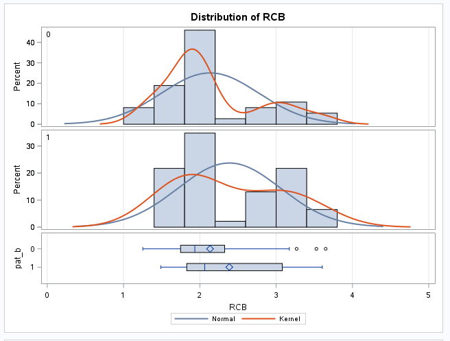
I am comparing two groups from a trial. I want to visually show the distribution of each group. I would like combine the two histogram with two boxplots in one, Basically I want it to look like the output from a ttest but without kernel and normal lines.
Google is apparently not my friend. Anyone here able to help me? I am using enterprise guide 7.15
Thank you in advance
Accepted Solutions
- Mark as New
- Bookmark
- Subscribe
- Mute
- RSS Feed
- Permalink
- Report Inappropriate Content
Thank you for your response. It got me in the right direction!
I used this answer to get there, maybe it can be helpful to others as well.
https://communities.sas.com/t5/Statistical-Procedures/Turn-off-kernel-line-in-proc-ttest/td-p/413651
- Mark as New
- Bookmark
- Subscribe
- Mute
- RSS Feed
- Permalink
- Report Inappropriate Content
This link has something similar to what you are showing:
https://support.sas.com/kb/35/171.html
It has complete code and uses a SAS data set you should have available. The main difference is it only has one histogram and one horizontal box plot.
- Mark as New
- Bookmark
- Subscribe
- Mute
- RSS Feed
- Permalink
- Report Inappropriate Content
Thank you for your response. It got me in the right direction!
I used this answer to get there, maybe it can be helpful to others as well.
https://communities.sas.com/t5/Statistical-Procedures/Turn-off-kernel-line-in-proc-ttest/td-p/413651
Catch up on SAS Innovate 2026
Nearly 200 sessions are now available on demand with the SAS Innovate Digital Pass.
Explore Now →Learn how use the CAT functions in SAS to join values from multiple variables into a single value.
Find more tutorials on the SAS Users YouTube channel.
SAS Training: Just a Click Away
Ready to level-up your skills? Choose your own adventure.


