- Home
- /
- Programming
- /
- Graphics
- /
- Why does the DATALINEPATTERNS option not work in the SGPLOT procedure
- RSS Feed
- Mark Topic as New
- Mark Topic as Read
- Float this Topic for Current User
- Bookmark
- Subscribe
- Mute
- Printer Friendly Page
- Mark as New
- Bookmark
- Subscribe
- Mute
- RSS Feed
- Permalink
- Report Inappropriate Content
Hi there,
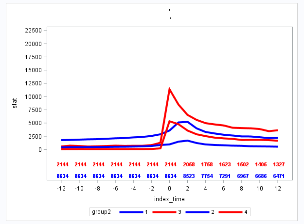
I have the SGPLOT code below. However, the datalinepatterns option could not work. The output plot lines are still all solid. Does any one know how to change the line style? I want two solid lines and two dot lines.
Thank you!
proc sgplot data=forplotfinal;
styleattrs datacontrastcolors=(blue red blue red) datalinepatterns=(solid dot solid dot);
series x=index_time y=stat/lineattrs=(thickness=4)group=group2;
scatter x=index_time y=cohort/ markerchar=remaining2 markercharattrs=(size=8 weight=bold) y2axis group=cohort;
where cancern=1;
xaxis values=(-12 to 12 by 2 );
yaxis values=(0 to 22500 by 2500) offsetmin=0.2 min=0;
y2axis offsetmax=0.9 display=none min=1 max=2;
run;

- Mark as New
- Bookmark
- Subscribe
- Mute
- RSS Feed
- Permalink
- Report Inappropriate Content
Does this option have any effect?
ods graphics / attrpriority=none;- Mark as New
- Bookmark
- Subscribe
- Mute
- RSS Feed
- Permalink
- Report Inappropriate Content
YES!!!! It works!! Thank you very much!!!
- Mark as New
- Bookmark
- Subscribe
- Mute
- RSS Feed
- Permalink
- Report Inappropriate Content
That implies that (somehow) you were using HTMLBlue as your style. HTMLBlue uses AttrPriority=Color, which favors color change over patterns.
- Mark as New
- Bookmark
- Subscribe
- Mute
- RSS Feed
- Permalink
- Report Inappropriate Content
this solved it for me also, thanks. I guess it should be marked as the solution
Catch up on SAS Innovate 2026
Dive into keynotes, announcements and breakthroughs on demand.
Explore Now →Learn how use the CAT functions in SAS to join values from multiple variables into a single value.
Find more tutorials on the SAS Users YouTube channel.
SAS Training: Just a Click Away
Ready to level-up your skills? Choose your own adventure.


