- Home
- /
- Programming
- /
- Graphics
- /
- PROC SGPLOT: quarter max value for XAXIS
- RSS Feed
- Mark Topic as New
- Mark Topic as Read
- Float this Topic for Current User
- Bookmark
- Subscribe
- Mute
- Printer Friendly Page
- Mark as New
- Bookmark
- Subscribe
- Mute
- RSS Feed
- Permalink
- Report Inappropriate Content
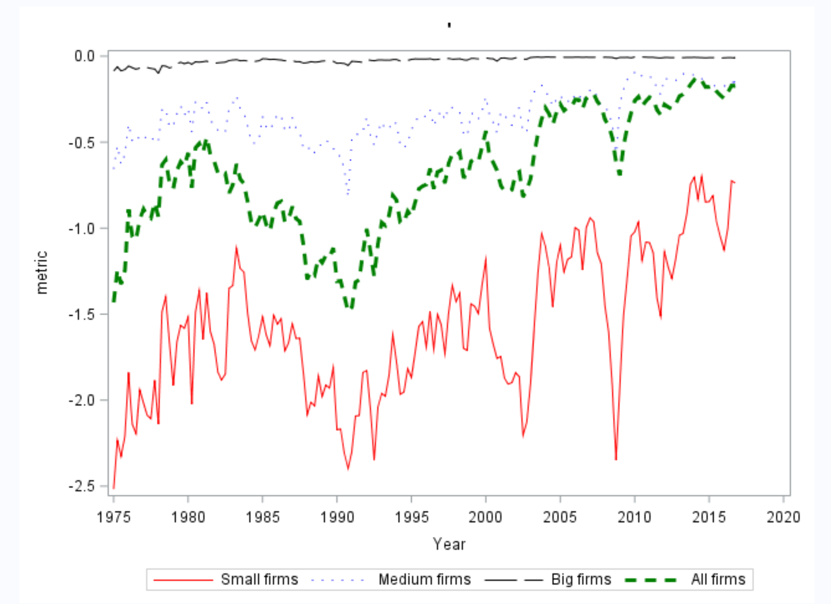
My PROC SGPLOT produces a weird gap on the right. I tried to set MAX value but it does not work.My year quarter has YYQn6. format and the maximum value in my data is 20164( quarter 4 2016). I tried MAX option but it does not work
Here is my code:
proc sgplot data= input;
	series x=yearquarter y=series1/lineattrs=(color=red pattern = solid) legendlabel= "Small firms";
	series x=yearquarter y=series2/lineattrs=(color=blue pattern = thindot) legendlabel= "Medium firms";
	series x=yearquarter y=series3/lineattrs=(color=black pattern = longdash) legendlabel= "Big firms";
	series x=yearquarter y=liq_mean/lineattrs=(color=green pattern=dash thickness= 3) legendlabel= "All firms";
	YAXIS LABEL = "metric";
	XAXIS LABEL = 'Year' MAX='20DEC2014'D;
run;
Here is what the graph looks like. the max value on the x-axis is 2020 but in the data, it is 2016
- Mark as New
- Bookmark
- Subscribe
- Mute
- RSS Feed
- Permalink
- Report Inappropriate Content
Have you tried specifying a time interval? Specifically Quarter.
If SAS overrides the max value it usually leaves a note in the log, was there any messages in your log?
Note: I'm moving this post to the graphics forum for better responses.
- Mark as New
- Bookmark
- Subscribe
- Mute
- RSS Feed
- Permalink
- Report Inappropriate Content
yes there is a note:
NOTE: The column format YYQN6 is replaced by an auto-generated format on the axis.
so I specified it to be quarter and that problem solved but they displayed all quarter labels on the xaxis which makes it look ugly.
Catch up on SAS Innovate 2026
Dive into keynotes, announcements and breakthroughs on demand.
Explore Now →Learn how use the CAT functions in SAS to join values from multiple variables into a single value.
Find more tutorials on the SAS Users YouTube channel.
SAS Training: Just a Click Away
Ready to level-up your skills? Choose your own adventure.


