- Home
- /
- Programming
- /
- Graphics
- /
- PROC SGPLOT : VALUESDISPLAY Only Displaying Some Labels (Not All)
- RSS Feed
- Mark Topic as New
- Mark Topic as Read
- Float this Topic for Current User
- Bookmark
- Subscribe
- Mute
- Printer Friendly Page
- Mark as New
- Bookmark
- Subscribe
- Mute
- RSS Feed
- Permalink
- Report Inappropriate Content
I am trying to use VALUES and VALUESDISPLAY options in an XAXIS statement to specify exactly how I want tick marks labeled. But I am finding that unless I severely truncate the labels I specify in VALUESDISPLAY, SAS decides on its own to display only some of them. I saw nothing in documentation about any limits. I would prefer that they all display, obviously, even if they need to be wrapped (which they will need to be).
Is there any way to force SAS to display all the text strings I specify in VALUESDISPLAY in their entirety?
Thank you in advance!
Here is my code currently:
     proc sgplot data = ft2;
          where usubjid_ = "&&P&QQ";
          series x = ftdy y = low   / legendlabel = '4 KHz Low-pass' markers lineattrs=(thickness=1 color = blue);
          xaxis values        = (-48          1          15                 29                 57                 85)
		        valuesdisplay = ('Screening' 'Baseline' 'Visit 4 (Day 15)' 'Visit 5 (Day 29)' 'Visit 6 (Day 57)' 'Visit 7 (Day 85)') */
                labelattrs    = (family = "courier new" size = 8.9 pt color = black);
	      yaxis values = (-20 to 20 by 5)    labelattrs = (family = "courier new" size = 8.7 pt color = black);
	      title1 h=8pt color=black font='courier' J=L "Drugs, Inc.                                                                                                Page &QQ of &TOTPAGES";
	      title2 h=8pt color=black font='courier' J=L "&STDNO";
          title3 h=8pt color=black font='courier' J=L "Cohorts 4 and 5 Only";
          title5 h=8pt color=black font='courier' J=C "&TITLE5";
	      title6 h=8pt color=black font='courier' J=C "&TITLE6";
 	      title8 h=8pt color=black font='courier' J=C "Subject/Age/Sex [a]/Race [b]/Cohort/Randomized Treatment Group: &&P&QQ";
Accepted Solutions
- Mark as New
- Bookmark
- Subscribe
- Mute
- RSS Feed
- Permalink
- Report Inappropriate Content
The STAGGER should kick in when you make the text big enough to collide. Did you increase the text size?
- Mark as New
- Bookmark
- Subscribe
- Mute
- RSS Feed
- Permalink
- Report Inappropriate Content
Hello,
I have moved your post to the Graphics programming board.
More chance on a really good answer here.
Cheers,
Koen
- Mark as New
- Bookmark
- Subscribe
- Mute
- RSS Feed
- Permalink
- Report Inappropriate Content
Some values may be thinned. Try setting FITPOLICY=none.
Split and wrap works for discrete axis only.
See FITPOLICY for XAXIS:
https://documentation.sas.com/doc/en/pgmsascdc/9.4_3.5/grstatproc/p07m2vpyq75fgan14m6g5pphnwlr.htm
- Mark as New
- Bookmark
- Subscribe
- Mute
- RSS Feed
- Permalink
- Report Inappropriate Content
Have you tried SPLITCHAR?
xaxis values = (-48 1 15 29 57 85)
      valuesdisplay = ('Screening' 'Baseline' 'Visit 4*(Day 15)' 'Visit 5*(Day 29)' 'Visit 6*(Day 57)' 'Visit 7*(Day 85)')
      splitchar='*'  labelattrs    = (family = "courier new" size = 8.9 pt color = black);
Splitchar would make visit 4 something like this on the axis.
 Visit 4
(Day 15)
without data and your ODS Graphics settings it is hard to try to test anything. You might have to narrow of graphics display area to ever get what you want. Sometimes making the graphics display area wider.
You also show a close quote */ at the end of the values display that would likely render the shown code not to run at all.
- Mark as New
- Bookmark
- Subscribe
- Mute
- RSS Feed
- Permalink
- Report Inappropriate Content
thank you, Jay and Ballard. I had limited success by combining features of your responses.
I had to specify "TYPE = DISCRETE" to make things work, even after widening. but then I noticed that instesd of spacing my values on X axis according to study day, it they were being spaced evenly.
I wonder if I can just reduce the font size of the tick mark labels. Even with fitpolicy=None, tick mark labels only appear for first, third and fifth tick marks. I can see why, I guess; they dont fit when eyeballing it without 'TYPE = DISCRETE'.
I was unable to get "SPLITCHAR =" to split the tick mark label under any circumstance. That would solve problems.
I will try again tomorrow, thank you...
- Mark as New
- Bookmark
- Subscribe
- Mute
- RSS Feed
- Permalink
- Report Inappropriate Content
Welcome to the trade-off between "automatically making the axes look 'good' based on the way the developers think it should be done, and the way the developers understood the requests of users (er, the users who sent in requests)" ... and providing flexibility letting users control the axes exactly as they want. 😕
If all else fails, you might try "blanking" the automatic axis values, and use annotate (sganno=) to write your own values along the axis. (Another option might be to try old SAS/Graph proc gplot.)
- Mark as New
- Bookmark
- Subscribe
- Mute
- RSS Feed
- Permalink
- Report Inappropriate Content
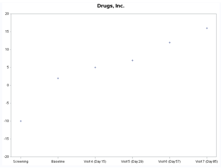
Here's an example using SAS/Graph proc gplot ...
data ft2;
input ftdy y;
datalines;
-48 -10
1  2
15 5
29 7
57 12
85 16
;
run;

axis1 label=none minor=none offset=(0,0)
 order=(-20 to 20 by 5);
axis2 label=none
 order=(-48,1,15,29,57,85)
 offset=(5,5)
 value=(
 t=1 'Screening'
 t=2 'Baseline'
 t=3 'Visit 4 (Day 15)'
 t=4 'Visit 5 (Day 29)'
 t=5 'Visit 6 (Day 57)'
 t=6 'Visit 7 (Day 85)'
 );

title1 "Drugs, Inc.";
proc gplot data=ft2;
plot y*ftdy / vaxis=axis1 haxis=axis2;
run;
- Mark as New
- Bookmark
- Subscribe
- Mute
- RSS Feed
- Permalink
- Report Inappropriate Content
Thank you, Graph Guy. I was also thinking I may have to go "old-school" with GPLOT. But it would have taken me a long time to look all that up. The one issue I see with that example is that the customer wants the tick marks displayed spaced by study day rather than evenly on the axis. \
I will let you and everybody else know how it goes.
- Mark as New
- Bookmark
- Subscribe
- Mute
- RSS Feed
- Permalink
- Report Inappropriate Content
Do you have a screen-capture (or even a hand-drawn image) of an axis, the way you're wanting it?
- Mark as New
- Bookmark
- Subscribe
- Mute
- RSS Feed
- Permalink
- Report Inappropriate Content
Hi GraphGuy,
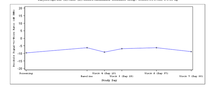
The current version, produced via PROC SGPLOT, is good except the tick mark labels are too small. If I make them any larger, they collide, so every other one is "thinned out." If I could get them to wrap, I could make the text large enough.
It is very important to the customer that the visits be spaced out by study day this way. That is what is complicating things, I guess.
Here is the code behind it:
     proc sgplot data = ft2;
          where usubjid_ = "&&P&QQ";
          series x = ftdy y = low   / legendlabel = '4 KHz Low-pass' markers lineattrs=(thickness=1 color = blue);
          xaxis /*type = discrete*/
                /*split*/
                /*splitchar     = '|' */
                fitpolicy = none
                values        = (-48  1  15  29  57  85)
		        valuesdisplay = ('Screening' 'Baseline' 'Visit 4 (Day 15)' 'Visit 5 (Day 29)' 'Visit 6 (Day 57)' 'Visit 7 (Day 85)')
                valueattrs    = (family = "courier new" color=black  size = 6.5 pt)
                labelattrs    = (family = "courier new" size = /*8.9*/ 9.5 pt color = black);
	      yaxis values = (-20 to 20 by 5)    labelattrs = (family = "courier new" size = 8.7 pt color = black);
	      title1 h=8pt color=black font='courier' J=L "Drugs, Inc.                                                                                                Page &QQ of &TOTPAGES";
	      title2 h=8pt color=black font='courier' J=L "&STDNO";
          title3 h=8pt color=black font='courier' J=L "Cohorts 4 and 5 Only";
          title5 h=8pt color=black font='courier' J=C "&TITLE5";
	      title6 h=8pt color=black font='courier' J=C "&TITLE6";
 	      title8 h=8pt color=black font='courier' J=C "Subject/Age/Sex [a]/Race [b]/Cohort/Randomized Treatment Group: &&P&QQ";
          run;
- Mark as New
- Bookmark
- Subscribe
- Mute
- RSS Feed
- Permalink
- Report Inappropriate Content
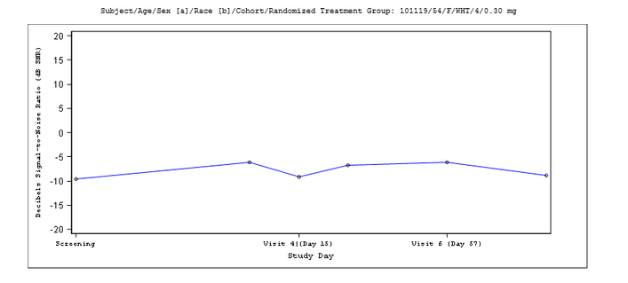
Since this is a linear axis, try setting FITPOLICY=STAGGER and see if that will work for you.
- Mark as New
- Bookmark
- Subscribe
- Mute
- RSS Feed
- Permalink
- Report Inappropriate Content
Thank you for your suggestion Dan. However, it doesn't seem to have had any effect (maybe there was some corresponding adjustment needed).
I truly do not understand why SPLITCHAR= is not set up to adjust tick mark labels regardless of the scenario. It seems to me to be purely cosmetic. There must be a good reason that I am not thinking of.
- Mark as New
- Bookmark
- Subscribe
- Mute
- RSS Feed
- Permalink
- Report Inappropriate Content
The STAGGER should kick in when you make the text big enough to collide. Did you increase the text size?
- Mark as New
- Bookmark
- Subscribe
- Mute
- RSS Feed
- Permalink
- Report Inappropriate Content
Ah, it did after I increased. Now it looks like this. I am going to try to get away with this, thanks so much...
- Mark as New
- Bookmark
- Subscribe
- Mute
- RSS Feed
- Permalink
- Report Inappropriate Content
It seems like SPLITPOLICY = SPLIT should work also, but it doesn't. Not only does it not split the label, it also displays my split character in the label (and suppresses some of my labels). I will explore this. Somewhere above somebody said SPLITCHAR doesn't work unless the axis values are discrete.
Catch up on SAS Innovate 2026
Dive into keynotes, announcements and breakthroughs on demand.
Explore Now →Learn how use the CAT functions in SAS to join values from multiple variables into a single value.
Find more tutorials on the SAS Users YouTube channel.
SAS Training: Just a Click Away
Ready to level-up your skills? Choose your own adventure.


