- Home
- /
- Programming
- /
- Graphics
- /
- PROC SGPLOT, SCATTER PLOT and "-" as SYMBOL ?
- RSS Feed
- Mark Topic as New
- Mark Topic as Read
- Float this Topic for Current User
- Bookmark
- Subscribe
- Mute
- Printer Friendly Page

- Mark as New
- Bookmark
- Subscribe
- Mute
- RSS Feed
- Permalink
- Report Inappropriate Content
Hi everyone,
I'm very new with SAS ODS Graphics and I'm currently working on a Sacatter Plot using PROC SGPLOT and SCATTER.
The scatter plot itself worked fine, but now my Statistician wants me to show the mean values as a horizontal bar "-".
I searched SAS and found, that the following SYMBOL names can be used:
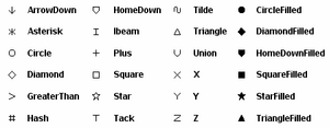
Is there any possibility to use other symbols in graphics?
Thank you in advance!
Natalie
Accepted Solutions

- Mark as New
- Bookmark
- Subscribe
- Mute
- RSS Feed
- Permalink
- Report Inappropriate Content
The list you have included has all the marker symbols that can be used in SG and GTL. However, you can add a scatter plot with "-" as a symbol with the MARKERCHAR option.
- Mark as New
- Bookmark
- Subscribe
- Mute
- RSS Feed
- Permalink
- Report Inappropriate Content
The list you have included has all the marker symbols that can be used in SG and GTL. However, you can add a scatter plot with "-" as a symbol with the MARKERCHAR option.
- Mark as New
- Bookmark
- Subscribe
- Mute
- RSS Feed
- Permalink
- Report Inappropriate Content
Dear Sanjay,
thank you very much!
It's a very nice option, I included it in my code now and all works perfectly ![]()
Natalie

- Mark as New
- Bookmark
- Subscribe
- Mute
- RSS Feed
- Permalink
- Report Inappropriate Content
Dear Natalie,
I have a similar situation, would you please tell me how to add the "-" on the scatter plot?
thanks
John
- Mark as New
- Bookmark
- Subscribe
- Mute
- RSS Feed
- Permalink
- Report Inappropriate Content
Hi John,
there are actually only two steps, which are needed with MARKERCHAR-option.
First I added a new variable MEANSYMBOL in my input data set, which contains the character string to be displayed in the graph, in my case it is "-". My data set looks like this:
treatment mean meansymbol
1 8.5 -
2 9.6 -
3 7.5 -
Then in the PROC SGPLOT I set the MARKERCHAR=meansymbol
(SAS: MARKERCHAR= variable specifies a variable whose values replace the marker symbols in the plot)
SCATTER X=treatment Y=mean / MARKERCHAR=meansymbol (COLOR=BLACK)
If needed COLOR, SIZE, WEIGHT etc. can be modified.
I hope it helps! ![]()
Natalie
- Mark as New
- Bookmark
- Subscribe
- Mute
- RSS Feed
- Permalink
- Report Inappropriate Content
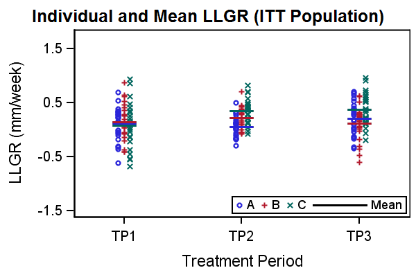
Hi Natalie and Sanjay,
I tried MARKERCHAR option with regard to using "-" as symbol. It works but it does not show the "-" in legend (see code below or attachment). Is there a way to show the "-" and "xx"in legend when using MARKERCHAR option?
thanks!!
John
data try;
input trt numb value mean median run;
cards;
1 101 26.5 33.9 27.8 7
1 102 29 33.9 27.8 7
1 103 49.1 33.9 27.8 7
1 104 26 33.9 27.8 7
1 105 52.8 33.9 27.8 7
1 106 19.9 33.9 27.8 7
2 201 25.8 30.4 28.3 8
2 202 16.7 30.4 28.3 8
2 203 38.1 30.4 28.3 8
2 204 30.7 30.4 28.3 8
2 205 51.3 30.4 28.3 8
2 206 19.8 30.4 28.3 8
3 301 26.5 33.9 27.8 9
3 302 29 33.9 27.8 9
3 303 49.1 33.9 27.8 9
3 304 26 33.9 27.8 9
3 305 52.8 33.9 27.8 9
3 306 19.9 33.9 27.8 9
;
run;
proc sgplot data=try; *noautolegend;
options orientation=landscape;
xaxis values=(0 to 4 by 1) label='trt' ;
yaxis values=(-10 to 60 by 10) label="something" ;
title "";
scatter x = trt y = value / markerattrs=(size=9 symbol=circle color=black) legendlabel="Individual Value" name="Ind";
scatter x = trt y = mean / markerattrs=(size=9 symbol=starfilled color=black) legendlabel="Mean" name="Mean";
scatter x = trt y = median / markerattrs=(size=9 symbol=diamondfilled color=black) legendlabel="Median" name="Med";
keylegend "Ind" "Mean" "Med"/ title="" position=topright location=inside across=1 ;
run;
When us "-" and "xxx"as symbols, these symbol did not show in the legend.
data try1;
set try;
meanbar='--------';
mednbar='xxxxx';
run;
proc sgplot data=try1; *noautolegend;
options orientation=landscape;
xaxis values=(0 to 4 by 1) label='trt' ;
yaxis values=(-10 to 60 by 10) label="something" ;
title "";
scatter x = trt y = value / markerattrs=(size=9 symbol=circle color=black) legendlabel="Individual Value" name="Ind";
scatter x = trt y = mean / MARKERCHAR=meanbar legendlabel="Mean" name="Mean";
scatter x = trt y = median / MARKERCHAR=mednbar legendlabel="Median" name="Med";
keylegend "Ind" "Mean" "Med"/ title="" position=topright location=inside across=1 ;
run;
- Mark as New
- Bookmark
- Subscribe
- Mute
- RSS Feed
- Permalink
- Report Inappropriate Content
No, there is no way in SAS 9.2 to get the marker character into the legend. However, there are other ways to skin the cat. ![]() I have done this before:
I have done this before:
What you want is a line segment to represent the mean and median. I use the VECTOR plot to do this. You can add the vector plot into the legend.
Here, the mean values for each group are computed and added to the data. The X variable is numeric with a UDF. The values are 1, 2, 3. So, you can make the vector span from -delta to +delta on each side of the value. In your case without a grouped case it should be simpler. If you want mean and median, you can create a point pair for each. You can set the line pattern of the second to dash, and see both values in the graph and legend.
- Mark as New
- Bookmark
- Subscribe
- Mute
- RSS Feed
- Permalink
- Report Inappropriate Content
Hi Sanjay,
Thanks for your suggestion!!, I tried in a different way but don't know why the square symbols were shown in the legend automatically. Could you help to remove the squares from the legend. see attachment.
Thanks!
John
- Mark as New
- Bookmark
- Subscribe
- Mute
- RSS Feed
- Permalink
- Report Inappropriate Content
Hmmm. That may be a bug. We don't expect scatterplots with MARKERCHARACTER to be added to a legend, so it is still drawing a default marker. Setting MarkerAttrs does not work either as it ignores it. Here I used "- - - -" for median:
- Mark as New
- Bookmark
- Subscribe
- Mute
- RSS Feed
- Permalink
- Report Inappropriate Content
Thanks Sanjay! How to get the "- - - -" for median, I mean which key in the computer keyboard was used. John
- Mark as New
- Bookmark
- Subscribe
- Mute
- RSS Feed
- Permalink
- Report Inappropriate Content
it is just dash space dash space.
- Mark as New
- Bookmark
- Subscribe
- Mute
- RSS Feed
- Permalink
- Report Inappropriate Content
Thanks! The color style works. In my program, can I set the square color to white so that the square will "disappear". how to do that ?
the following does not work.
scatter x = trt y = mean / MARKERCHAR=meanbar(color=white) legendlabel="--- Mean" name="Mean";
- Mark as New
- Bookmark
- Subscribe
- Mute
- RSS Feed
- Permalink
- Report Inappropriate Content
Where did you get that syntax from? I suggest you look up the documentation on proc SGPLOT for various options. Use markercharattrs=(color=white), If you do use this, the ----- marker in the plot and its representation in the legend will be white.
- Mark as New
- Bookmark
- Subscribe
- Mute
- RSS Feed
- Permalink
- Report Inappropriate Content
Turns out it is not really a bug. The "marker" you are seeing is really a color swatch. Instead of two separate statements, if you had used one with group values of "Mean" and "Median", you would see two swatches, one blue and one red (in listing style). So, that may work for you if you have a color style.
- Mark as New
- Bookmark
- Subscribe
- Mute
- RSS Feed
- Permalink
- Report Inappropriate Content
Sorry, I did not ask the question clearly. The question is: Is there a way to turn off the color swatch or somehow let the color swatch to become white so that only ---Mean or - - median are shown in the legend. ![]()
.jpg")
Catch up on SAS Innovate 2026
Nearly 200 sessions are now available on demand in the Innovate Hub.
Watch Now →Learn how use the CAT functions in SAS to join values from multiple variables into a single value.

Find more tutorials on the SAS Users YouTube channel.
SAS Training: Just a Click Away
Ready to level-up your skills? Choose your own adventure.
-
20 replies
-
06-06-2012 05:31 AM
-
14481 views
-
0 likes
-
3 in conversation
-
